
49
Overflow Wrap In A Flex Container
In this blog, we'll look at a very specific thing i.e. the use of
overflow-wrap property inside a flex container. overflow-wrap is a very handy CSS property and I've used it in almost all of the projects that I've worked in. In a nutshell
overflow-wrap allows us wrap some overflowing content in places where it would not wrap by default. But let's explore this with the help of an example.From the above example our focus would only be in the following snippet, everything else is just for styling.
<div class="card-body">
  <p class="card-body-content">
    The longest word in any of the major English language
    dictionaries is
    <span class="highlight">
      pneumonoultramicroscopicsilicovolcanoconiosis
    </span>
    , a word that refers to a lung disease contracted from
    the inhalation of very fine silica particles,
    specifically from a volcano; medically, it is the same
    as silicosis.
  </p>
</div>
So, by default if the text inside a container cannot fit the container (i.e. it overflows), then the text starts wrapping by introducing line breaks at normal word break points (like spaces).
And that is exactly what's happening currently, the text (
card-body-content) inside the container (.card-body) overflows it and hence line breaks are introduced. But the word "pneumonoultramicroscopicsilicovolcanoconiosis" still overflows the container because there are no valid break points to wrap it.
Before we start using
overflow-wrap let's try to make the container (.card-body) display: flexCrap! Things get even worse now, but why? What's so different about flex?
<div class="card-body flex">
  <p class="card-body-content">
    Same content
  </p>
</div>
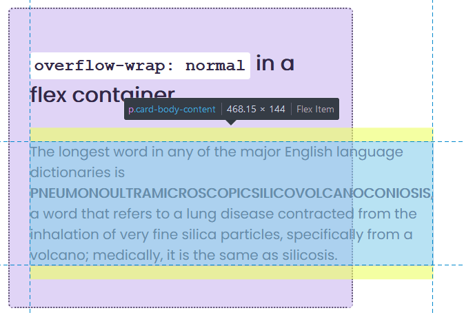
Flex relies on
min-content and max-content intrinsic sizes to structure the layout. So, by default flex tries to fit in all the flex items in a single row wherein each item gets their max-content intrinsic size, but if doing so overflows the container then it starts shrinking the items (this behavior can be altered using the flex-shrink property on the flex items) and the items are shrank until they reach their min-content intrinsic size, after which the items start overflowing the container.Now coming back to the example, the flex container is initially trying to fit its only item in a single row wherein the item gets a width equal to its
max-content intrinsic size (and the max-content size is when the entire item is spread in a single line without any wrapping), but clearly that would overflow the container - so flex starts wrapping the item - but remember it would only wrap the item until it reaches its min-content intrinsic size (which is equal to the longest word in the item).So, the width of the flex container here is equal to the width of the word "pneumonoultramicroscopicsilicovolcanoconiosis" and the line breaks that happen is based on this width (look at the image below).
Now that we have an understanding of how flex works, let's use the
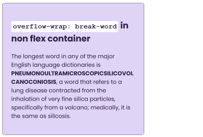
overflow-wrap property in our code and look at the following three scenarios:overflow-wrap: break-word in non flex containeroverflow-wrap: break-word in a flex containeroverflow-wrap: anywhere in a flex container<div class="card-body">
<p class="card-body-content wrap-break-word">
Same content
</p>
</div>break-word
The same as the anywhere value, with normally unbreakable words allowed to be broken at arbitrary points if there are no otherwise acceptable break points in the line, but soft wrap opportunities introduced by the word break are NOT considered when calculating min-content intrinsic sizes.
So, from the definition above (except maybe the last sentence which we'll discuss next), it's quite clear that because our content is allowed to wrap at any arbitrary point there's no overflow.
<div class="card-body flex">
  <p class="card-body-content wrap-break-word">
    Same content
  </p>
</div>
When we make the container a flexbox,
overflow-wrap: break-word doesn't seem to have any effect. Let's look at the definition of overflow-wrap: break-word again, specifically the last sentence.break-word
The same as the anywhere value, with normally unbreakable words allowed to be broken at arbitrary points if there are no otherwise acceptable break points in the line, but soft wrap opportunities introduced by the word break are NOT considered when calculating min-content intrinsic sizes.**
This means
break-word is not shrinking the min-content intrinsic size of the flex item because of which the flex-item is still overflowing.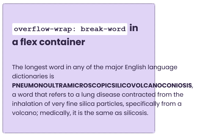
<div class="card-body flex">
  <p class="card-body-content wrap-anywhere">
    Same content
  </p>
</div>
anywhere
To prevent overflow, an otherwise unbreakable string of characters — like a long word or URL — may be broken at any point if there are no otherwise-acceptable break points in the line. No hyphenation character is inserted at the break point. Soft wrap opportunities introduced by the word break are considered when calculating min-content intrinsic sizes.
When we use
anywhere, it actually shrinks the min-content intrinsic of the flex item because of which the flex item is allowed to wrap and there's no overflow.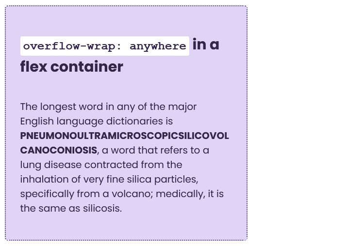
That's it for this blog! I understand that the example might be a little contrived and it might not click instantly, but I would suggest you to read it again and play with code, it will eventually make sense. Also, put you thoughts in the comments!
Peace ✌
49