
25
Dark Mode Using React
Originally posted Here
If you've ever worked in front of a screen, you probably know how it feels to finally get away from the computer, only to have your eyes strained over the course of the day. One way developers have started to combat this is the use of dark mode. Dark mode uses light text on a dark background, also leading to lower power consumption on certain devices. This is also a great tool in keeping users engaged and interested in your content.
First, we need to create a react app. The most popular way to do this is to run the following command:
npx create-react-app dark-mode-exampleThis will create a directory called
dark-mode-example, and will install React and the necessary dependencies to get you started. Once that is complete, you should see the following in the terminal:Success! Created dark-mode-example at /home/example/dark-mode-example
Inside that directory, you can run several commands:
npm start
Starts the development server.
npm run build
Bundles the app into static files for production.
npm test
Starts the test runner.
npm run eject
Removes this tool and copies build dependencies, configuration files
and scripts into the app directory. If you do this, you can’t go back!
We suggest that you begin by typing:
cd dark-mode-example
npm start
Happy hacking!Now that our React app is set up, lets run
cd dark-mode-example and npm start to start the development server. A Browser window will open in your default browser, and you should see the following:
Now we can open our favorite text editor and start coding. I recommend using VS Code, so we can stop our development server with
ctrl + c and then run code . since we're already in the project directory. For the purposes of this tutorial, we'll only be editing two files: src/App.js and src/App.css. We can start by editing src/App.js:It should currently look something like this:
import logo from "./logo.svg";
import "./App.css";

function App() {
  return (
    <div className="App">
      <header className="App-header">
        <img src={logo} className="App-logo" alt="logo" />
        <p>
          Edit <code>src/App.js</code> and save to reload.
        </p>
        <a
          className="App-link"
          href="https://reactjs.org"
          target="_blank"
          rel="noopener noreferrer"
        >
          Learn React
        </a>
      </header>
    </div>
  );
}

export default App;
Remove the header tag and everything within, only leaving the following:
import "./App.css";

function App() {
  return <div className="App"></div>;
}

export default App;
Now we can edit
src/App.css. It should currently contain the following:.App {
text-align: center;
}
.App-logo {
height: 40vmin;
pointer-events: none;
}
@media (prefers-reduced-motion: no-preference) {
.App-logo {
animation: App-logo-spin infinite 20s linear;
}
}
.App-header {
background-color: #282c34;
min-height: 100vh;
display: flex;
flex-direction: column;
align-items: center;
justify-content: center;
font-size: calc(10px + 2vmin);
color: white;
}
.App-link {
color: #61dafb;
}
@keyframes App-logo-spin {
from {
transform: rotate(0deg);
}
to {
transform: rotate(360deg);
}
}We removed almost everything that relies on this file in the previous step, so remove everything except the
.App class. The file should now look like this:.App {
text-align: center;
}While we have this file open, lets update the
.App class, and add a few more classes we'll use in the following steps:* {
margin: 0;
padding: 0;
box-sizing: border-box;
}
.App {
height: 100vh;
width: auto;
text-align: center;
font-size: 5em;
color: #2e3440;
background-color: #d8dee9;
transition: all 0.2s ease;
}
.dark,
.dark .App {
color: #d8dee9;
background-color: #2e3440;
transition: all 0.2s ease;
}Lets talk about what we've done here. The first change you may notice is the
* selector. This is a universal selector, and will apply to all elements. This serves as a simple way to reset the default styles of all elements, creating a consistent look and feel across multiple browsers. We also added a new class called .dark. This class will be added to the .App class when the user clicks the dark mode button. The new styles will be applied, and any elements that are not in the .dark class will not be affected.Lets go back to
src/App.js and add some text, and a button to toggle dark mode on and off. We'll assign the class .dark-mode-toggle to the button, and use the onClick event to toggle Dark Mode on and off. Because we're using useState to toggle Dark Mode, we'll import it at the top of the filee. Then we need to create our darkMode variable and setDarkMode modifier. For the time being we will default to false, which means the app will use light mode.import "./App.css";
import { useState } from "react";
function App() {
const [darkMode, setDarkMode] = useState(false);
return (
<div className="App">
<h1>{darkMode ? "Dark Mode" : "Light Mode"}</h1>
<p>This is a test</p>
<button
className="dark-mode-toggle"
onClick={() => {
setDarkMode(!darkMode);
}}
>
{darkMode ? "Dark Mode" : "Light Mode"}
</button>
</div>
);
}
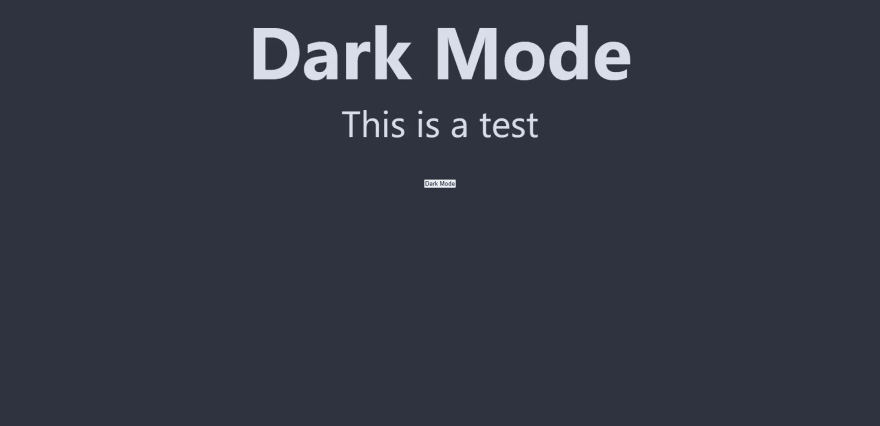
export default App;Once you've added the button, you can test it by clicking it. You should see the following:

Click the button and the header and button text should be updated to say

Dark Mode, thanks to the ternary statements we just implemented. Here's what you should see after clicking the button:Awesome! We're toggling dark mode on and off with a button, but we're not changing any styling yet. To do this, we'll need to import
useEffect alongside our existing useState hook. After importing useEffect, we can use it below our variable declarations. When using useEffect, we can pass in a function as the second argument. This function will be called after the component mounts, and will be called again whenever the darkMode variable changes. If the second argument is an empty function, then the effect will only run once when the component mounts. We can use this to add a listener to the darkMode variable, and then add or remove the .dark class from the body when it changes. Our useEffect hook will look like this:useEffect(() => {
if (darkMode) {
document.body.classList.add("dark");
} else {
document.body.classList.remove("dark");
}
}, [darkMode]);With this in place, our button starts to actually make some changes! When dark mode is active, we will see the following:
We need to update our button with a blank div to style into the slider button. First, remove the ternary statement from the label of the button, and replace it with a
div element. Then, add a the class .dark-mode-slider to the div as shown below:<button
className="dark-mode-toggle"
onClick={() => {
setDarkMode(!darkMode);
}}
>
<div className="dark-mode-slider" />
</button>To achieve a nice slider look, we'll update
src/App.css to add the .dark-mode-toggle and .dark-mode-slider classes from our button above. Add the following to src/App.css:/* Button Styles */
.dark-mode-toggle {
width: 80px;
height: 36px;
border-radius: 50px;
top: 0;
left: 0;
}
.dark-mode-toggle svg {
fill: #000;
}
.dark-mode-slider {
height: 30px;
width: 30px;
border-radius: 50%;
background-color: #2e3440;
display: flex;
position: relative;
transform: translateX(0px);
transition: all 0.2s ease;
}
.dark .dark-mode-slider {
transform: translateX(45px);
}Here you can see we have positioned the slider to the left for our default light mode, then when the
.dark class is added to the body, we'll move the slider to the right using CSS transitions. This will give the slider a nice sliding effect, giving your application a nice polished feel. This is just the beginning of what we can do with dark mode, as you can store values to local storage, then access them when the user returns to the site. We'll be covering this in the next tutorial.25