
97
Achieving backdrop blur without 'backdrop-filter'
Hi everyone!
At the the time of writing (this will probably change in the future)...

...it's rather popular to go for a "glass look" in your designs. Having been around in the web design space for... a while (guess), I feel kind of like I've been ahead of the curve on this one. I've been favouring glass-style designs since I could poke around in MS Frontpage.
Anyway, that's not the point of this post. As you can tell by the title, I'm going to be focusing on a rather exciting, "new" CSS property:
backdrop-filter:, specifically using the function blur().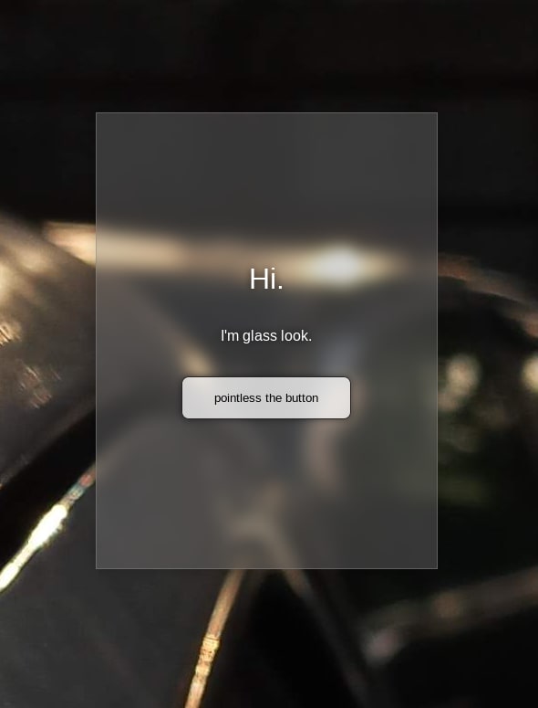
With the resurgence (was it ever popular though?) of glass/glass-look in UI design, having a blurry backdrop on your page elements has become all the rave.
BUT! There's something you should know before you dive in.
It's *not* supported everywhere! I know this comes as a shock, so if you need a moment...
Truth is, quite a large number of users are using Firefox, and even the latest Firefox release (as of the time of writing) does not support the
backdrop-filter: property in any context (unless you're willing to turn on some features in about:config).
Now, this is probably not such a big deal to most designers, because y'all don't use glass anyway, haha. Oh wait, but you want to jump on the glass train, don't you? It's that shiny-new-thing smell, isn't it?
While the numerical majority of your website users will likely be on a blink or webkit based browser, there are still enough people using Firefox as their daily driver that you should consider them. Why? Well, let's just say without appropriate blurring, glass can be a bit... disappointing:

Okay, I admit, this isn't ugly enough. But trust me, it can get ugly.
In case it's not obvious, using glass-look comes with some tradeoffs. I won't list a whole bunch of them here, but I will point out the one that should be most obvious: readability.
Without an appropriately contrasted background, text is hard to read. This is especially true for visually impaired readers, such as yours truly (I'm nearsighted and have a mild astigmatism, but I can also fly and shoot lasers from my eyes, so who's counting?).
So, blurring your glassy element(s)' background(s) can be more than just a matter of aesthetics. I'd recommend also making appropriate use of text-shadows if you're going to go for a glass-look, but that's another topic for another time.
Yes! Fortunately, we can rely on something that's well supported in almost all browsers, except Internet Destroy- um... sorry, Internet Explorer!
Now, I must point out that this solution is not perfect. It can be a little slower, at least on older systems, or if used poorly. However, it gives, in my opinion, acceptable, sometimes more realistic, results.
To achieve this solution, you'll need to understand four things: pseudo-elements, positioning, filters, and the z-index.
On the surface, this may all sound like a lot, but it's not as complicated as it sounds. In fact, I've covered this before (see method #2).
backdrop-filter: property, is done by filters, which are CSS functions that affect images of any kind, whether they are image elements, or backgrounds. backdrop-filter: simplifies our workflow by allowing us to directly apply these filters to the background of any element, which is something we couldn't do in the past. We can achieve the same level of versatility with the method mentioned here.property: value; pair of z-index: -1;.
Demo Source Code
To start, I've removed
backdrop-filter: blur(8px); from the parent div, added position: relative; and a ::before pseudo-element with the following properties:div::before {
background-color: rgb(235, 235, 235);
content: '';
position: absolute;
inset: 3%;
z-index: -1;
}Note: inset is shorthand for top, bottom, right, and left, but not supported in Internet Exploder [sic]. Not that it matters anyway, because Internet Eradicator [sic] does not support normal CSS filters either. All Internet Explorer jokes aside, you probably still can use this method with Internet Explorer, if you are willing to find its non-standard filter syntax.
I would, but I don't have a copy of IE to test on, so I will not cover it here.
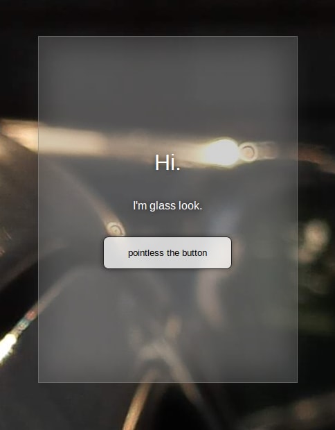
Now that we know how our backdrop looks, we can blur it, and turn up the opacity. To do this, we'll add
filter: blur(); and change rgb() to rgba(), as follows:div::before {
div::before {
background-color: rgba(235, 235, 235, .3);
content: '';
filter: blur(18px);
position: absolute;
inset: 3%;
z-index: -1;
}This should give us a result that looks like this:
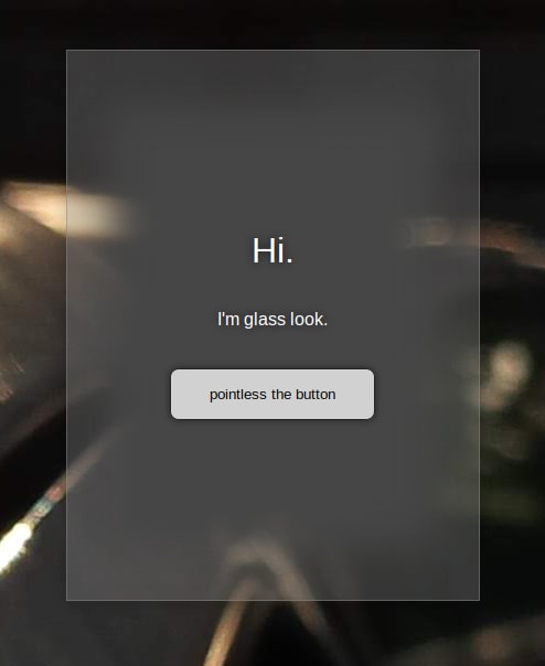
If you're not satisfied, you can further tweak your values. For instance, I've gone for a darker background, but with more space around the edges:
div::before {
  background-color: rgba(35, 35, 35, 1);
  content: '';
  filter: blur(18px);
  position: absolute;
  inset: 10%;
  z-index: -1;
}
While this method is more technically complicated than dropping in a single
property: value; pair, it's FAR more versatile, apart from being better supported across different browsers. Both solutions can be animated, but this method gives you more options, and can be pretty smooth if done correctly (see my portfolio for instance).I hope you've found this tutorial useful. You can follow me on here, or on YouTube for more CSS and Design tips, tricks, and guides.
Enjoy, and go out and create!
P.S.:
For the why behind this issue in Firefox, read the bug report. There's a lot of technical mumbo-jumbo, jimbo-jambo, and rambo-bambo, but trust me, it's worth it, if you want to understand what goes into features like this.
For the why behind this issue in Firefox, read the bug report. There's a lot of technical mumbo-jumbo, jimbo-jambo, and rambo-bambo, but trust me, it's worth it, if you want to understand what goes into features like this.
97