
52
CSS Box Shadow
So in this topic , I'll cover about
So first we'll know about general syntax of
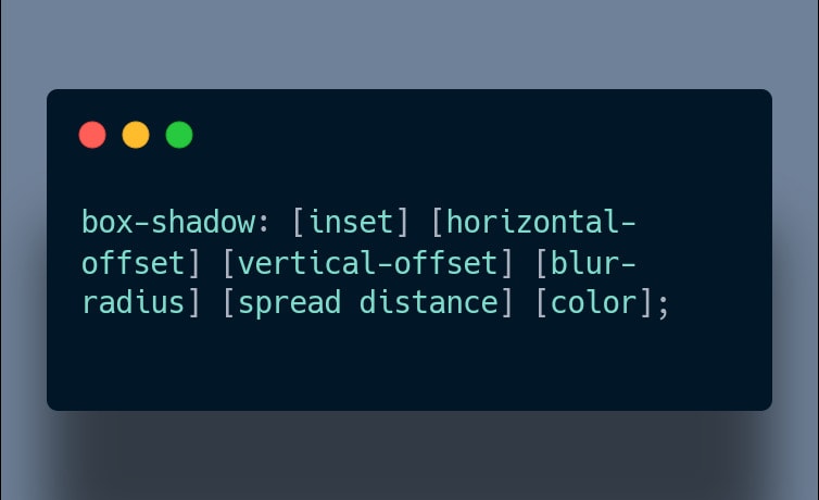
box-shadow propery in CSS.So first we'll know about general syntax of
box-shadow property.1)Drop shadow:
A drop shadow is effectively a blurred, offset version of the input image's alpha mask, drawn in a specific color and composited below the image.


A drop shadow is effectively a blurred, offset version of the input image's alpha mask, drawn in a specific color and composited below the image.
2)Inner Shadow:
An inner shadow can be rendered using the


An inner shadow can be rendered using the
inset property value.3)a)Offset Drop (bottom-right) shadow:


3)b)Offset Drop (top-left) shadow:


4)a)With inset:
If the


If the
inset keyword property value is present,the box-shadow will appear inside the HTML element as you can see in the Image.4)b)Without inset:


5)a) Horizontal offset:
The Horizontal offset value controls the x-axis position of the


The Horizontal offset value controls the x-axis position of the
box-shadow.5)b) Vertical Offset:
The vertical offset controls the


Note:
The vertical offset controls the
box-shadow's position on the y-axis.Note:
+ve value shift the box-shadow to the right
-ve value shift the box-shadow to the left
6)Blur radius:
If the blur radius is 0 ,the


If the blur radius is 0 ,the
box-shadow will be sharp and it's color will be solid. As you increase the value , it'll become blurrier and more opaque7)Spread distance:
It makes the
It makes the
box-shadow larger or smaller in all directions.a)+ve (spread distance )value-
the


the
box-shadow will grow in size on all sidesb)-ve (spread distance) value-


box-shadow contract on all sides8)Color:


color value sets the box shadow's color.52