
70
Angular Material Theming System: Complete Guide
In the latest releases of Angular Material, the SASS theming API has been reworked. In this article, we will learn about custom themes, modifying typography and much more using new SASS mixins.
In this article, you will learn what Angular Material Theming is and what are some recent changes to adhere to the new module system of SASS.
Then, we will set up a project with Angular Material. We will then add a custom theme in it and understand some important mixins,
core, define-palette, define-light-theme and we will apply custom theme to Angular Material components. And we will also learn how to use a pre-built theme.After setting up the theme, we will understand typography and also modify it for header tags (
<h1>, <h2>, etc.) for the application.Next, we will create a dark theme using
define-dark-theme. We will implement lazy loading for dark theme, so that it only loads when needed.After adding support for multiple themes, we will learn how to apply Angular Material’s theming to custom components. We will take an example of an
alert component and apply themes to it.We will also learn about how to customize styles of Angular Material components. We will take the example of
MatButton and add new variants for it.And at last, we are going to learn how to update an old code-base with Angular Material version 10 to the latest version, i.e. 13. We will see how to resolve SASS errors and what major changes are made in each release.
The Angular team builds and maintains both common UI components and tools to help us build our own custom components.
@angular/material is Material Design UI components for Angular applications.Angular Material also provides tools that help developers build their own custom components with common interaction patterns.
In Angular Material, a theme is a collection of color and typography options. Each theme includes three palettes that determine component colors: primary, accent and warn.
Angular Material's theming system comes with a predefined set of rules for color and typography styles. The theming system is based on Google's Material Design specification. You can also customize color and typography styles for components in your application.
Before moving ahead, It would be great if you have familiarity with SASS basics, including variables, functions, mixins, and use.
SASS introduced a new module system, including a migration from
@import to @use in 2019. The @use rule loads mixins, functions, and variables from other SASS stylesheets, and combines CSS from multiple stylesheets together. Stylesheets loaded by @use are called "modules".By switching to
@use syntax, we can more easily determine what CSS is unused, and reduce the size of the compiled CSS output. Each module is included only once no matter how many times those styles are loaded.Angular Material v12 included a migration from
@import usage to @use for all imports into the Angular Material SASS styles. They updated their code base for all styles with version 12. You can check out that particular release for more information.This refactor of the theming API surface is easier to understand and read, helping developers like us take better advantage of this new module system.
Note: While writing this article, I used Angular version 13 and the approach described in this article should also work for version 12. For older versions, you can jump to the update guide.
In this section, we are going to learn how to use the new mixins and functions like
core-theme, all-components-theme, define-palette, etc. To summarize, below are main tasks which we will be doing:Let’s first create a new Angular Project with SASS:
ng new my-app --style=scss --defaultsUse the Angular CLI's installation schematic to set up your Angular Material project by running the following command:
ng add @angular/materialThe
ng add command will install Angular Material, the Component Dev Kit (CDK), Angular Animations and ask you the following questions to determine which features to include:You're done! Angular Material is now configured to be used in your application.
A theme file is a SASS file that uses Angular Material SASS mixins to produce color and typography CSS styles.
Let’s jump to
src/styles.scss file and have a look at our theme:// src/styles.scss
@use "@angular/material" as mat;
@include mat.core();
$my-app-primary: mat.define-palette(mat.$indigo-palette);
$my-app-accent: mat.define-palette(mat.$pink-palette, A200, A100, A400);
$my-app-warn: mat.define-palette(mat.$red-palette);
$my-app-theme: mat.define-light-theme(
(
color: (
primary: $my-app-primary,
accent: $my-app-accent,
warn: $my-app-warn,
),
)
);
@include mat.all-component-themes($my-app-theme);
html,
body {
height: 100%;
}
body {
margin: 0;
font-family: Roboto, "Helvetica Neue", sans-serif;
}Let’s break the above code into pieces to understand more.
@include mat.core();The first thing in the theme file you will notice is the
core mixin. Angular Material defines a mixin named core that includes prerequisite styles for common features used by multiple components, such as ripples. The core mixin must be included exactly once for your application, even if you define multiple themes.Angular Material represents a theme as a SASS map that contains your color and typography choices. Colors are defined through a palette.
A palette is a collection of colors representing a portion of color space. Each value in this collection is called a hue. In Material Design, each hue in a palette has an identifier number. These identifier numbers include 50, and then each 100 value between 100 and 900. The numbers order hues within a palette from lightest to darkest. Angular Material represents a palette as a SASS map.
$my-app-primary: mat.define-palette(mat.$indigo-palette);
$my-app-accent: mat.define-palette(mat.$pink-palette, A200, A100, A400);
$my-app-warn: mat.define-palette(mat.$red-palette);To construct a theme, 2 palettes are required:
primary and accent, and warn palette is optional.The
define-palette SASS function accepts a color palette, as well as four optional hue numbers. These four hues represent, in order: the "default" hue, a "lighter" hue, a "darker" hue, and a "text" hue.Components use these hues to choose the most appropriate color for different parts of themselves. For example,
MatButton’s theme uses the hues to generate font colors:// src/material/button/_button-theme.scss
// content reduced for brevity
// Applies a property to an mat-button element for each of the supported palettes.
@mixin _theme-property($theme, $property, $hue) {
$primary: map.get($theme, primary);
$accent: map.get($theme, accent);
$warn: map.get($theme, warn);
$background: map.get($theme, background);
$foreground: map.get($theme, foreground);
&.mat-primary {
#{$property}: theming.get-color-from-palette($primary, $hue);
}
&.mat-accent {
#{$property}: theming.get-color-from-palette($accent, $hue);
}
&.mat-warn {
#{$property}: theming.get-color-from-palette($warn, $hue);
}
&.mat-primary,
&.mat-accent,
&.mat-warn,
&.mat-button-disabled {
&.mat-button-disabled {
$palette: if($property == "color", $foreground, $background);
#{$property}: theming.get-color-from-palette($palette, disabled-button);
}
}
}
@mixin color($config-or-theme) {
$config: theming.get-color-config($config-or-theme);
$foreground: map.get($config, foreground);
.mat-button,
.mat-icon-button,
.mat-stroked-button {
@include _theme-property($config, "color", text);
}
}In our example, we have used predefined palettes, i.e.
$indigo-palette, $pink-palette and $red-palette. You can check out other palettes at the Angular Material GitHub repo’s file:// src/material/core/theming/_palette.scss
// content reduced for brevity
$red-palette: (
50: #ffebee,
100: #ffcdd2,
200: #ef9a9a,
300: #e57373,
// ...
contrast: (
50: $dark-primary-text,
100: $dark-primary-text,
200: $dark-primary-text,
300: $dark-primary-text,
// ...
)
);
$pink-palette: (
50: #fce4ec,
100: #f8bbd0,
200: #f48fb1,
300: #f06292,
// ...
contrast: (
50: $dark-primary-text,
100: $dark-primary-text,
200: $dark-primary-text,
300: $dark-primary-text,
// ...
)
);You can also create your own palettes by defining a SASS map like below:
$indigo-palette: (
 50: #e8eaf6,
 100: #c5cae9,
 200: #9fa8da,
 300: #7986cb,
 // ... continues to 900
 contrast: (
   50: rgba(black, 0.87),
   100: rgba(black, 0.87),
   200: rgba(black, 0.87),
   300: white,
   // ... continues to 900
 )
);$my-app-theme: mat.define-light-theme(
(
color: (
primary: $my-app-primary,
accent: $my-app-accent,
warn: $my-app-warn,
),
)
);You can construct a theme by calling either
define-light-theme or define-dark-theme with the result from define-palette. The choice of a light versus a dark theme determines the background and foreground colors used throughout the components.@include mat.all-component-themes($my-app-theme);Angular Material offers a "theme" mixin that emits styles for both color and typography and It’s the
all-component-themes mixin.You can check the source file:
src/material/core/theming/_all-theme.scss to see the mixin all-component-themes:// src/material/core/theming/_all-theme.scss
@mixin all-component-themes($theme-or-color-config) {
$dedupe-key: 'angular-material-theme';
@include theming.private-check-duplicate-theme-styles($theme-or-color-config, $dedupe-key) {
@include core-theme.theme($theme-or-color-config);
@include autocomplete-theme.theme($theme-or-color-config);
@include badge-theme.theme($theme-or-color-config);
@include bottom-sheet-theme.theme($theme-or-color-config);
@include button-theme.theme($theme-or-color-config);
// other material components' themes...
}
}Additionally, there is a "color" mixin that emits all components' color styles and a "typography" mixin that emits all components’ typography styles. They are
all-component-colors and all-component-typographies mixins.// src/material/core/color/_all-color.scss
@mixin all-component-colors($config-or-theme) {
$config: if(theming.private-is-theme-object($config-or-theme),
theming.get-color-config($config-or-theme), $config-or-theme);
@include all-theme.all-component-themes((
color: $config,
typography: null,
density: null,
));
}And
all-components-typography mixin is present at src/material/core/typography/_all-typography.scss:// src/material/core/typography/_all-typography.scss
@mixin all-component-typographies($config-or-theme: null) {
$config: if(theming.private-is-theme-object($config-or-theme),
theming.get-typography-config($config-or-theme), $config-or-theme);
@include badge-theme.typography($config);
@include typography.typography-hierarchy($config);
@include autocomplete-theme.typography($config);
@include bottom-sheet-theme.typography($config);
@include button-theme.typography($config);
// other components' typographies
}These mixins emit styles for all 35+ components in Angular Material. This will produce unnecessary CSS, except when your application is using every single component from the library. Let’s look at the
styles size after the build command and then I’ll show you how to reduce it:
Just like
all-component-colors, all-component-typographies and all-component-themes, each Angular Material component has a color, a typography and a theme mixin.// src/material/button/_button-theme.scss
// content reduced for brevity
@mixin color($config-or-theme) {
$config: theming.get-color-config($config-or-theme);
$primary: map.get($config, primary);
$accent: map.get($config, accent);
$warn: map.get($config, warn);
// sets up color for buttons
}
@mixin typography($config-or-theme) {
$config: typography.private-typography-to-2014-config(
theming.get-typography-config($config-or-theme));
.mat-button, .mat-raised-button, .mat-icon-button, .mat-stroked-button,
.mat-flat-button, .mat-fab, .mat-mini-fab {
font: {
family: typography-utils.font-family($config, button);
size: typography-utils.font-size($config, button);
weight: typography-utils.font-weight($config, button);
}
}
}
@mixin theme($theme-or-color-config) {
$theme: theming.private-legacy-get-theme($theme-or-color-config);
@include theming.private-check-duplicate-theme-styles($theme, 'mat-button') {
$color: theming.get-color-config($theme);
$typography: theming.get-typography-config($theme);
@if $color != null {
@include color($color);
}
@if $typography != null {
@include typography($typography);
}
}
}We can apply the styles for each of the components used in the application by including each of their theme SASS mixins.
First, we will remove
all-component-themes from styles.scss and instead, add core-theme:// @include mat.all-component-themes($my-app-theme); <-- removed
@include mat.core-theme($my-app-theme);core-theme emits theme-dependent styles for common features used across multiple components, like ripples.Next, we need to add component related styles. In this example, we are only going to use
MatButton, so we will add button-theme:@include mat.button-theme($my-app-theme);You can add other components’
theme’s in the same way. But, core-theme is only needed once per theme. Let’s look at the styles size now after build.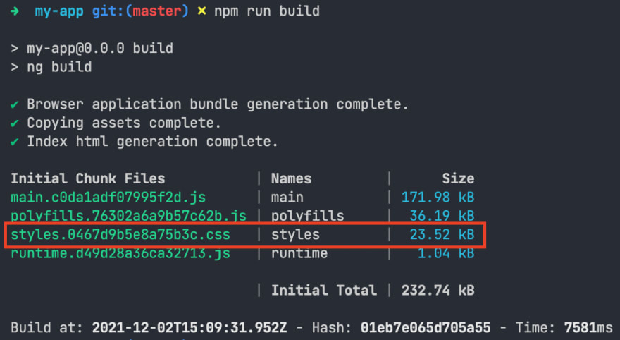
Notice how using only the needed components’ themes reduces the style's size. In our case, it was 72.31 kB earlier and it’s reduced to 23.52 kB, which is almost 58% less.
For better code management, we will move theme related code into
styles/themes/_light.scss:// src/styles/themes/_light.scss
@use "sass:map";
@use "@angular/material" as mat;
$my-app-light-primary: mat.define-palette(mat.$indigo-palette);
$my-app-light-accent: mat.define-palette(mat.$pink-palette, A200, A100, A400);
$my-app-light-warn: mat.define-palette(mat.$red-palette);
$my-app-light-theme: mat.define-light-theme(
(
color: (
primary: $my-app-light-primary,
accent: $my-app-light-accent,
warn: $my-app-light-warn,
),
)
);And use the same in
styles.scss:// styles.scss
@use "@angular/material" as mat;
@use "./styles/themes/light";
@include mat.core();
@include mat.core-theme(light.$my-app-light-theme);
@include mat.button-theme(light.$my-app-light-theme);
html,
body {
height: 100%;
}
body {
margin: 0;
font-family: Roboto, "Helvetica Neue", sans-serif;
}Let’s add a
[mat-raised-button] in application and see how it looks:<button mat-raised-button color="primary">Raised</button>
<button mat-raised-button color="accent">Accent</button>
<button mat-raised-button color="warn">Warn</button>And the output should look like below:

When we installed Angular Material, we selected “Custom” in theme selection. If you want any pre-built theme, you can select any theme instead of “Custom”. There are 4 pre-built themes provided:
| Theme | Light or dark? | Palettes (primary, accent, warn) |
|---|---|---|
| deeppurple-amber.css | Light | deep-purple, amber, red |
| indigo-pink.css | Light | indigo, pink, red |
| pink-bluegray.css | Dark | pink, bluegray, red |
| purple-green.css | Dark | purple, green, red |
For instance, if you want to use
indigo-pink.css’s theme, you just need to include that file in the styles array of your project’s angular.json file:"styles": [
"./node_modules/@angular/material/prebuilt-themes/indigo-pink.css",
// other styles
],Typography is a way of arranging type to make text legible, readable, and appealing when displayed. Angular Material's theming system supports customizing the typography settings for the library's components. Additionally, Angular Material provides APIs for applying typography styles to elements in your own application.
When we installed Angular Material through schematics, it set up the font asset for us in
index.html:<link href="https://fonts.googleapis.com/css2?family=Roboto:wght@300;400;500&display=swap" rel="stylesheet">And to support
Roboto, it also added some global styles in styles.scss:body {
font-family: Roboto, "Helvetica Neue", sans-serif;
}In the Material theme, each set of typography is categorised in levels based on which part of the application's structure it corresponds to, such as a header. You can learn more about it at typography levels from the 2014 version of the Material Design specification.
| Name | CSS Class | Native Element | Description |
|---|---|---|---|
| display-4 | .mat-display-4 |
None | 112px, one-off header, usually at the top of the page (e.g. a hero header). |
| display-3 | .mat-display-3 |
None | 56px, one-off header, usually at the top of the page (e.g. a hero header). |
| display-2 | .mat-display-2 |
None | 45px, one-off header, usually at the top of the page (e.g. a hero header). |
| display-1 | .mat-display-1 |
None | 34px, one-off header, usually at the top of the page (e.g. a hero header). |
| headline |
.mat-h1 or .mat-headline
|
<h1> |
Section heading corresponding to the <h1> tag. |
| title |
.mat-h2 or .mat-title
|
<h2> |
Section heading corresponding to the <h2> tag. |
| subheading-2 |
.mat-h3 or .mat-subheading-2
|
<h3> |
Section heading corresponding to the <h3> tag. |
| subheading-1 |
.mat-h4 or .mat-subheading-1
|
<h4> |
Section heading corresponding to the <h4> tag. |
| -- | .mat-h5 |
<h5> |
-- |
| -- | .mat-h6 |
<h6> |
-- |
| body-1 |
.mat-body or .mat-body-1
|
Body text | Base body text. |
| body-2 |
.mat-body-strong or .mat-body-2
|
None | Bolder body text. |
| caption |
.mat-small or .mat-caption
|
None | Smaller body and hint text. |
| button | -- | -- | Buttons and anchors. |
| input | -- | -- | Form input fields. |
You can define a typography level with the
define-typography-config SASS function. This function accepts, in order, CSS values for font-size, line-height, font-weight, font-family, and letter-spacing. You can also specify the parameters by name, as demonstrated in the example below.@use '@angular/material' as mat;
$my-custom-level: mat.define-typography-level(
$font-family: Roboto,
$font-weight: 400,
$font-size: 1rem,
$line-height: 1,
$letter-spacing: normal,
);Angular Material handles all those levels using typography config. Angular Material represents this config as a SASS map.This map contains the styles for each level, keyed by name. You can create a typography config with the
define-typography-config SASS function. Every parameter for define-typography-config is optional; the styles for a level will default to Material Design's baseline if unspecified.For this example, we will change the typography of headings and we will use Work Sans as
font-family. Let’s see how.First, we will add the font at the bottom of
<head> in index.html:<link rel="stylesheet" href="https://fonts.googleapis.com/css2?family=Work+Sans:wght@300;400;500&display=swap">Next, create a file
styles/typography/_config.scss and create a variable in it:// src/styles/typography/_config.scss
$heading-font-family: "'Work Sans', sans-serif";Now it’s time to create the config using
define-typography-config in styles/typography/_config.scss:$my-app-typography: mat.define-typography-config(
$display-4: mat.define-typography-level(112px, $font-family: $heading-font-family),
$display-3: mat.define-typography-level(56px, $font-family: $heading-font-family),
$display-2: mat.define-typography-level(45px, $font-family: $heading-font-family),
$display-1: mat.define-typography-level(34px, $font-family: $heading-font-family),
$headline: mat.define-typography-level(24px, $font-family: $heading-font-family),
$title: mat.define-typography-level(20px, $font-family: $heading-font-family),
);To customize component typography for the entire application, we will pass the custom typography config to the
core mixin in styles.scss:// src/styles.scss
@use "@angular/material" as mat;
@use "./styles/themes/light";
@use "./styles/typography/config" as typography;
@include mat.core(typography.$my-app-typography);
// rest remains samePassing the typography config to core mixin will apply specified values to all Angular Material components. If a config is not specified,
core will emit the default Material Design typography styles.In addition to the
core mixin, we can specify your typography config when including any theme mixin, like below:$custom-theme: mat.define-light-theme((
color: (
primary: $custom-primary,
accent: $custom-accent,
),
typography: $custom-typography,
));Because the
core mixin always emits typography styles, specifying a typography config to a theme mixin results in duplicate typography CSS. You should only provide a typography config when applying your theme if you need to specify multiple typography styles that are conditionally applied based on your application's behavior.Angular Material's native elements’ typography works if content is wrapped within the '.mat-typography
CSS class. If you check theindex.htmlfile,mat-typographyclass is added to thetag. It was done when we ranIf you don’t want to wrap the whole application in a
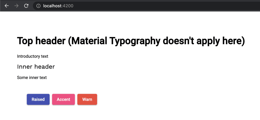
mat-typography class, you can also use individual classes listed in the levels table.Let’s temporarily modify the content of
<body> in index.html:html
<body>
<!-- This header will *not* be styled because it is outside.mat-typography` -->Top header (Material Typography doesn't apply here)
<!-- This paragraph will be styled as `body-1` via the `.mat-body` CSS class applied -->
<p class="mat-body">Introductory text</p>
<div class="mat-typography">
<!-- This header will be styled as `title` because it is inside `.mat-typography` -->
<h2>Inner header</h2>
<!-- This paragraph will be styled as `body-1` because it is inside `.mat-typography` -->
<p>Some inner text</p>
<app-root></app-root>
</div>`
If you look at the output, you will get an idea how typography works:
After modifying typography, below is the content of
src/styles/typography/_config.scss:// src/styles/typography/_config.scss
@use "@angular/material" as mat;
$heading-font-family: "'Work Sans', sans-serif";
$my-app-typography: mat.define-typography-config(
  $display-4: mat.define-typography-level(112px, $font-family: $heading-font-family),
  $display-3: mat.define-typography-level(56px, $font-family: $heading-font-family),
  $display-2: mat.define-typography-level(45px, $font-family: $heading-font-family),
  $display-1: mat.define-typography-level(34px, $font-family: $heading-font-family),
  $headline: mat.define-typography-level(24px, $font-family: $heading-font-family),
  $title: mat.define-typography-level(20px, $font-family: $heading-font-family),
);
`
$my-app-typography: mat.define-typography-config(
$display-4:
mat.define-typography-level(112px, $font-family: $heading-font-family),
$display-3:
mat.define-typography-level(56px, $font-family: $heading-font-family),
$display-2:
mat.define-typography-level(45px, $font-family: $heading-font-family),
$display-1:
mat.define-typography-level(34px, $font-family: $heading-font-family),
$headline:
mat.define-typography-level(24px, $font-family: $heading-font-family),
$title: mat.define-typography-level(20px, $font-family: $heading-font-family),
);
`
And below is the content of
style.scss:// src/styles.scss
@use "@angular/material" as mat;
@use "./styles/themes/light";
@use "./styles/typography/config" as typography;
@use "./styles/typography/config" as typography;
html,
body {
height: 100%;
}
body {
margin: 0;
font-family: Roboto, "Helvetica Neue", sans-serif;
}
`
body {
height: 100%;
}
body {
margin: 0;
font-family: Roboto, "Helvetica Neue", sans-serif;
}
`
Now we will add a dark theme in the application. Create a new file called
dark.scss in the styles/themes folder with the following content:// src/styles/themes/dark.scss
@use "sass:map";
@use "@angular/material" as mat;
@use "@angular/material" as mat;
@use "../typography/config" as typography;
@use "../components";
@use "../components";
$my-app-dark-primary: mat.define-palette(mat.$blue-grey-palette);
$my-app-dark-accent: mat.define-palette(mat.$amber-palette, A200, A100, A400);
$my-app-dark-warn: mat.define-palette(mat.$deep-orange-palette);
$my-app-dark-theme: mat.define-dark-theme(
(
color: (
primary: $my-app-dark-primary,
accent: $my-app-dark-accent,
warn: $my-app-dark-warn,
),
)
);
$my-app-dark-accent: mat.define-palette(mat.$amber-palette, A200, A100, A400);
$my-app-dark-warn: mat.define-palette(mat.$deep-orange-palette);
$my-app-dark-theme: mat.define-dark-theme(
(
color: (
primary: $my-app-dark-primary,
accent: $my-app-dark-accent,
warn: $my-app-dark-warn,
),
)
);
Notice that we are using a class selector
.dark-theme to render a dark theme.While creating
dark-theme, instead of core-theme and button-theme, which we used in the original theme, we are using core-color and button-color. The reason behind that is we only want to change colors in dark-theme and every other style should remain the same. If we use theme mixins, it would generate all the styles again, which are not required.To complete the theme setup for background and font color, we will need to add class
mat-app-background to the <body> tag in index.html:html
<body class="mat-typography mat-app-background">
<app-root></app-root>
</body>
For our application,
dark-theme is an additional theme and can be loaded based on user preferences. So, instead of making it part of the default application, we will lazy load it.Let’s make changes for that in the project’s
angular.json:json
"styles": [
"src/styles.scss",
{
"input": "src/styles/themes/dark.scss",
"bundleName": "dark-theme",
"inject": false
}
],
You can learn more about lazy loading stylesheets at: How to exclude stylesheets from the bundle and lazy load them in Angular?
To load the
dark-theme based on user’s selection, we will simply implement a service called style-manager.service.ts and whenever we want to change theme, we will simply call toggleDarkTheme from this service:// style-manager.service.ts
import { Injectable } from '@angular/core';
@Injectable({ providedIn: 'root' })
export class StyleManager {
isDark = false;
export class StyleManager {
isDark = false;
toggleDarkTheme() {
if (this.isDark) {
this.removeStyle('dark-theme');
document.body.classList.remove('dark-theme');
this.isDark = false;
} else {
const href = 'dark-theme.css';
getLinkElementForKey('dark-theme').setAttribute('href', href);
document.body.classList.add('dark-theme');
this.isDark = true;
}
}
if (this.isDark) {
this.removeStyle('dark-theme');
document.body.classList.remove('dark-theme');
this.isDark = false;
} else {
const href = 'dark-theme.css';
getLinkElementForKey('dark-theme').setAttribute('href', href);
document.body.classList.add('dark-theme');
this.isDark = true;
}
}
removeStyle(key: string) {
const existingLinkElement = getExistingLinkElementByKey(key);
if (existingLinkElement) {
document.head.removeChild(existingLinkElement);
}
}
}
const existingLinkElement = getExistingLinkElementByKey(key);
if (existingLinkElement) {
document.head.removeChild(existingLinkElement);
}
}
}
function getLinkElementForKey(key: string) {
return getExistingLinkElementByKey(key) || createLinkElementWithKey(key);
}
return getExistingLinkElementByKey(key) || createLinkElementWithKey(key);
}
function getExistingLinkElementByKey(key: string) {
return document.head.querySelector(
);
}
return document.head.querySelector(
link[rel="stylesheet"].${getClassNameForKey(key)});
}
function createLinkElementWithKey(key: string) {
const linkEl = document.createElement('link');
linkEl.setAttribute('rel', 'stylesheet');
linkEl.classList.add(getClassNameForKey(key));
document.head.appendChild(linkEl);
return linkEl;
}
const linkEl = document.createElement('link');
linkEl.setAttribute('rel', 'stylesheet');
linkEl.classList.add(getClassNameForKey(key));
document.head.appendChild(linkEl);
return linkEl;
}
function getClassNameForKey(key: string) {
return
}
`
return
style-manager-${key};}
`
Above is a very opinionated approach, you can change it as per your need.
Now, let’s utilize the above service in
app.component.ts:// src/app/app.component.ts
import { Component } from '@angular/core';
import { StyleManager } from './shared/services/style-manager.service';
import { StyleManager } from './shared/services/style-manager.service';
@Component({
selector: 'app-root',
templateUrl: './app.component.html',
styleUrls: ['./app.component.scss'],
})
export class AppComponent {
title = 'my-app';
isDark = this.styleManager.isDark;
selector: 'app-root',
templateUrl: './app.component.html',
styleUrls: ['./app.component.scss'],
})
export class AppComponent {
title = 'my-app';
isDark = this.styleManager.isDark;
constructor(private styleManager: StyleManager) {}
toggleDarkTheme() {
this.styleManager.toggleDarkTheme();
this.isDark = !this.isDark;
}
}
`
this.styleManager.toggleDarkTheme();
this.isDark = !this.isDark;
}
}
`
Next, we will add a button to toggle dark and light themes in
app.component.html:Angular Material Theming System: Complete Guide
`
Let’s look at the output now:

Notice that when we change theme, it changes colors and background colors of buttons and text. And also notice that
dark-theme.css is only included when the user switches to the dark theme.Let’s assume that there is an
alert component with the template below:Success
Success Stroked
Success Flat
Success Raised
check_circle
check_circle
check_circle
Success Stroked
Success Flat
Success Raised
check_circle
check_circle
check_circle
Info
Info Stroked
Info Flat
Info Raised
info
info
info
`
Info Stroked
Info Flat
Info Raised
info
info
info
`
Let’s take a look at output now:

If your current project uses Angular Material older than version 12 and wants to update to version 13, then follow this section, else you can jump to the summary.
For this example, we are going to take code from my series of “Custom Theme for Angular Material Components Series”. The code is available at indepth-theming-material-components.
If you run
ng version inside the project's folder, you will notice that version 10.1 is used. And we want to upgrade it to version 13.We are going to follow guidelines from the Angular Update Guide. Angular CLI does not support migrating across multiple major versions at once. So we will migrate each major version individually.
Open up the terminal in the project's folder and run the commands below. After each command you will have to commit your changes, otherwise Angular CLI will not allow you to proceed further.
While running any of the commands below, if you face any error like
Could not resolve dependency or Conflicting peer dependency, do the following:package.json
npm i
--force
bash

npx @angular/cli@11 update @angular/core@11 @angular/cli@11
bash

npx @angular/cli@11 update @angular/material@11
With this, we have updated the project to version 11. Check once by running
npm start. Now, we will upgrade the project to version 12.bash
npx @angular/cli@12 update @angular/core@12 @angular/cli@12
bash

npx @angular/cli@12 update @angular/material@12
With the above command, you will see many changes, let’s understand what’s changed.
The first major change you will notice is migration from
@import to @use. So in all .scss files, below @importscss
@import "~@angular/material/theming";
is changed to below
@use:scss
@use "~@angular/material" as mat;
The
@use rule loads mixins, functions, and variables from other SASS stylesheets, and combines CSS from multiple stylesheets together. Stylesheets loaded by @use are called "modules".The SASS team discourages the continued use of the
@import rule. SASS will gradually phase it out over the next few years, and eventually remove it from the language entirelyTo adhere to the above-mentioned module system, many APIs are also reworked. And they have been refactored for better developer experience. For example,
mat-get-color-config is changed to mat.get-color-config. mat-color is changed to mat.get-color-from-palette.Now if you try to run the project, it will throw errors. Let’s resolve those errors one by one.
The first error you will see is at line 7 of
sidenav.component.scss-theme.scss:bash
7 │ $config: mat-get-color-config($config-or-theme);
│ ^^^^^^^^^^^^^^^^
To fix that, we will change
mat-get-color-config to mat.get-color-config. And make the same change in dialog.component.scss-theme.scss:scss
$config: mat.get-color-config($config-or-theme);
The next error you will see is at line 28:
bash

28 │         @include _mat-toolbar-color($val);

   │         ^^^^^^^^^^^^^^^^^^^^^^^^^^^^^^^^^
Above error is coming because within Angular Material version 12, components’ color mixins are refactored. And we can’t simply use the mixin any more. So, instead of using
MatToolbar’s color mixin, we will use it’s SASS code. So change above line with below 2 lines in both, sidenav.component.scss-theme.scss and dialog.component.scss-theme.scss files:scss
background-color: mat.get-color-from-palette($val);
color: mat.get-color-from-palette($val, default-contrast);
Now your project should run fine.
As per the latest SASS changes,
map module functions should be used in the new module system. For that, first we will use the SASS:map module using the @use rule:scss
@use "sass:map";
And then, simply change all
map-get to map.get in both, sidenav.component.scss-theme.scss and dialog.component.scss-theme.scss files:scss
$primary: map.get($config, primary);
$accent: map.get($config, accent);
$warn: map.get($config, warn);
$foreground: map.get($config, foreground);
$background: map.get($config, background);
bash

npx @angular/cli@13 update @angular/core@13 @angular/cli@13
bash

npx @angular/cli@13 update @angular/material@13
After the above command, except dependencies, one major change you will notice in all
.scss files is the removal of ~ (tilde) from @use "~@angular/material" as mat;.The reason behind that is SASS-loader has deprecated the usage of
~ and it’s recommended that it’s removed from code.Why remove it?
The loader will first try to resolve
@use as a relative path. If it cannot be resolved, then the loader will try to resolve @use inside node_modules.In this article, we first learned about what Angular Material Theming is and it is based on Google's Material Design specification. And then we understood that with Angular Material version 12,
@import rule migrated to @use and SASS APIs were refactored for better developer experience.We started with a blank project and added Angular Material. Next, we understood the
core mixin, define-palette function, palettes and define-light-theme function and we created a custom theme. And then we applied our custom theme to first all components using all-components-theme and at last we optimized it to use only core-theme and button-theme and reduced final styles size.We also learned how to use a pre-built theme by adding the theme's stylesheet path in the
styles array of angular.json. For example, we can add ./node_modules/@angular/material/prebuilt-themes/indigo-pink.css to use the indigo-pink theme in our application.Then we started with typography. We first understood typography levels and how to create one using
define-typography-level. Next, we learned that Angular Material handles all those levels using typography config, and Angular Material represents this configuration as a SASS map. We created a custom config using define-typography-config and applied it to core mixin so that custom typography is applied to the whole application.Next we created a dark theme in a separate file
themes/dark-theme.scss. Then we used only color mixins, i.e. core-color and button-color, and not theme mixing to avoid duplicate style generation. And at last, we made changes in angular.json so that dark theme is loaded on demand only when needed.Then we followed a step-by-step process to add support for Angular Material’s Theming system to custom components.
And at last, we learned about how to customise Angular Material’s button component, i.e.
MatButton. In this, we mainly followed the approach from its source code and we added two new variants to it: success and info.The project which we created in this article is available on GitHub repo at angular-material-theming-system-complete-guide.
With the new system, we also looked at how to update older Angular Material versions to the latest one by taking examples from one of the old projects.
While writing this article I took references from Angular Material Guides.
70