28
loading...

npx -y sb init --builder webpack5yarn add -D @storybook/addon-postcss// package.json
"resolutions": {
"webpack": "^5"
}yarn// .storybook/main.js
const path = require('path');
module.exports = {
stories: ['../src/**/*.stories.mdx', '../src/**/*.stories.@(js|jsx|ts|tsx)'],
staticDirs: ['../public'],
addons: [
'@storybook/addon-links',
'@storybook/addon-essentials',
{
/**
* NOTE: fix Storybook issue with PostCSS@8
* @see https://github.com/storybookjs/storybook/issues/12668#issuecomment-773958085
*/
name: '@storybook/addon-postcss',
options: {
postcssLoaderOptions: {
implementation: require('postcss'),
},
},
},
],
core: {
builder: 'webpack5',
},
webpackFinal: (config) => {
/**
* Add support for alias-imports
* @see https://github.com/storybookjs/storybook/issues/11989#issuecomment-715524391
*/
config.resolve.alias = {
...config.resolve?.alias,
'@': [path.resolve(__dirname, '../src/'), path.resolve(__dirname, '../')],
};
/**
* Fixes font import with /
* @see https://github.com/storybookjs/storybook/issues/12844#issuecomment-867544160
*/
config.resolve.roots = [
path.resolve(__dirname, '../public'),
'node_modules',
];
return config;
},
};stories and staticDirs if they match up with your folder structure. By specifying staticDirs we can use assets from public folders.// .storybook/preview.js
import '../src/styles/globals.css';
import * as NextImage from 'next/image';
const OriginalNextImage = NextImage.default;
Object.defineProperty(NextImage, 'default', {
configurable: true,
value: (props) => <OriginalNextImage {...props} unoptimized />,
});
export const parameters = {
actions: { argTypesRegex: '^on[A-Z].*' },
controls: {
matchers: {
color: /(background|color)$/i,
date: /Date$/,
},
},
previewTabs: {
'storybook/docs/panel': { index: -1 },
},
};previewTabs config. You can remove it if you want.globals.css and mock NextImage to work with Storybook.yarn storybookto start up the dev server.// src/components/buttons/__stories__/Button.stories.tsx
import { ComponentMeta, ComponentStory } from '@storybook/react';
import * as React from 'react';
import { HiSearch } from 'react-icons/hi';
import Button from '@/components/buttons/Button';
export default {
title: 'Components/Buttons/Button',
component: Button,
argTypes: {
children: {
control: { type: 'text' },
},
},
} as ComponentMeta<typeof Button>;
const Template: ComponentStory<typeof Button> = (args) => <Button {...args} />;
export const Default = Template.bind({});
Default.args = {
children: 'Button',
variants: 'primary',
};
export const WithIcon = Template.bind({});
WithIcon.args = {
children: (
<div className='flex gap-2 items-center'>
<HiSearch />
<span>Search</span>
</div>
),
};type ButtonProps = {
/** Button children element */
children: React.ReactNode;
/** Show loading spinner and disable button */
isLoading?: boolean;
/** Button color variant */
variants?: 'primary' | 'secondary';
/** Disable the button and add not-allowed cursor */
disabled?: boolean;
} & React.ComponentPropsWithoutRef<'button'>;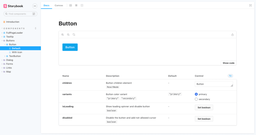
curl -s https://raw.githubusercontent.com/theodorusclarence/expansion-pack/main/storybook/trigger.sh | bash -sOriginally posted on my personal site, find more blog posts and code snippets library I put up for easy access on my site 🚀
28