19
loading...

npm i @react-pdf/rendererimport {
Document,
Page,
Text,
View,
StyleSheet,
PDFViewer,
} from "@react-pdf/renderer";
// Create styles
const styles = StyleSheet.create({
page: {
backgroundColor: "#d11fb6",
color: "white",
},
section: {
margin: 10,
padding: 10,
},
viewer: {
width: window.innerWidth, //the pdf viewer will take up all of the width and height
height: window.innerHeight,
},
});
// Create Document Component
function BasicDocument() {
return (
<PDFViewer style={styles.viewer}>
{/* Start of the document*/}
<Document>
{/*render a single page*/}
<Page size="A4" style={styles.page}>
<View style={styles.section}>
<Text>Hello</Text>
</View>
<View style={styles.section}>
<Text>World</Text>
</View>
</Page>
</Document>
</PDFViewer>
);
}
export default BasicDocument;StyleSheet module allows developers to apply CSS code on their PDF documents. Here, we are telling React to change the background color and the font color of our pagesviewer object, we are using the width and height properties. As a result, this will tell react-pdf that we want the browser’s PDF viewer to take up all of the space on the pagePDFViewer component will render a PDF viewer on the browserBasicDocument component to the DOM like so:import BasicDocument from "./BasicDocument";
function App() {
return (
<div className="App">
<BasicDocument />
</div>
);
}
export default App;
const styles = StyleSheet.create({
  viewer: {
    width: window.innerWidth / 3,
    height: window.innerHeight / 2,
  },
  //further code...
});width and height properties. This will decrease their available size on the page.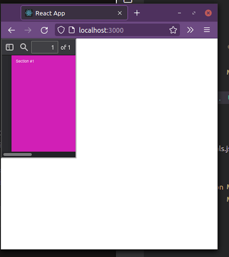
L component. This is handy for cases where you want to redirect the user to a website:import { Link } from "@react-pdf/renderer";
<Text>
<Link src="www.facebook.com">Go to Facebook</Link>
</Text>src prop to Facebook’s website. When the user clicks on this piece of text, the app will redirect them to the page.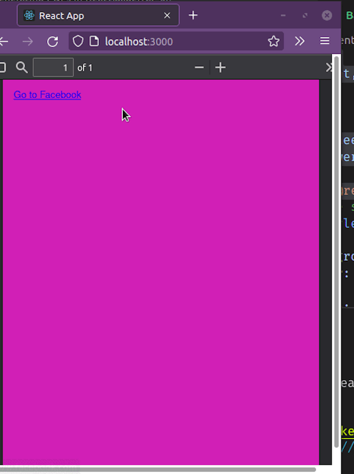
Note component. One critical use case for this element is when you need to display comments in a file:import { Note } from "@react-pdf/renderer";
<Note>This will take the user to Facebook</Note>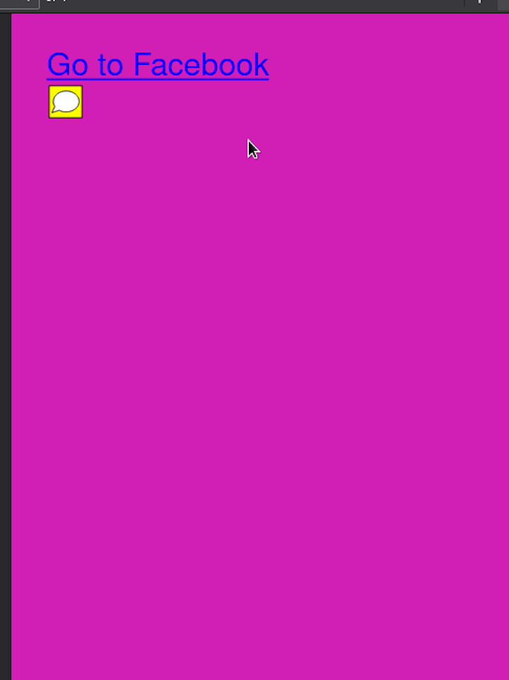
Canvas component lets users draw content on the page. This is suitable for displaying simple diagrams and logos in SVG format.import { Canvas } from "@react-pdf/renderer";
// Create styles
const styles = StyleSheet.create({
canvas: {
backgroundColor: "black",
height: 500,
width: 500,
},
});
<Canvas
style={styles.canvas}
paint={
(painterObject) =>
painterObject
.save()
.moveTo(100, 100) //move to position 100,100
.lineTo(300, 100) //draw a line till 300, 100
.lineTo(300, 300) //draw another line till 300,300
.fill("red") //when the diagram is drawn, set the background color to pink
}
/>Canvas component to display a diagram. The paint prop is a callback function. One of its parameters is a painterObject argument, which gives us access to drawing methods.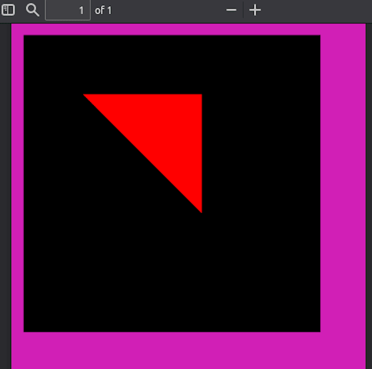
SVG component to render SVG diagrams. Just like Canvas, we can use this for rendering simple diagrams.import { Line, Svg } from "@react-pdf/renderer";
// Create styles
const styles = StyleSheet.create({
line: {
x1: "0", //starting coords are x1 and y1
y1: "0",
x2: "200", //ending coords:
y2: "200",
strokeWidth: 2,
stroke: "rgb(255,255,255)", //stroke color
},
});
<Svg width={"50%"} height={"50%"} style={{ backgroundColor: "blue" }}>
<Line style={styles.line} />
</Svg>Line to render a line in the document. Notice that Line is a child of the Svg component.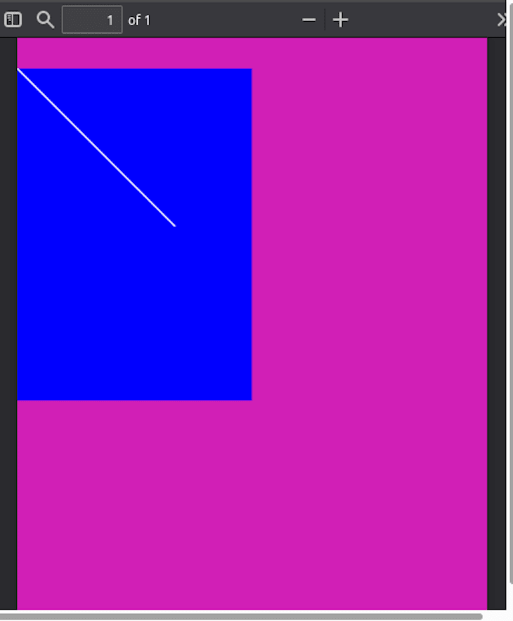
Polygon component to render closed shapes like so:<Svg width={"50%"} height={"50%"} style={{ backgroundColor: "blue" }}>
<Polygon
points="100,100 200,100 200,250 100,250"
fill="white" //color of background
stroke="black" //color of border
strokeWidth={10} //border thickness
/>
</Svg>points prop accepts a dataset of coordinates. This will help the app render the graphic.
Image component gives us the ability to insert images over the network or on a local disk. This is great for displaying complex diagrams or screenshots.import { Image } from "@react-pdf/renderer";
const styles = StyleSheet.create({
image: {
width: 500,
height: 500,
},
});
<Image
style={styles.image}
src="https://image.shutterstock.com/image-photo/tiny-floating-house-on-lake-600w-1980476267.jpg"
/>src prop contains the source URL of the image that we want to render.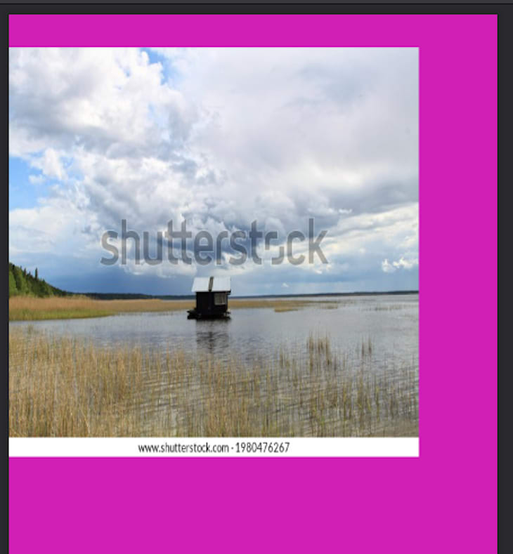
flex property, which allows for responsive design. This is handy for cases where you want your documents to scale up or down depending on the device’s screen size:// Create styles. Notice that we have specified a flex direction.
const styles = StyleSheet.create({
page: {
flexDirection: "column",
},
});
<Page size="A4" style={styles.page}>
<View style={{ backgroundColor: "black", flex: 1 }}></View>
<View style={(styles.section, { backgroundColor: "pink", flex: 1 })}></View>
</Page>flex property on both of our View components. This means that half the page will have a background color of black and the other half will have a pink colored background.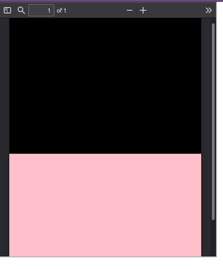
break prop like so:// Create styles
const styles = StyleSheet.create({
text: {
fontSize: 40,
},
});
// Create Document Component
<Page>
<Text break style={styles.text}>
First PDF break
</Text>
<Text break style={styles.text}>
Second break
</Text>
</Page>
render prop of the Text component like so:<Document>
<Page size="A4">
<Text
style={styles.text}
render={({ pageNumber, totalPages }) =>
`Page ${pageNumber} of ${totalPages}`
}
fixed
/>
</Page>
<Page>
<Text> Hello, second page!</Text>
</Page>
</Document>render prop has two arguments: pageNumber (the current index of the page), and totalPages (the total number of pages that this document contains). We are displaying both of their values to the client.
render function is executed twice for <Text /> elements: once for layout on the page wrapping process, and another one after it knows how many pages the document will have. Therefore, use it in cases where app performance is not a problem.render prop on our View element:<View render={({ pageNumber }) => (
//detect if user is NOT on an even page:
pageNumber % 2 === 0 && (
<View style={{ background: 'red' }}>
{/*If condition is fulfilled, display this component*/}
<Text>I'm only visible in odd pages!</Text>
</View>
)
)} />
19