
46
Build a Vacation Rental Site with Amplify Studio
One of the most exciting projects I've worked on in my career, AWS Amplify Studio, just launched at Re:Invent in public preview. With Amplify Studio you can quickly go from a designer’s vision to a full stack, cloud connected app that scales with your needs. You can create components in Figma, import them into Amplify Studio, and then connect them to your AWS-backed data models. Then, Studio can export your UI components to human-readable React code that you can extend yourself. Let's go step by step through how you would build an app with Amplify Studio.
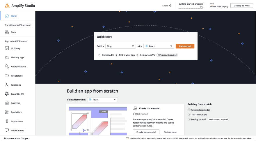
Head to the Amplify Sandbox. Once there, change the dropdown after Build a to "Blank", then click Get Started.
On the Data Modeling page, add a "Rental" model with the fields "name", "image", "price" (an integer), and "location".

Then click the "Deploy to AWS" button on the upper right of the page.
If you're new to Amplify's data modeling, you can check out this tutorial to learn more!
On the deployment page, choose whether or not you have an AWS account (create one if you don't have one yet!) and then choose an app name and deployment region.
Once your app finishes deploying, click the Launch Studio button.

Now, head to the
content tab on the left side. This gives you an admin panel where you can perform full CRUD actions for your models -- create a few rental properties! Click Create rental then use the form to create new entries.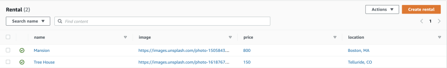
If you go back to the home page for studio, you'll see an option on the Amplify Studio home page to "Accelerate UI development" - click the Build UI button underneath. On the UI Library home page, there will be a Get started button that once clicked asks you for a link to your Figma file.

Amplify launched a UI Kit on Figma. You can duplicate this file and then make any modifications that you want and create your own components! Do this in the
components Figma page.
I'll modify the appearance of
CardA to round the corners, bold some text, and remove the background color.
This UI kit correlates with the Amplify UI Components, which Studio will be using under the hood when it generates your Figma components to React.
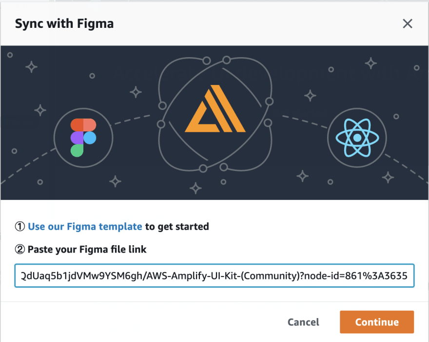
Speaking of, let's import our Figma components into Studio. Copy your Figma file's URL and paste it into Studio. Then click "Continue". Your components will be loaded into Studio.
From there, you can accept or reject your components, and you can view their variants. I'll go ahead and "Accept all".
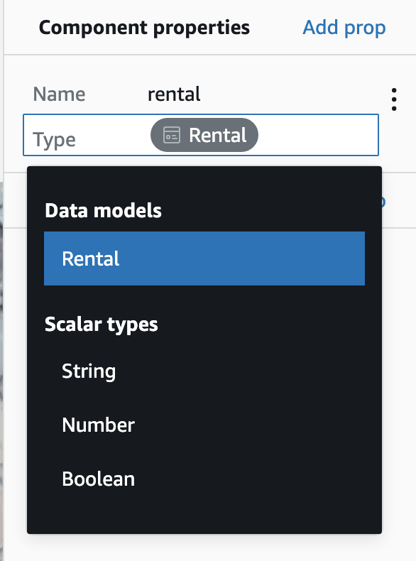
Now, I've created a data model and UI components. I now need to link my data to the UI. I'll choose my
CardA component and then click Configure.
Then, create a prop using the component properties form. Choose a name and then use the dropdown to find the model you created! This will pass the data from that model to the component.
From there, select the elements you would like to populate with your data and choose the attribute you'd like to use. I'll click the "image" which right now is a placeholder, then I'll set the
src prop to rental.image.
For the spot that currently says "Classic Long Sleeve T-Shirt", set the label to
rental.name. Finally, for the price, I'll set what currently says $99 to the price from my data model. I'll also concatenate that with a "$" and "/night".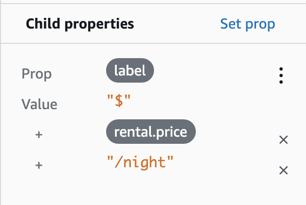
Now, my component renders my live data!

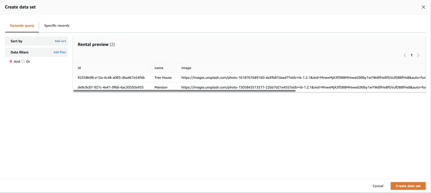
I want to display all my rentals, instead of just one. So, I'll create a collection from my component. Click "Create Collection" on the right side of the page. Then choose a name for your collection, I'll go with
RentalCollection. Once on the collection page, you can choose whether your cards render in a grid or list, the number of columns, padding between, and the direction of the collection.I'll create a grid, then switch to four columns and add 4px in between each one.

You can also modify the data set that goes into the collection. You can sort the items, or add a filter by clicking "View/Edit" next to "Data set".
If you're new to React, check out this tutorial before continuing!
Now we have components created with data bound to them, let's use those components in an app! I'll create a React app:
$ npx create-react-app amplify-studio-tutorial
$ cd amplify-studio-tutorial
Then, I'll install the Amplify JavaScript libraries and React components.
$ npm i aws-amplify @aws-amplify/ui-reactThen, I'll run the Amplify pull command to run code generation in my app. You can find the
amplify pull command specific to your app by clicking "local setup instructions" in Studio.
Run this command in your React app, and you'll see quite a few files generated including
/src/ui-components -- this contains all of your React components! You can open them up and see what's inside.Now, let's set our app up. First, in your
index.js file, configure amplify by pasting in these three lines of code:import config from './aws-exports'
import Amplify from 'aws-amplify'
Amplify.configure(config)These will tie your frontend to your Amplify-created backend.
Now, head to your App.js, and clear out the existing
return ().Import the
AmplifyProvider component, and the Amplify CSS file:import { AmplifyProvider } from '@aws-amplify/ui-react'
import '@aws-amplify/ui-react/styles.css'Then, add the
AmplifyProvider at the top level of your return. This will provide styling to all of its child components.function App () {
return (
<AmplifyProvider>
</AmplifyProvider>
)
}
export default AppNow, let's render our
RentalCollection! First, import it:import { RentalCollection } from './ui-components'Then, add it to the render:
function App () {
return (
<AmplifyProvider>
+ <RentalCollection />
</AmplifyProvider>
)
}
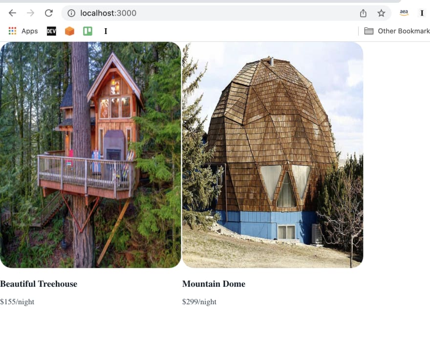
export default AppIf you run your React server and check out your page, you'll have your rentals collection!
Amplify doesn't load a font in for you automatically, so you'll probably want to add your own. For example, you could add
Inter to your App.css file:@import url('https://fonts.googleapis.com/css2?family=Inter:slnt,[email protected],100..900&display=swap');You can customize these React components in your own code. First, you can use props in order to modify your components. If you wanted to make your grid of rentals into a list, for example, you could pass the prop
type="list" to your RentalCollection.<RentalCollection type="list" />You can find a list of all props in the Amplify UI docs.
Sometimes, you'll want to modify child components instead of the top level one. You can use overrides in order to do so!
Right now, the images are kind of wonky due to my styling in Figma. Let's change the object-fit to cover for the image via overrides to fix that.
Open up the code for the
RentalCollection component. Inside each of its child components, you'll notice a line of code like this: {...getOverrideProps(overrides, "Collection.CardA[0]")}. The second value is a key you can use to specify which component you want to add an override to.In this case we'll add the following to our
RentalCollection instance:<RentalCollection
type='list' overrides={{
'Collection.CardA[0]': {
}
}}
/>This will add overrides to the CardA component. In this case, though, we want to override the
Image component inside of CardA. Open up the code for that component, and you'll see similar overrides for each of its child components.We'll pass a second override object to the CardA override. Then we'll set the key to the override key for our Image. Then we'll set the objectFit prop to
cover.<RentalCollection
type='list' overrides={{
'Collection.CardA[0]': {
overrides: {
'Flex.Image[0]': { objectFit: 'cover' }
}
}
}}
/>You can use this to add almost any customization you need to your components!
Note that if you re-run
amplify pull your components will regenerate. Because of this, you won't want to modify the components in the ui-components directory directly. If you decided you wanted to modify the code in a component file, you could drag it out of that directory and it would no longer get overwritten by amplify pull!You may want to add a theme to your UI components so that they match your brand. You can do this via a JavaScript object, CSS variables, or through the Amplify Theme Editor Figma Plugin.
Install the plugin, then choose it from the Figma plugin dropdown.

You'll be prompted to enter your app's Amplify Studio URL, and then to sign into your app. In order to get your sign in, you can create a user within the AWS Amplify Console for your app.
Note: make sure to reset your new user's password before using it to log into the Figma Plugin!
You can then change any of the colors for your app, change your brand colors, and any of the components' colors. You can apply them to the Figma file and to your Studio app. Once you sync with Studio, the next time you run
amplify pull, you'll have a theme object that you can pass as a prop to AmplifyProvider which will apply your theme to your app!If at any point you want to update a component, you can do so within Figma and then click "Sync with Figma" in Studio. Then, you'll be able to observe your changes compared to what you have now, and either accept or reject your changes.
You can use the whole Amplify ecosystem with an app that you create with Amplify Studio. You can add frontend hosting, additional backend resources like authentication, storage, and serverless functions, and then extend your project outside of what Amplify natively offers with CDK.
I can't wait for you to build your own app with Amplify Studio out. If you have any feedback, please leave a GitHub issue or join our Discord Community!
46