
37
How to Create a Dark Mode Component in React
All code from this tutorial is available in this repository, and a video version of this tutorial is available below.
Providing users with a dark mode for your web application has become an expectation, and there are many ways to accomplish it. Typically this is most efficiently done by taking advantage of the power of CSS variables.
In this tutorial we are going to show how to bundle the entire dark mode feature into a single
<DarkMode /> component that you can take with you and place inside any application. This component will not only persist your choice of settings through a page close or refresh, it will also respect the user's
prefers-color-scheme setting in their browser. Pretty cool!So let's dive into it.
Before we start we'll begin by taking a look a demo of the final product, so you know what to expect from this tutorial. Once you have completed it, you will have your own
<DarkMode /> component that you can drop into any application to achieve this functionality.I'll presume that you have a basic familiarity with React.
You do not need to be an expert. In fact we don't have a single stateful variable, or any hooks or lifecycle methods. The goal here (as it should always be) is to minimize complexity. We don't need them for this feature.
We will be using Create React App for this tutorial as it is an extremely easy way to quickly and easy establish a React application template that you can build on.
If you choose not to use CRA you should still be able to follow along with this tutorial. We will be writing pure CSS, but in order to copy the examples exactly you would need to have webpack setup with a CSS loader to support the
import syntax for CSS files. If you are not using
webpack you can simply use a <link> element for your CSS files in your index.html rather than importing them.We will also be using Typescript as is the default for every web project I built these days. If you are not super familiar with Typescript you should still be able to follow along, thee amount of explicit typing in these examples is minimal.
Lastly, I have included a section on adding tests for your component using React Testing Library. This section is optional.
If you are using CRA then run the following command (if you have your own existing project then disregard)
npx create-react-app dark-mode-example --template typescriptWhen the application loads it will determine the dark/light setting in the following order of priority:
We'll begin by creating the CSS that handles dark mode.
src/DarkMode.css/* 1 */
:root {
--font-color: #333;
--background-color: #eee;
--link-color: cornflowerblue;
}
/* 2 */
[data-theme="dark"] {
--font-color: #eee;
--background-color: #333;
--link-color: lightblue;
}
/* 3 */
body {
background-color: var(--background-color);
color: var(--font-color);
}
a {
color: var(--link-color);
}The :root selector matches the root element representing the DOM tree. Anything you place here will be available anywhere in the application. This is where will will create the CSS variables that hold the colours for our light theme.
Here we set the colours for our dark theme. Using the attribute selector we target any element with a data-theme="dark" attribute on it. This is a custom attribute that we will be placing ourselves on the <html> element.
We set the background colour and text color of our application. This will always be the value of the --background-color and --font-color variables. The value of those variables will change depending on when the data-theme="dark" attribute is set due to the cascade. The dark values are set after the root values so if the selector applies the initial (light) value of those variables will be overwritten with the dark values.
Notice I have also added a custom link colour here which changes based on the value of the theme. You can add as many custom colours as you want here and have them all be controlled by your light/dark toggle. Try adding some more yourself!
Next we will create a custom checkbox input to look like a toggle switch based on this example.
I won't comment on how this CSS works as it's not in the scope of this tutorial and not relevant to dark/light mode. The styles below are simply to override the look of the default HTML checkbox.
Add them below the above code in
src/DarkMode.csssrc/DarkMode.css/* Custom Dark Mode Toggle Element */
.toggle-theme-wrapper {
display: flex;
flex-direction: row;
align-items: center;
gap: 4px;
}
.toggle-theme-wrapper span {
font-size: 28px;
}
.toggle-theme {
position: relative;
display: inline-block;
height: 34px;
width: 60px;
}
.toggle-theme input {
display: none;
}
.slider {
background-color: #ccc;
position: absolute;
cursor: pointer;
bottom: 0;
left: 0;
right: 0;
top: 0;
transition: 0.2s;
}
.slider:before {
background-color: #fff;
bottom: 4px;
content: "";
height: 26px;
left: 4px;
position: absolute;
transition: 0.4s;
width: 26px;
}
input:checked + .slider:before {
transform: translateX(26px);
}
input:checked + .slider {
background-color: cornflowerblue;
}
.slider.round {
border-radius: 34px;
}
.slider.round:before {
border-radius: 50%;
}Now we will create our
DarkMode component. To start we are just going to focus on the structure of the component itself, no events or functions:
src/DarkMode.tsximport "./DarkMode.css";
const DarkMode = () => {
return (
<div className="toggle-theme-wrapper">
<span>☀️</span>
<label className="toggle-theme" htmlFor="checkbox">
<input
type="checkbox"
id="checkbox"
/>
<div className="slider round"></div>
</label>
<span>🌒</span>
</div>
);
};
export default DarkMode;The
<input> element will be handling the state of our colour theme. When it is checked then dark mode is active, when it is not checked then light mode is active. If you render this component you should have a nice looking custom toggle button without any functionality.
To make our toggle switch work, we have to attack some Javascript functions to the
onChange event of the input that fires when the checkbox is toggled. We also need to decide which mode we are going to show by default when the page or application is first loaded. There is a lot to unpack here; there will be explanations for what is happening with the numbered comments below the example.
src/DarkMode.tsximport "./DarkMode.css";
import { ChangeEventHandler } from "react";
// 1
const setDark = () => {
// 2
localStorage.setItem("theme", "dark");
// 3
document.documentElement.setAttribute("data-theme", "dark");
};
const setLight = () => {
localStorage.setItem("theme", "light");
document.documentElement.setAttribute("data-theme", "light");
};
// 4
const storedTheme = localStorage.getItem("theme");
const prefersDark =
window.matchMedia &&
window.matchMedia("(prefers-color-scheme: dark)").matches;
const defaultDark =
storedTheme === "dark" || (storedTheme === null && prefersDark);
if (defaultDark) {
setDark();
}
// 5
const toggleTheme: ChangeEventHandler<HTMLInputElement> = (e) => {
if (e.target.checked) {
setDark();
} else {
setLight();
}
};
const DarkMode = () => {
return (
<div className="toggle-theme-wrapper">
<span>☀️</span>
<label className="toggle-theme" htmlFor="checkbox">
<input
type="checkbox"
id="checkbox"
// 6
onChange={toggleTheme}
defaultChecked={defaultDark}
/>
<div className="slider round"></div>
</label>
<span>🌒</span>
</div>
);
};
export default DarkMode;We create functions called setDark and setLight which do exactly what the names describe. We want these to be as simple as possible. When we invoke them we expect the app to switch to either light or dark mode.
This is how we handle persistance. Using localStorage will allow us to save a value and have it persist even after the user closes the app or reloads the page. Every time light or dark mode is set, we save that value in the theme property of localStorage.
This is where we set the data-theme="dark" (or light) value on the <html> DOM element. This is what actually updates the colours in our app. When that attribute is added then the [data-theme="dark"] selector from our CSS becomes active and the dark colour variables are set (and vice versa).
The section under comment 4 is where the "initial" state is established when the page is loaded before the actual toggle switch has been used. storedTheme gets the value from localStorage if it exists. prefersDark checks a media query for the user's browser settings for prefers-color-scheme. Lastly defaultDark is meant to check both of those and decide whether to default to dark mode based on the 3 rules of priority we established at the beginning of this tutorial. If it evaluates to true, we set the app to dark mode before the component even renders. (Note the reason we can do this is we are targeting the <html> attribute which will already exist.)
This is the event handler function we have written to capture the change event that occurs when a user clicks the checkbox. If the box is checked we enable dark mode, otherwise light mode.
We place the event handler we just created onto the onChange attribute so it fires every time the checkbox changes. We also use the defaultDark boolean value we established to determine if the checkbox is enabled by default.
Before we add this component to our app we can write a few tests to ensure it works as we expect it to.
Create React App comes prepackaged with React Testing Library. It will automatically pick up any
.test.tsx files you create. src/DarkMode.test.tsximport React from "react";
import { render, screen, fireEvent } from "@testing-library/react";
import DarkMode from "./DarkMode";
// 1
test("renders dark mode component", () => {
render(<DarkMode />);
// 2
const inputElement = screen.getByRole("checkbox") as HTMLInputElement;
expect(inputElement).toBeInTheDocument();
});
// 3
test("toggles dark mode", () => {
render(<DarkMode />);
const inputElement = screen.getByRole("checkbox") as HTMLInputElement;
// 4
expect(inputElement.checked).toEqual(false);
fireEvent.click(inputElement);
expect(inputElement.checked).toEqual(true);
// 5
expect(document.documentElement.getAttribute("data-theme")).toBe("dark");
});A simple test to ensure the component renders.
The input has a role of checkbox so we would expect to be able to find the element by that role.
A test to ensure that the component actually activates dark mode when the checkbox is toggled
Use testing library's fireEvent function we can simulate a click on our input. We assert before clicking that it should not be checked, then after clicking it should be checked.
This component by design does have side effects and that's what this final assertion is aiming to detect. Although the component is only a small container for an input, it is designed to apply the data-theme attribute to the root <html> element. That element can be accessed directly with the Javascript variable document.documentElement. We check here that the dark value is applied to the attribute after the element is clicked.
If using the default CRA setup (or you have custom configured it to do so) we can run our tests with:
npm run testAnd get our results:

Below I have simply imported and added
<DarkMode /> to the default App template created when you run Create React App.src/App.tsximport React from "react";
import logo from "./logo.svg";
import "./App.css";
import DarkMode from "./DarkMode";
function App() {
return (
<div className="App">
<header className="App-header">
<DarkMode />
<img src={logo} className="App-logo" alt="logo" />
<p>
Edit <code>src/App.tsx</code> and save to reload.
</p>
<a
className="App-link"
href="https://reactjs.org"
target="_blank"
rel="noopener noreferrer"
>
Learn React
</a>
</header>
</div>
);
}
export default App;Lastly, we need to update the default CSS included with the CRA setup, otherwise some of the color/background-color values will overwrite our theme variables.
The below example is the default version of
App.css with the color values commented out. You can delete them entirely if you like.src/App.css.App {
text-align: center;
}
.App-logo {
height: 40vmin;
pointer-events: none;
}
@media (prefers-reduced-motion: no-preference) {
.App-logo {
animation: App-logo-spin infinite 20s linear;
}
}
.App-header {
/* background-color: #282c34; */
min-height: 100vh;
display: flex;
flex-direction: column;
align-items: center;
justify-content: center;
font-size: calc(10px + 2vmin);
/* color: white; */
}
.App-link {
/* color: #61dafb; */
}
@keyframes App-logo-spin {
from {
transform: rotate(0deg);
}
to {
transform: rotate(360deg);
}
}If you followed along with everything you'll be treated to a very function app with your own custom
<DarkMode /> component.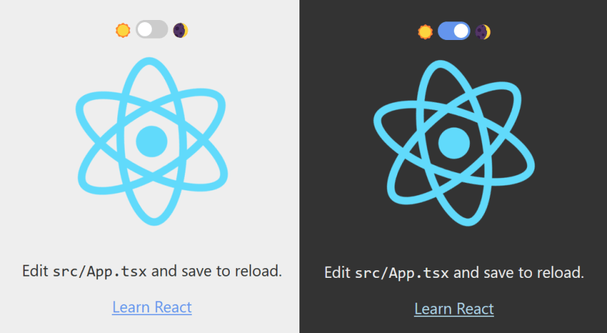
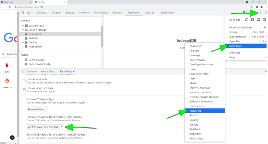
We mentioned that this app supports the user's browser configuration for preferred colour scheme, but we didn't actually explain how you can set that value.
Unfortunately browsers do not make it easy, but it can be achieved with the following steps in either Chrome or Firefox:
about:config into your navigation barui.systemUsesDarkTheme and set it as a Number
dark or 0 for light
... icon at the upper right of the toolsChrome is a bit trickier so here is a screenshot showing where to find it:
I hope you enjoyed this tutorial and learned something from it! You might have picked up on the fact that although this was written from a React perspective, nearly all the code we are working with would work just as well independently of React.
Try it yourself the next time you are working with vanilla HTML/CSS, or even a different framework! You'll find that this code can be reused anywhere with very few modifications needed.
Please check some of my other learning tutorials. Feel free to leave a comment or question and share with others if you find any of them helpful:
For more tutorials like this, follow me @eagleson_alex on Twitter
37