
32
React-Calendar with Custom Styles
I was looking for a calendar to use in a React project and found the React-Calendar component. It has all the functionality that I was looking for and saves me a lot of time from building it out on my own. It can be controlled with state so that the selected date(s) can affect what displays in the app. I wanted to customize its styling to fit my project, so here's what I came up with!
The examples here are based on the following components:
I will be using the styled-components package to add styles to my project, but this could all be done in a CSS file if that's your preferred method. Here's my starter code:
import Calendar from 'react-calendar';
import styled from 'styled-components';

function App() {
  return (
    <CalendarContainer>
      <Calendar calendarType='US' />
    </CalendarContainer>
  );
}

export default App;

const CalendarContainer = styled.div`
  /* ~~~ container styles ~~~ */
  max-width: 600px;
  margin: auto;
  margin-top: 20px;
  background-color: #d4f7d4;
  padding: 10px;
  border-radius: 3px;
`;
I have some styles started for the
<div> that holds the calendar just so the calendar is not floating in the void.Note: I also applied the calendarType property to the calendar that sets the first day of the week to Sunday. This is how I'm used to seeing calendars, but by leaving this property off the week should start with Monday.
Here's what it looks like before any styling has been applied to the
<Calendar /> component: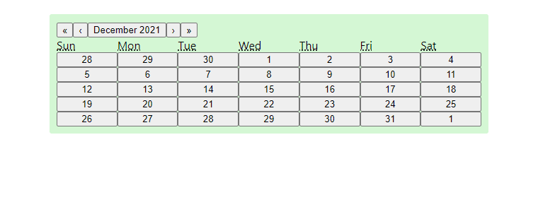
You can see that this component is built with a lot of button components. Before we go through applying our own styles, let's look at a stylesheet the component is packaged with.
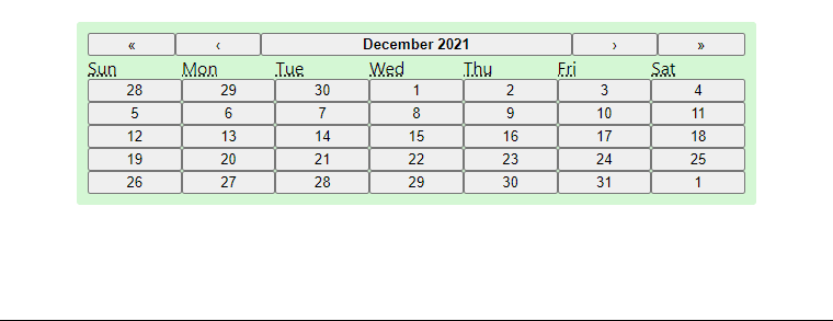
The react-calendar component has the option to import a default stylesheet. It can be imported by adding this line to the top of your file:
import 'react-calendar/dist/Calendar.css';Here's what the calendar looks like with these styles:

Looks much better! However I want to really make it my own for and have control over how it looks. This way I can make sure its appearance is consistent with the rest of my app. Luckily we can add our own styles!
Since we can nest selectors with styled-components (similar to SCSS), we can add all of our custom styles into the
CalendarContainer styled component. React-Calendar creates elements with certain classes already applied, so we can use those as our selectors. Let's start by updating the navigation. Here's what I want to do:
Here's how we can do that:
const CalendarContainer = styled.div`
  /* ~~~ container styles ~~~ */
  /* ... */

  /* ~~~ navigation styles ~~~ */
  .react-calendar__navigation {
    display: flex;

    .react-calendar__navigation__label {
      font-weight: bold;
    }

    .react-calendar__navigation__arrow {
      flex-grow: 0.333;
    }
  }
`;
Next I want to center the labels for the days of the week:
const CalendarContainer = styled.div`
  /* ~~~ container styles ~~~ */
  /* ~~~ navigation styles ~~~ */
  /* ... */

  /* ~~~ label styles ~~~ */
  .react-calendar__month-view__weekdays {
    text-align: center;
  }
`;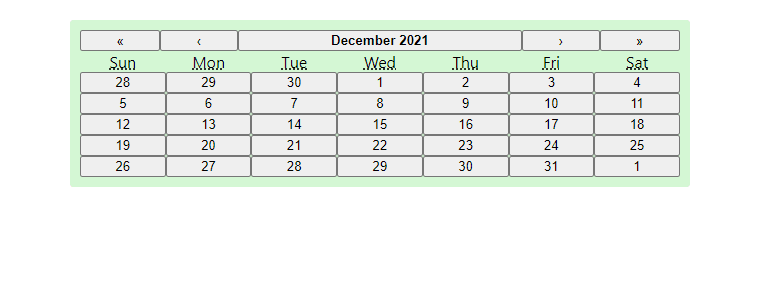
The layout is looking good, but we still need to apply some styles to the buttons:
const CalendarContainer = styled.div`
  /* ~~~ container styles ~~~ */
  /* ~~~ navigation styles ~~~ */
  /* ~~~ label styles ~~~ */
  /* ... */

  /* ~~~ button styles ~~~ */
  button {
    margin: 3px;
    background-color: #6f876f;
    border: 0;
    border-radius: 3px;
    color: white;
    padding: 5px 0;

    &:hover {
      background-color: #556b55;
    }

    &:active {
      background-color: #a5c1a5;
    }
  }
`;
The buttons look a little better, but now the layout is all messed up! There are only six days in a row now. Let's fix that!
So by default the views have the style
display: flex; applied, which unfortunately leads to items spilling over to other rows instead of ensuring that there are always 7 days in a week. Luckily we can overwrite this behavior by using grid:const CalendarContainer = styled.div`
/* ~~~ container styles ~~~ */
/* ~~~ navigation styles ~~~ */
/* ~~~ label styles ~~~ */
/* ~~~ button styles ~~~ */
/* ... */
/* ~~~ day grid styles ~~~ */
.react-calendar__month-view__days {
display: grid !important;
grid-template-columns: 14.2% 14.2% 14.2% 14.2% 14.2% 14.2% 14.2%;
.react-calendar__tile {
max-width: initial !important;
}
}
`;
Awesome, by creating a grid with seven columns (each at 14.2%), we're back to seven days a week!
Note that some elements that react-calendar creates have styles applied directly to the element. To overwrite these, we need the !important rule so our class selectors can take precedence.
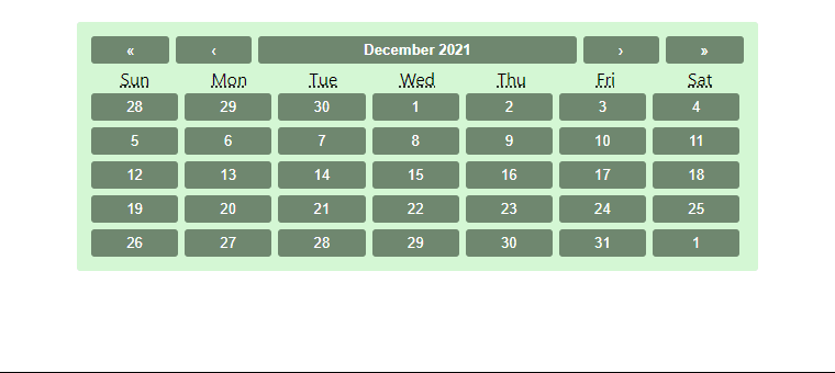
The days of neighboring months look identical to the days of the active month right now, but we can change that as well. We can also change styles of days on the weekend.
const CalendarContainer = styled.div`
  /* ~~~ container styles ~~~ */
  /* ~~~ navigation styles ~~~ */
  /* ~~~ label styles ~~~ */
  /* ~~~ button styles ~~~ */
  /* ~~~ day grid styles ~~~ */
  /* ... */

  /* ~~~ neighboring month & weekend styles ~~~ */
  .react-calendar__month-view__days__day--neighboringMonth {
    opacity: 0.7;
  }
  .react-calendar__month-view__days__day--weekend {
    color: #dfdfdf;
  }
`;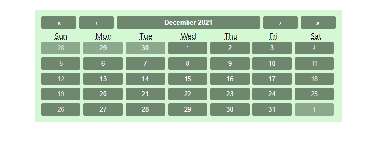
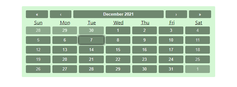
With React-Calendar, when the user clicks on a day it is set as the active day. However there's no way for the user to tell which day is currently selected yet, so let's address that now:
const CalendarContainer = styled.div`
  /* ~~~ container styles ~~~ */
  /* ~~~ navigation styles ~~~ */
  /* ~~~ label styles ~~~ */
  /* ~~~ button styles ~~~ */
  /* ~~~ day grid styles ~~~ */
  /* ~~~ neighboring month & weekend styles ~~~ */
  /* ... */

  /* ~~~ active day styles ~~~ */
  .react-calendar__tile--range {
      box-shadow: 0 0 6px 2px black;
  }
`;
Our month view is looking good, but what about the other views? Let's take a look at the year view:
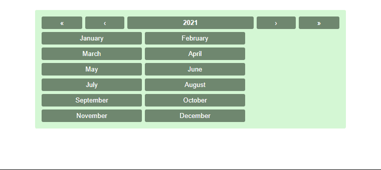
So the year view could use some improvement. Since we added our own styles to the buttons, some buttons are being pushed to the next row. Similar issues occur in the decade and century views too. Luckily we can fix this like we did before by using
grid. We'll show the list of months in a grid of 3 columns by 4 rows. The 10 buttons in the decade and century views will be in a grid of 5 columns by 2 rows.const CalendarContainer = styled.div`
/* ~~~ container styles ~~~ */
/* ~~~ navigation styles ~~~ */
/* ~~~ label styles ~~~ */
/* ~~~ button styles ~~~ */
/* ~~~ day grid styles ~~~ */
/* ~~~ neighboring month & weekend styles ~~~ */
/* ~~~ active day styles ~~~ */
/* ... */
/* ~~~ other view styles ~~~ */
.react-calendar__year-view__months,
.react-calendar__decade-view__years,
.react-calendar__century-view__decades {
display: grid !important;
grid-template-columns: 20% 20% 20% 20% 20%;
&.react-calendar__year-view__months {
grid-template-columns: 33.3% 33.3% 33.3%;
}
.react-calendar__tile {
max-width: initial !important;
}
}
`;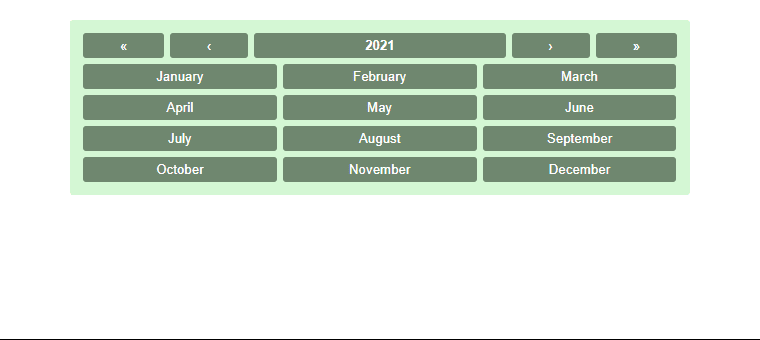
And there we go! A React-Calendar component styled with the help of styled-components.
It's really easy to change the styling of the React-Calendar component, you just need to know which class selectors to use. The styles I've put together here are just one way to go about it. Once all the selectors and styles are in place, it's much easier to play around and determine what suits your project.
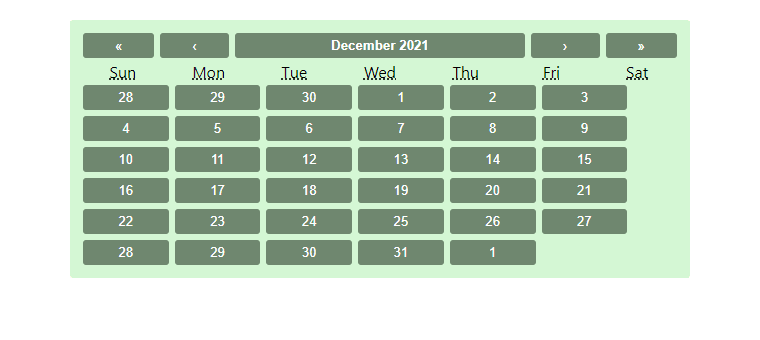
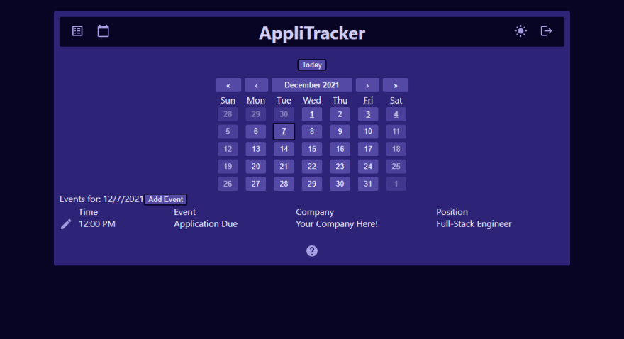
I also have very similar styles applied to this component in an app I am currently building out, you can check that out here as well if you're interested. The app is still being developed and you'll need to sign up to see the calendar, so here's a screenshot of what it currently looks like:
Thanks for reading!
32