
31
How to Implement a Like Button in React
After reading this article, you’ll understand how to implement and add eye-catching interactions to buttons in your React application. 🤘
We’ll implement the like button from scratch. And we’re not gonna rely on help from any external packages. We’ll also add plenty of awesome micro-interactions which will take our simple button to another level. 🚀
All the code is available on Github.
So without any further ado, let’s get started! 👨💻
The first part we need to implement is the React component itself. It‘s going to be just a simple button that contains one SVG and the text. Additionally, we also want to keep track of the
liked state.import React, { useState } from "react";
import cn from "classnames";
import { ReactComponent as Hand } from "./hand.svg";
import "./styles.scss";
const LikeButton = () => {
const [liked, setLiked] = useState(null);
return (
<button
onClick={() => setLiked(!liked)}
onAnimationEnd={() => setClicked(false)}
className={cn("like-button-wrapper", {
liked,
})}
>
<div className="like-button">
<Hand />
<span>Like</span>
</div>
</button>
);
};
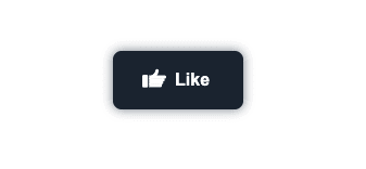
export default LikeButton;I know, it’s not much. But we’re just getting started. The good part is that button is fully operational. And with a little bit of styling. It actually doesn’t look half bad. 🤷
But I’ll let you be the judge of that. 😀
Now that we have the button just sitting there. Let’s give it some style and move things a little.
We break down all the interactions that are happening and implement them one by one. And we’re going to start with the 2 simplest ones:
For these 2 changes, we need to modify our React code a little. We will just add
span tag that will make the change of the whole text possible. The tag will hold the suffix of the “like” text.This is how the React code will change. 👇
import React, { useState } from "react";
import cn from "classnames";
import { ReactComponent as Hand } from "./hand.svg";

import "./styles.scss";

const LikeButton = () => {
  const [liked, setLiked] = useState(null);

  return (
    <button
      onClick={() => setLiked(!liked)}
      onAnimationEnd={() => setClicked(false)}
      className={cn("like-button-wrapper", {
        liked,
      })}
    >
      <div className="like-button">
        <Hand />
        <span>Like</span>
        <span className={cn("suffix", { liked })}>d</span>
      </div>
    </button>
  );
};

export default LikeButton;
And when we apply corresponding styles.
.like-button-wrapper {
  &::before {
    content: "";
    z-index: 1;
    position: absolute;
    left: 0;
    right: 0;
    top: 0;
    bottom: 0;
    will-change: background-color;
    transition: background-color 0.3s, transform 0.3s;
    background-color: $dark;
    box-shadow: 0 0 10px $darkLower;
    border-radius: 8px;
  }

  &.liked {
    &::before {
      background-color: $primary;
    }
  }

  .suffix {
    opacity: 0;
    transition: opacity 300ms, transform 300ms;
    transform: translateX(15px);

    &.liked {
      opacity: 1;
      transform: translateX(0);
    }
  }
}
This is what we get in return 👇

I’d say we made quite a bit of progress. The button looks much better already. And to be honest, I think it’s ready to go live. To the hands of our users. I think they would definitely be happy. The color has a smooth transition. And we’re also transforming the text in a very sophisticated way. ✨
However, I think we can go even further. And let’s just go there by adding another interaction that will get us a little bit closer to the final result.
This is a very subtle change. But in my opinion, it just looks great. And from the UX perspective, it makes our button much more user-friendly. The animation itself notifies the user that the click actually happened.
So what exactly I’m talking about? Every time the button is clicked. We slowly scale it down and then bring it back to its original size. to achieve this, we have to modify our React component a bit. 🤏
We’re utilizing
onAnimationEnd event handler to reset the state of clicked back to false. We need to do this so the animation plays over and over each time the button is clicked.import React, { useState } from "react";
import cn from "classnames";
import { ReactComponent as Hand } from "./hand.svg";
import "./styles.scss";
const LikeButton = () => {
const [liked, setLiked] = useState(null);
const [clicked, setClicked] = useState(false);
return (
<button
onClick={() => {
setLiked(!liked);
setClicked(true);
}}
onAnimationEnd={() => setClicked(false)}
className={cn("like-button-wrapper", {
liked,
clicked,
})}
>
<div className="like-button">
<Hand />
<span>Like</span>
<span className={cn("suffix", { liked })}>d</span>
</div>
</button>
);
};
export default LikeButton;Now, we just need to apply some additional styling. 🧑🎨
.like-button-wrapper {
  &.clicked {
    &::before {
      animation: click 300ms;
    }
  }
}

@keyframes click {
  0% {
    transform: scale(1);
  }
  50% {
    transform: scale(0.96);
  }
  100% {
    transform: scale(1);
  }
}
And our component is looking better and better.
The next part of the button that needs our love and attention is the icon. Since we’re using SVG, we can perform a little bit of wizardry. And by wizardry, I mean animating SVGs with CSS. 🧙
First, let’s look at our icon. Notice we assigned the ids to individual tags. This will help us to identify them using CSS selectors.
<svg width="84" height="67" viewBox="0 0 84 67" fill="none" xmlns="http://www.w3.org/2000/svg">
  <g id="Icon">
    <g id="hand">
      <rect id="Rectangle 1" y="21.9999" width="20" height="45" rx="5" fill="white"/>
      <path id="thumb-4" d="M24 23.9999H79C81.7614 23.9999 84 26.2385 84 28.9999V30.9999C84 33.7613 81.7614 35.9999 79 35.9999H24V23.9999Z" fill="white"/>
      <path id="thumb-3" d="M24 53.9999H64C66.7614 53.9999 69 56.2385 69 58.9999V60.9999C69 63.7613 66.7614 65.9999 64 65.9999H24V53.9999Z" fill="white"/>
      <path id="thumb-2" d="M24 43.9999H69C71.7614 43.9999 74 46.2385 74 48.9999V50.9999C74 53.7613 71.7614 55.9999 69 55.9999H24V43.9999Z" fill="white"/>
      <path id="thumb-1" d="M24 33.9999H74C76.7614 33.9999 79 36.2385 79 38.9999V40.9999C79 43.7613 76.7614 45.9999 74 45.9999H24V33.9999Z" fill="white"/>
    </g>
  <path id="thumb-start" d="M34 29.5506C37.1438 28.5631 44.1537 25.192 47.0428 19.6065" stroke="white" stroke-width="12" stroke-linecap="round" stroke-linejoin="round"/>
  <path id="thumb-end" d="M44.6172 22.7471C46.9813 20.4514 51.7265 14.2881 51.7952 8.00001" stroke="white" stroke-width="12" stroke-linecap="round" stroke-linejoin="round"/>
  </g>
</svg>
Animating SVGs may seem pretty confusing at the start. But the most important thing is to not be scared. Just thinks of it as a set of HTML tags. And I bet you’re not intimidated by them.
From the SVG above, we pick the element with id
thumb-end and animate it every time a user hovers over the button. We also want to tilt the whole icon a little. That’s why we’re applying the transform to the whole svg tag..like-button-wrapper {
&:hover:not(.liked) {
svg {
transform: translateY(-2px) rotate(8deg);
#thumb-end {
transform: rotate(45deg) translate(5px, -45px);
}
}
}
&.liked {
svg {
animation: hop 500ms;
}
}
svg {
width: 22px;
height: 22px;
margin-right: 8px;
transform: translateY(-2px);
transition: transform 0.2s;
#thumb-end {
transition: transform 0.2s;
}
}
}
@keyframes hop {
0% {
transform: rotate(8deg) translateY(-2px);
}
30% {
transform: rotate(-14deg) translateY(-5px);
}
65% {
transform: rotate(7deg) translateY(2px);
}
100% {
transform: rotate(0deg) translateY(-2px);
}
}The last and the most fun part is the
hop animation. It is not really needed, but I think it makes the whole interaction much more fun and playful. Just look at it. 🤓
We’re slowly, but steadily reaching the end. The last part to add is the particles. Once again, we need to look inside our component. And extend it a bit.
import React, { useState } from "react";
import cn from "classnames";
import { ReactComponent as Hand } from "./hand.svg";

import "./styles.scss";

const particleList = Array.from(Array(10));

const LikeButton = () => {
  const [liked, setLiked] = useState(null);
  const [clicked, setClicked] = useState(false);

  return (
    <button
      onClick={() => {
        setLiked(!liked);
        setClicked(true);
      }}
      onAnimationEnd={() => setClicked(false)}
      className={cn("like-button-wrapper", {
        liked,
        clicked,
      })}
    >
      {liked && (
        <div className="particles">
          {particleList.map((_, index) => (
            <div
              className="particle-rotate"
              style={{
                transform: `rotate(${
                  (360 / particleList.length) * index + 1
                }deg)`,
              }}
            >
              <div className="particle-tick" />
            </div>
          ))}
        </div>
      )}
      <div className="like-button">
        <Hand />
        <span>Like</span>
        <span className={cn("suffix", { liked })}>d</span>
      </div>
    </button>
  );
};

export default LikeButton;
We added one container that holds all the particles. And inside we generated 10 particles. Each of them is rotated and together they form a circle of particles.
The problem is that our button is not a circle, but rather a rectangle. And for this reason, we need to absolutely position the starting point of each particle to the edges of our button. In the words of CSS, this is what we need to do.
.like-button-wrapper {
  .particles {
    position: absolute;
    left: 0;
    right: 0;
    top: 0;
    bottom: 0;

    .particle-rotate {
      position: absolute;

      &:nth-child(1) {
        right: 0;
        top: 50%;
      }

      &:nth-child(2) {
        right: 0;
        bottom: 0;
      }

      &:nth-child(3) {
        right: 33%;
        bottom: 0;
      }
      &:nth-child(4) {
        right: 66%;
        bottom: 0;
      }
      &:nth-child(5) {
        left: 0;
        bottom: 0;
      }
      &:nth-child(6) {
        left: 0;
        bottom: 50%;
      }
      &:nth-child(7) {
        left: 0;
        top: 0;
      }
      &:nth-child(8) {
        left: 33%;
        top: 0;
      }
      &:nth-child(9) {
        left: 66%;
        top: 0;
      }
      &:nth-child(10) {
        right: 0;
        top: 0;
      }
    }

    .particle-tick {
      position: absolute;
      z-index: -1;
      width: 10px;
      height: 1px;
      background-color: $primary;
      animation: boom 500ms;
      transform: translateX(-25px);
    }
  }
}

@keyframes boom {
  0% {
    transform: translateX(-25px);
    opacity: 1;
  }
  100% {
    transform: translateX(50px);
    opacity: 0;
  }
}
We also applied
boom animation to each particle. So now when the button is clicked. We celebrate by releasing the particles. 🎉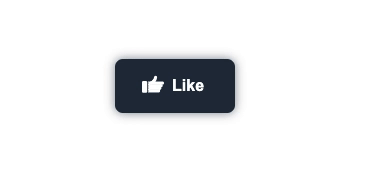
Believe it or not, this is it. We broke down and implemented each interaction separately. And by putting them together. We constructed a like button using React. ⚛️
There are plenty of interactions used in our example. Together they can seem pretty complex. But when we break them down and look at them one at a time. We can easily solve them and combine them into one beautifully designed component. 🧱
31