
38
Learn to use StorybookJS in your React Project
To understand this better, imagine you have a couple of components in your project and need to interact with them. The 'normal' workflow is to run the app locally in your browser and then interact with or test the components.
However, doing this every time for a large app with numerous components can be daunting. This is where storybook comes in. It allows you test out and interact with components without needing to run the actual app in local.
The best part of storybook is that it is a JavaScript tool, so it can be used with almost any JavaScript framework. In this article, we'll focus on using Storybook in a ReactJS project.
Before diving deep into learning Storybook, you want to make sure you have the required packages in your project.
(Skip this step if you already have a React project set up)
If you don't already have a React project, the first thing you'd need to do is to bootstrap a CRA project.
To do this use the command:
To do this use the command:
npx create-react-app storybook-projectNote: storybook-project will be the name of our directory, but you can replace yours with whatever name you like.
cd into your project directory, in this case
This will completely install storybook in your React project
storybook-project and run the command:npx sb initThis will completely install storybook in your React project
Once installation is complete, run
yarn storybook to get storybook running locally.If you encounter challenges getting storybook to run, delete the yarn.lock and node modules of your project then run yarn again.
Still facing issues? check their docs
After running
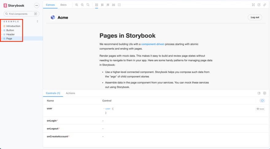
yarn storybook, you'll see the Storybook interface show up in your browser. The left panel has a search bar to search for different components

You'd also notice a grouping, with a title named Example. And then a button, header and page components. Each of these components have their own stories which we'll explore shortly.
In code, there are two things to note:
A .storybook folder with some settings.
For now, we don't need to make edits to this folder. The main thing to take note of is that for components to show up in storybook, you need a .stories.js file extension. You can equally have a .jsx, .ts, .tsx file extension.
All stories are in the stories folder in the src directory.
Check out the
Button, Header and Page. stories files. You'd notice a pattern, each of these files have an export default with a Title and Component. For storybook to work, every stories file must have an export default with a Title and component property.
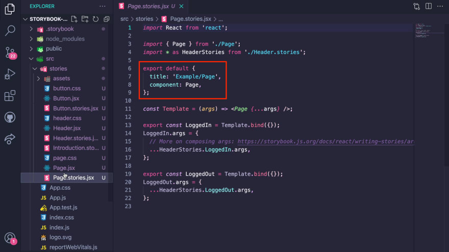
The title as:
'Example/Page' is what groups each of these components under the Example group that we saw earlier.The component property is the name of the component as it shows up in storybook.
A component can have multiple states or use cases.
These multiple states of a single component are what we define as a story.
For example, the same button component can have a primary, secondary and large story.

In code, a story is a function that returns a component’s state given a set of arguments. It is a named exports at the bottom of the stories file

To have a good grasp of how to create stories, let's create two new stories for the
Button component- A default story and a disabled story.First, delete the stories folder that came with the installation and create a new one.
Build out the Button component with some styles in a
Button.jsx file within the stories directory.import React from 'react';
export function Button({disabled, children} ) {
return (
<button
disabled={disabled}
style={{
padding: 12,
fontSize: 12,
background: disabled ? 'lightgray' : 'green',
color: disabled ? 'gray' : 'white',
}}
>
{children}
</button>
);
}Create a
Button.stories.jsx file to build the 2 stories- default story and disabled story. Don't forget to export default and specify the title and the component.import React from 'react';
import { Button } from './Button';
export default {
title: 'Components / Button',
component: 'Button',
};
export const Default = () => <Button>Click me</Button>
export const Disabled = () => <Button disabled>Don't click me</Button>;
ArgTypes is a way to control each story. Think of it like a way to modify the props within your components.
For our button, we'd add a
disabled argType and specify the control as a boolean (since this is going to be either true or false).Also, since the children prop is a text, set the argTypes control to
text. See code below:import React from 'react';
import { Button } from './Button';
export default {
title: 'Components / Button',
component: 'Button',
argTypes: {
disabled: { control: 'boolean' },
children: { control: 'text' },
},
};
export const Default = (args) => <Button {...args} />;
Default.args = {
disabled: false,
children: 'Click me',
};
export const Disabled = (args) => <Button {...args} />;
Disabled.args = {
disabled: true,
children: "Don't click me",
};Now you can tweak each story component.

For a video tutorial, watch learn Storybook in 8mins
Storybook offers you many more features like performing unit tests on stories to confirm functionality, accessibility checks and more. Best of all, you can publish your storybook online using Vercel, GitHub pages, and other hosting platforms.
38