
36
Loading Components Dynamically in an Angular App
Businesses have unique and complex needs. In addition to the user or organization-specific data to show, there might be a need to display different views and content conditionally. The conditions might include the user's role or which department they belong to. The information about a user might be part of the authenticated user's ID token as a profile claim.
In Angular, you can show different components or even parts of templates conditionally using built-in directives such as
*ngIf. Using *ngIf works when the amount of conditional template changes are small, but what if the view has a lot changes, or if the number of conditions to evaluate increases? Managing the correct view only by using *ngIf becomes difficult. These types of scenarios are where dynamic components are helpful. Angular has the mechanics to load components at runtime so you can dynamically display content. After following the instructions in this post, you'll have an Angular app using Angular Material UI controls that displays unique content based on an authenticated user's claim value.
The main flow for the application is after initially launching a welcome page; you'll log in using Okta from a button in the toolbar and redirect to the guarded content. The toolbar now displays your name, and you'll see a rotation of dynamically created components based on a user claim from your ID token.

In this post, we'll
We'll be covering a lot in this post to build out a non-trivial Angular application. As a result, this post assumes some Angular knowledge. We'll be blazing through some basics to focus on working through the dynamic components and user profile information.
If you are new to Angular, check out the following fantastic resources and guides first:
Prerequisites
The Angular CLI automates creating Angular apps quickly. It makes the project folder and scaffolds the application shell. We'll pass in the parameters to
We'll have a lot of small components in this application, so inline templates and styles will allow us to minimize the number of files to touch.
Run the following command to create an Angular v13 app.
npx @angular/cli@13 new dynamic-components --routing --style=scss --inline-template --inline-style --skip-testsYou now have a directory named
dynamic-components with a working application skeleton. All CLI commands in the rest of this post should be run inside the project directory.Next, we'll add the Angular Material component library to the application using their schematic. We'll pass in the parameters to
Run the following command with preset values to add the Angular Material v13 library and affirm that you will proceed with the installation.
ng add @angular/material@13 --theme=custom --typography=true --animations=trueFeel free to serve the app using
ng run or npm start in a second terminal so you can view the changes as you progress through this post. With our application scaffolded and libraries added, we can now add our code. Start by creating three components: a
Home component that contains the application's default view, a Menu component to handle logging in, and a Profile component to display your name after authentication by running the following code.ng generate component home
ng generate component menu
ng generate component profileWe can update what we'll first see when loading the application with these components. Open the project in your favorite IDE and open the
src/app/app-routing.module.ts file to add HomeComponent as a default route, as shown below.const routes: Routes = [
{ path: '', component: HomeComponent }
];Next open
src/app/app.module.ts. We need to add some modules for the Material components we'll use.In the
NgModule imports array, add the following Angular Material component modules: MatToolbarModule from @angular/material/toolbar
MatIconModule from @angular/material/icon
MatButtonModule from @angular/material/button
MatMenuModule from @angular/material/menu
Now we can update the templates. Open
src/app/app.component.ts and replace the entire component with the following code.@Component({
selector: 'app-root',
template: `
<mat-toolbar color="primary" class="toolbar">
<h1>My favorite work app</h1>
<div>
<app-profile></app-profile>
<app-menu></app-menu>
</div>
</mat-toolbar>
<router-outlet></router-outlet>
`,
styles: [`
.toolbar { display: flex; justify-content: space-between; }
`]
})
export class AppComponent { }We added a Material toolbar that displays text, along with the contents of the
Profile and Menu components. We'll update the template of those components in a bit. Below the toolbar, the <router-outlet></router-outlet> shows the view for the current route. You should see the output of the Home component when you serve the app.Open
src/app/home/home.component.ts, which is your welcome landing page. Feel free to change the template and styles to whatever suits you. I added text, an illustration, and styles like below for my tastes.
@Component({
  selector: 'app-home',
  template: `
    <div class="welcome">
      <h2 class="mat-display-1">Welcome! Log in to get started.</h2>
      <img src="assets/welcome.svg" alt="welcome illustration" />
    </div> `,
  styles: [`
    .welcome {
      display: flex;
      flex-direction: column;
      align-items: center;

      h2 { margin: 3rem; }
      img { width: 40%; }
    }
  `]
})
export class HomeComponent { }Next, we'll create a new module,
Protected, to hold the view guarded by authentication. We can pass in the parameters for routing, creating the default component, and lazy-loading, by running the following command.ng generate module protected --routing --route=protected --module=appThis module also contains the dynamic components, interfaces, and directives for dynamic loading, which holds most of the app's business logic.
There's a directive for the component view reference named
DynamicDirective, and a component to house the dynamic component view and orchestrate the loading called DepartmentComponent.We'll put all the code in the same folder by running the following code.
ng generate component protected/department
ng generate directive protected/department/dynamic
Now on to the dynamically created components themselves. There's a base interface for all dynamically created components that contains component data named
DynamicComponent. We're being a little tricky for the CLI here, so we need to rename the interface after we generate it manually. First, create the interface by running the following command.ng generate interface protected/department/dynamic --type=componentOpen the
src/app/protected/department/dynamic.component.ts file and rename the interface from Dynamic to DynamicComponent to help us better keep track of what the interface provides.We have three dynamically created components to display content:
Clawesome, Pawesome, and Smiley.ng generate component protected/department/clawesome --flat
ng generate component protected/department/pawesome --flat
ng generate component protected/department/smiley --flatLet's get the main view for the
Protected module set up. The default view in this module shows ProtectedComponent, which displays a task list and the DepartmentComponent dynamic component loader. First, we'll import the Material component modules, then update the Protected component template and styles, and populate the task list.Open
src/app/protected/protected.module.ts and add the following Material component modules to the imports array:MatCardModule from @angular/material/card
MatListModule from @angular/material/list
Next open
src/app/protected/protected.component.ts. First, we'll set up the tasks. Create a public array for task items in the component and set the values to whatever you want. Here's my task list.public tasks: string[] = [
'Respond to that one email',
'Look into the thing',
'Reply to their inquiry',
'Set up the automation'
];For the
ProtectedComponent's template, we'll use Material's List component. Update the inline template and styles code to look like the following.@Component({
selector: 'app-protected',
template: `
<div class="dashboard">
<main>
<h2>My tasks</h2>
<mat-selection-list #todo class="task-list">
<mat-list-option *ngFor="let task of tasks">
{{task}}
</mat-list-option>
</mat-selection-list>
</main>
<app-department></app-department>
</div>
`,
styles: [`
.dashboard {
margin-top: 2rem; display: flex;
main {
width: 75%;
h2 { text-align: center; }
.task-list { width: 80%; margin: auto; }
mat-selection-list { max-width: 800px; }
}
}
`]
})If you want to check out your work by running the application, you'll need to manually type in the route for the
Protected module as part of the URL.localhost:4200/protectedWhen we add authentication, we'll automatically route to it.
Next, let's get into this exciting dynamic component loading part! Here's how this works. The
Department component is the container for the dynamic components, and controls which component to show. The Department component HTML template contains an ng-template element with a helper directive to identify where to add the dynamic component to the view.Angular v13 included updates to the
ViewContainerRef API to make working with dynamic components more straightforward. We could use Angular Component Development Kit (CDK) Portals instead since it has extra helper functionality, but let's take the updated API out for a spin. 😁Each of the dynamic components needs the same base component interface. In our case, the base component interface is the
DynamicComponent interface. Open each dynamic component file, Clawesome, Pawesome, and Smiley, and implement the DynamicComponent interface to the class. The interface is empty now, but we'll add members later. Feel free to remove the OnInit lifecycle hook too. The Clawesome component class looks like the following example, and the Pawesome and Smiley component classes should look similar.export class ClawesomeComponent implements DynamicComponent {
// ...remaining scaffolded code here
}Open
src/app/protected/department/dynamic.directive.ts to inject the ViewContainerRef. Your code will look like the following.@Directive({
selector: '[appDynamic]'
})
export class DynamicDirective {
constructor(public viewContainerRef: ViewContainerRef) { }
}Now on to the container component. Open
src/app/protected/department/department.component.ts. First, we'll update the template and styles. Update the inline template to include the template reference with the Dynamic directive. I added text, so my template and styles look like the following.@Component({
selector: 'app-department',
template: `
<h3 class="mat-headline">Relax, you got this</h3>
<ng-template appDynamic></ng-template>
`,
styles: [`
h3 { text-align: center; }
`]
})In the component class code, we have a bit to do. We need to load the dynamic components and rotate the components to display. We'll hard-code the list of components to show for now, but later we'll add a service and add in the logic for handling the user claim value.
We use the
ViewChild decorator on the Dynamic directive to access where to insert the component. When creating the component, we pass in the component Type. Copy the following class code and replace your DepartmentComponent class code.export class DepartmentComponent implements OnInit, OnDestroy {
@ViewChild(DynamicDirective, {static: true}) private dynamicHost!: DynamicDirective;
private interval: number|undefined;
private currentIndex = 1;
private messages: { type: Type<DynamicComponent> }[] = [
{ type: ClawesomeComponent },
{ type: PawesomeComponent },
{ type: SmileyComponent }
];
public ngOnInit(): void {
this.loadComponent();
this.rotateMessages();
}
public ngOnDestroy(): void {
clearInterval(this.interval);
}
private loadComponent(): void {
if (this.messages.length === 0) return;
this.currentIndex = (this.currentIndex + 1) % this.messages.length;
const message = this.messages[this.currentIndex];
const viewContainerRef = this.dynamicHost.viewContainerRef;
viewContainerRef.clear();
const componentRef = viewContainerRef.createComponent<DynamicComponent>(message.type);
}
private rotateMessages(): void {
this.interval = window.setInterval(() => {
this.loadComponent();
}, 10000);
}
}Let's talk through the
loadComponent method in a little more detail. First, we make sure we're rotating through the messages sequentially by keeping track of where in the array we are, then clearing out the previous component. To dynamically load the component, we use the directive as an anchor and create the component into its position in the DOM. The createComponent method requires the component type, not the instance. We use the base interface as a generic type for all the components, and use concrete component type in the method parameter.If you look at your app, you'll see the components rotating!
Now we can start customizing based on the user information.
Before you begin, you’ll need a free Okta developer account. Install the Okta CLI and run
okta register to sign up for a new account. If you already have an account, run okta login. Then, run okta apps create. Select the default app name, or change it as you see fit. Choose Single-Page App and press Enter.Use http://localhost:4200/login/callback for the Redirect URI and set the Logout Redirect URI to http://localhost:4200.
The Okta CLI will create an OIDC Single-Page App in your Okta Org. It will add the redirect URIs you specified and grant access to the Everyone group. It will also add a trusted origin for
http://localhost:4200. You will see output like the following when it’s finished:Okta application configuration:
Issuer: https://dev-133337.okta.com/oauth2/default
Client ID: 0oab8eb55Kb9jdMIr5d6
NOTE: You can also use the Okta Admin Console to create your app. See Create an Angular App for more information.
Make a note of the
Issuer and the Client ID. You will need them in the following steps.We can use the Okta-provided Angular SDK to connect to the OIDC client quickly. Add the two packages by running the following command.
npm install @okta/okta-angular@4 @okta/[email protected] --saveOpen
srcs/app/app.module.ts and create an OktaAuth instance by adding the following before the NgModule and replacing the placeholders with the Issuer and Client ID from earlier.import { OKTA_CONFIG, OktaAuthModule } from '@okta/okta-angular';
import { OktaAuth } from '@okta/okta-auth-js';
const oktaAuth = new OktaAuth({
issuer: 'https://{yourOktaDomain}/oauth2/default',
clientId: '{yourClientID}',
redirectUri: window.location.origin + '/login/callback'
});Next, add
OktaAuthModule to the imports array and configure the provider for the OKTA_CONFIG token, as shown below.@NgModule({
...
imports: [
...,
OktaAuthModule
],
providers: [
{ provide: OKTA_CONFIG, useValue: { oktaAuth } }
],
...
})Okta has a component for the login callback, but we need to add the route. Open
src/app/app-routing.module.ts and add the following to your routes array.{ path: 'login/callback', component: OktaCallbackComponent }We also want to guard the
Protected component route to authenticated users. Okta has a guard we can use. Open src/app/protected/protected-routing.module.ts to add a canActivate guard to the default route. Your routes array will look like the code snippet below.const routes: Routes = [{ path: '', component: ProtectedComponent, canActivate: [OktaAuthGuard] }];For the actual logging in, open
src/app/menu/menu.component.ts to add a menu with login and logout buttons. We'll use some Okta-provided code to log in, log out, and identify the authenticated state. Update the component code to match the code below.@Component({
selector: 'app-menu',
template: `
<button mat-icon-button aria-label="Button to open menu" [matMenuTriggerFor]="menu">
<mat-icon>menu</mat-icon>
</button>
<mat-menu #menu="matMenu">
<button mat-menu-item *ngIf="!isAuthenticated" (click)="login()">
<mat-icon>login</mat-icon> <span>Login</span>
</button>
<button mat-menu-item *ngIf="isAuthenticated" (click)="logout()">
<mat-icon>logout</mat-icon> <span>Logout</span>
</button>
</mat-menu>
`
})
export class MenuComponent implements OnInit, OnDestroy {
public isAuthenticated = false;
private _destroySub$ = new Subject<void>();
constructor(private _oktaAuth: OktaAuth, private _authStateService: OktaAuthStateService, private _router: Router) { }
public ngOnInit(): void {
this._authStateService.authState$.pipe(
filter((s: AuthState) => !!s),
map((s: AuthState) => s.isAuthenticated ?? false),
distinctUntilChanged(),
takeUntil(this._destroySub$)
).subscribe(
(authenticated: boolean) => this.isAuthenticated = authenticated
);
}
public ngOnDestroy(): void {
this._destroySub.next();
}
public async login(): Promise<void> {
await this._oktaAuth.signInWithRedirect().then(
_ => this._router.navigate(['/protected'])
);
}
public async logout(): Promise<void> {
await this._oktaAuth.signOut();
}
}Now that you can log in let's get your name displayed in the toolbar. Open
src/app/profile/profile.component.ts. Okta's auth state has user info. Notice it's also available through a claim. Replace the Profile component code with the following.@Component({
selector: 'app-profile',
template: `
<ng-container *ngIf="name$ | async as name ">
<span class="mat-body-1">{{name}}</span>
</ng-container>
`})
export class ProfileComponent {
public name$: Observable<string> = this._authStateService.authState$.pipe(
filter((s: AuthState) => !!s && !!s.isAuthenticated),
map((s: AuthState) => s.idToken?.claims.name ?? '')
);
constructor(private _authStateService: OktaAuthStateService) { }
}Now you see your name when you log in to the application.
All the messages have data to display. The data always includes an URL plus other content that is unique to each component. Let's define the interface to support the message data. Run the following command to create the interface.
ng generate interface messageThere'll be three different message formats, one for each dynamic component. So we'll define a message type, standardized data properties, and a class that holds the type and data properties. Open
src/app/message.ts and replace the contents with the following code.export type MessageType = 'Pawesome' | 'Clawesome' | 'Smiley';
export interface MessageData {
url: string;
content?: any;
}
export class MessageItem {
constructor(public type: MessageType, public data: MessageData) { }
}When we created the dynamic components earlier, they all implemented the same base interface,
DynamicComponent. Since all the dynamic components have some data, we need to update the DynamicComponent interface to reflect this shared property that all the components will implement.Open
src/app/protected/department/dynamic.component.ts and add a property named data of type MessageData to it. The interface now looks like the following.export interface DynamicComponent {
data: MessageData;
}Because we have separate components specifically designed to handle each message type, we keep the logic very straightforward. We'll apply template updates to each component and implement all the interface members by adding an input property to accept the data.
Start by opening
src/app/protected/department/clawesome.component.ts. This component's data has an URL to an image and string content. Update the component to the following.@Component({
selector: 'app-clawesome',
template: `
<mat-card class="card">
<img mat-card-image src="{{data.url}}" alt="Photo of a clawesome creature" >
<mat-card-content>
<p>{{data.content}}</p>
</mat-card-content>
</mat-card>
`,
styles: [` .card { max-width: 300px; } `]
})
export class ClawesomeComponent implements DynamicComponent {
@Input() data!: MessageData;
}Each component is a Material card control with an image to display. Next open
src/app/protected/department/pawesome.component.ts. In addition to the URL, content contains the properties name and about. Update the component to the following.@Component({
selector: 'app-pawesome',
template: `
<mat-card class="card">
<mat-card-header>
<mat-card-title>{{data.content.name}}</mat-card-title>
<mat-card-subtitle>Good doggo</mat-card-subtitle>
</mat-card-header>
<img mat-card-image src="{{data.url}}" alt="Photo of a pawesome creature" >
<mat-card-content>
<p> {{data.content.about}} </p>
</mat-card-content>
</mat-card>
`,
styles: [` .card { max-width: 300px; } `]
})
export class PawesomeComponent implements DynamicComponent {
@Input() data!: MessageData;
}Finally, open
src/app/protected/department/smiley.component.ts. The only data in this message type is the URL. Update the component to the following.@Component({
selector: 'app-smiley',
template: `
<mat-card class="card">
<img mat-card-image src="{{data.url}}" alt="Photo of a smiley creature" >
<mat-card-content>
<p>SMILE!</p>
</mat-card-content>
</mat-card> `,
styles: [` .card { max-width: 300px; } `]
})
export class SmileyComponent implements DynamicComponent {
@Input() public data!: MessageData;
}The rotating components look a little goofy now and you'll see a lot of errors in the console, but we'll get it fixed up soon.
Next, we need to add the claim. We'll assign a department to the user and create a claim that pulls in the department value. We can do this in the Okta dashboard. Navigate to Directory > People and click the user you'll log in with.
Navigate to the Profile tab and press Edit. Scroll down to Department and enter the number
1. We'll label the department names as either 1 or 2 for ease of coding.Since we see different content by user claim, it's helpful to have more than one user. If you have a second user, update their department name to
2, but you can also edit the department value between logging in.For the claim, navigate to Security > API and select your Authorization Server to edit in the Okta dashboard. If you are using a Developer Account, you'll have one named "default". In your "default" Authorization Server, navigate to the Claims tab. Press the Add Claim button to create a new claim. Name your claim "department", always include it in the "ID Token", and set its value to
user.profile.department. Your inputs should look like the image below.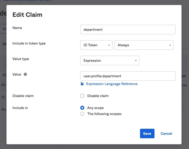
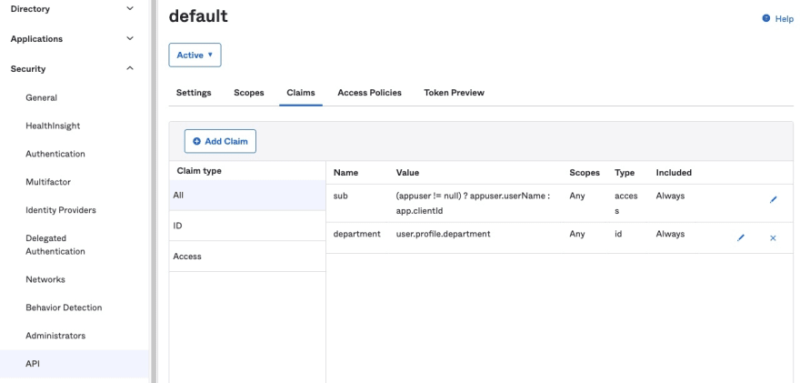
The ID token now contains the new claim with the value of the user's department.
The dynamic components are cool, but they don't do anything yet. The value of dynamic components is that the component contents change, and we can show whatever data in the component we want. Let's add the code to see how flexible dynamic components are. We need a service that emulates a server response to return messages. Run the following command to create the service.
ng generate service messageThe
MessageService returns messages the company wants to display to its users. All messages have a URL, and some have additional content to display. Open src/app/message.service.ts and add the following code to fake out message responses as a private class property.private messages: MessageItem[] = [
{
type: 'Clawesome',
data: {
url: 'https://images.pexels.com/photos/2558605/pexels-photo-2558605.jpeg?auto=compress&cs=tinysrgb&w=1260&h=750&dpr=1',
content: 'Cat ipsum dolor sit amet, meow for can opener to feed me',
}
},
{
type: 'Clawesome',
data: {
url: 'https://images.pexels.com/photos/1560424/pexels-photo-1560424.jpeg?auto=compress&cs=tinysrgb&w=1260&h=750&dpr=1',
content: 'Cat ipsum dolor sit amet, find dog bed and sleep all day',
}
},
{
type: 'Clawesome',
data: {
url: 'https://images.pexels.com/photos/3687957/pexels-photo-3687957.jpeg?auto=compress&cs=tinysrgb&w=1260&h=750&dpr=1',
content: 'Cat ipsum dolor sit amet, too cute for human to get mad'
}
},
{
type: 'Pawesome',
data: {
url: 'https://images.pexels.com/photos/97082/weimaraner-puppy-dog-snout-97082.jpeg?auto=compress&cs=tinysrgb&w=1260&h=750&dpr=1',
content: {
name: 'Sammy',
about: 'Snuggly cloud borker'
}
}
},
{
type: 'Pawesome',
data: {
url: 'https://images.pexels.com/photos/825949/pexels-photo-825949.jpeg?auto=compress&cs=tinysrgb&w=1260&h=750&dpr=1',
content: {
name: 'Pittunia',
about: 'Maximum adorable shooberino'
}
}
},
{
type: 'Pawesome',
data: {
url: 'https://images.pexels.com/photos/406014/pexels-photo-406014.jpeg?auto=compress&cs=tinysrgb&w=1260&h=750&dpr=1',
content: {
name: 'Bay',
about: 'Long snoot for pats'
}
}
},
{
type: 'Smiley',
data: {
url: 'https://images.pexels.com/photos/2168831/pexels-photo-2168831.jpeg?auto=compress&cs=tinysrgb&dpr=2&h=650&w=940'
}
},
{
type: 'Smiley',
data: {
url: 'https://cdn.pixabay.com/photo/2017/06/17/13/11/axolotl-2412189_960_720.jpg'
}
}
];There's one more property to add. A real server call should only return the messages relevant to the department of the caller. Users of department "1" shouldn't see the messages for department "2" by inspecting the network response. We'll handle this within the service by creating a mapping for message types by the department. Add the
departmentMapping property and update the constructor for the service as shown below.private departmentMapping: Map<number, MessageType[]> = new Map<number, MessageType[]>();
constructor() {
this.departmentMapping.set(1, ['Smiley']);
this.departmentMapping.set(2, ['Pawesome', 'Clawesome']);
}Now let's add a method to get the messages. Add the following code to filter the hard-coded messages.
public getMessages(department: number): MessageItem[] {
  const messageTypes = this.departmentMapping.get(department) ?? [];
  return this.messages.filter(m => messageTypes.includes(m.type));
}
Next, we need to call this service method. To do so, we'll read the claims values of the authenticated user and pass in the department to the
getMessages method. We'll access the claim through the ID token from Okta's auth state subject. Even though we're in a guarded route, we'll still add the safety measures to verify the user authentication, and to return a default value if the claim isn't on the ID token for some reason. Open src/app/protected/protected.component.ts and update to the following code.export class ProtectedComponent implements OnInit {
// ... task list property here don't delete
public messages: MessageItem[] = [];
constructor(private _authStateService: OktaAuthStateService, private _messageService: MessageService) { }
public ngOnInit(): void {
this._authStateService.authState$.pipe(
filter((s: AuthState) => !!s && !!s.isAuthenticated),
map((s: AuthState) => +s.idToken?.claims['department'] ?? 0),
take(1)
).subscribe(
(d: number) => this.messages = this._messageService.getMessages(d)
);
}
}We now have a list of messages to display to the user. We'll pass this to the dynamic component's container component to action. In the inline template for
ProtectedComponent, update the <app-department> element to pass in messages as an input property. You'll see an error in the IDE since we haven't created the input property in the Department component yet. The element in the inline template will look like the code below.<app-department [messages]="messages"></app-department>You can probably see where this is going. Now we'll update the Department component to support the input property. Open
src/app/protected/department/department.component.ts. Replace the hardcoded private messages property into a public input property like the code snippet below.@Input() public messages: MessageItem[] = [];You'll have a new error in the app because our code in the
loadComponent method expects a component type. We'll add a factory method to return the component type to create by matching the MessageType to the component type like the following example.private componentTypeFactory(type: MessageType): Type<DynamicComponent> {
let comp: Type<DynamicComponent>;
if (type === 'Pawesome') {
comp = PawesomeComponent;
} else if (type === 'Clawesome') {
comp = ClawesomeComponent;
} else {
comp = SmileyComponent;
}
return comp;
}Then we can update the
loadComponent method to use the factory method. We also have message data to pass into the components, although the dynamic components can't support the input property. Update the code and add the new line of code to pass data to the components like the code block below.const componentRef = viewContainerRef.createComponent<DynamicComponent>(this.componentTypeFactory(message.type));
componentRef.instance.data = message.data;Now everything should compile, and you should have a working app that displays a rotating set of cute animals images to help you power through working on that task list. Try logging in as a user with a different department (or change the department value for yourself in the Okta dashboard) to see the various dynamic components at work.
You can find the code for this project on GitHub.
 oktadev
/
okta-angular-dynamic-components-example
oktadev
/
okta-angular-dynamic-components-example
Loading Components Dynamically in an Angular App
We did a lot in this tutorial and had a lot of dependencies on Material and Okta libraries. Please check out this commit to see the changes required to run tests and create mocks of the Okta services.
We covered a lot in this post, tried out a new API, and explored some cool concepts. If you liked this post, check out the following.
Don't forget to follow us on Twitter and subscribe to our YouTube channel for more exciting content. We also want to hear from you on what tutorials you want to see and how you use dynamic components. Leave us a comment below.
36