
34
Build request forms using React, Ant Design, and a lowcode backend
Request/contact form is something that is required for most companies. This article will ease your way of making a copy of the Request/Contact form for your project.
This is a step-to-step guide on how one can build a Request form with low code. So let's begin!🚀
📝Step 1: Create-react-app
First thing first, create a new react project using - create-react-app
npx create-react-app forms📩 Step 2: Add the dependencies
Next, go to your project folder on the terminal and add all the required dependencies.
yarn add antd // For building the frontend on ant design👩🔧Step 3: Edit and create a skeleton
We'll use the
Layout component from Ant design library to layout our content, where we'll add the Header, Content and Footer components to our layout.Here, we'll have two menu items, one for each of the forms -
Contact Us and Get a Demo. In the middle of the page, we'll place our form components -
Contact Us and Get a Demo and a Footer at the bottom. We are keeping <Content> empty for now, we'll add them once we make our forms.
Go to your App.js file and remove the boilerplate code and add the following:
import React from "react";
import "./App.css";

import { Layout, Menu } from "antd";
import "antd/dist/antd.css";

const { Header, Content, Footer } = Layout;

const App = () => {
  return (
    //Layout Component
    <Layout className="layout">
      <Header // Header Component
        style={{
          position: "fixed",
          zIndex: 1,
          width: "100%",
        }}
      >
        <div className="logo" />
        <Menu // Header Tabs
          theme="dark"
          mode="horizontal"
          defaultSelectedKeys={["contactUs"]}
        >
          <Menu.Item key="contactUs" style={{ color: "#ffffff" }}>
            Contact Us
          </Menu.Item>
          <Menu.Item key="getADemo" style={{ color: "#ffffff" }}>
            Get a Demo
          </Menu.Item>
        </Menu>
      </Header>
      <Content // Content Component
        className="site-layout"
        style={{
          marginTop: 64,
          padding: 20,
          paddingBottom: 0,
        }}
      >
        <div className="site-layout-background"></div>
      </Content>
      <Footer
        style={{ textAlign: "center", backgroundColor: "fff" }} // Footer Component
      >
        Canonic ©2021 Created by Canonic Inc
      </Footer>
    </Layout>
  );
};

export default App;
We are keeping the component empty for now, we'll add our Forms once we make them.
✨Step 4: Add some styling
To add some basic styling in the code, edit -
src/App.css#components-layout-demo-fixed .logo {
float: left;
width: 120px;
height: 31px;
margin: 16px 24px 16px 0;
background: rgba(255, 255, 255, 0.2);
}
.site-layout .site-layout-background {
background: #fff;
}After completion of the above 4 steps, you should have something like this 👇

📝Step 5: Let's create the first form - Contact Us
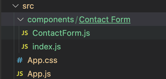
We'll create a component -
ContactForm at src/components/Contact Form. Create the respective ContactForm.js and index.js files. Your folder structure would look like this 👇
Add following code to your index.js file
export { default } from "./ContactForm";Coming to your main
ContactForm.js file! We'll use the Form components of Ant Design for all our input fields (FirstName, LastName, Email, etc.). They've got multiple attributes through which you can configure different settings of your input fields like Required Fields, Custom Error Message, etc. A button at the end of the form, which will let the users submit their request.// Import React & Ant Design Dependencies
import React from "react";
import { Form, Input, Button, Typography } from "antd";
const ContactForm = () => {
const [form] = Form.useForm();
const { Title, Text } = Typography;
return (
<div>
<Title // Form's Title
level={3}
style={{
marginBottom: 0,
paddingTop: 20,
paddingLeft: 30,
paddingRight: 30,
}}
>
✉️ Contact Us!
</Title>
<Text // Form's Description
type="secondary"
style={{
paddingLeft: 30,
paddingRight: 30,
}}
>
Let us know how we can help you.
</Text>
<Form // Ant Design's Form Component
name="contact-us"
layout="vertical"
form={form}
wrapperCol={{
span: 6,
}}
style={{
marginTop: 20,
paddingBottom: 10,
paddingLeft: 30,
paddingRight: 30,
}}
>
<Form.Item // Form Item (First Name)
label="First Name"
name="firstName"
required
tooltip="This is a required field"
rules={[
{
required: true,
message: "Please enter your first name!",
},
]}
>
<Input placeholder="First Name" />
</Form.Item>
<Form.Item // Form Item (Last Name)
label="Last Name"
name="lastName"
required
tooltip="This is a required field"
rules={[
{
required: true,
message: "Please enter your last name!",
},
]}
>
<Input placeholder="Last Name" />
</Form.Item>
<Form.Item // Form Item (Email)
label="Email"
name="email"
required
tooltip="This is a required field"
rules={[
{
required: true,
message: "Please enter your email!",
type: "email",
},
]}
>
<Input placeholder="Email" />
</Form.Item>
<Form.Item // Form Item (Message)
label="Type your message here"
name="message"
required
tooltip="This is a required field"
rules={[
{
required: true,
message: "Message is a required field!",
},
]}
>
<Input.TextArea
placeholder="Message ..."
autoSize={{ minRows: 4, maxRows: 6 }}
/>
</Form.Item>
<Form.Item // Form Item (Submit Button)
>
<Button type="primary">Submit</Button>
</Form.Item>
</Form>
</div>
);
};
export default ContactForm;Our
ContactForm component is ready, let's add it to our layout's content to see how it looks. Head back to App.js, import ContactForm & update the <Content> component.// Import ContactForm Component
import ContactForm from "./components/Contact Form";
// Add <ContactForm> in our <Content> component
...
<Content // Content Component
className="site-layout"
style={{
marginTop: 64,
padding: 20,
paddingBottom: 0,
}}
>
<div className="site-layout-background">
<ContactForm></ContactForm>
</div>
</Content>
...Here's what it should look like after successful completion. 👇
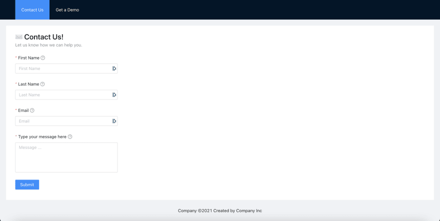
You can now add data to these fields and the required validation errors will also automatically pop up wherever necessary.
As of now, the submit button does not do anything. We want to store this information and trigger an email internally to the concerned people to take action whenever the form is submitted.
Let's head to canonic. Find the Canonic-Forms sample project, clone this project and deploy. 🚀

Once you deploy, the APIs will automatically be generated. Head on to the Docs and copy the
/Create contact us endpoint of the Contact us Table. This is the POST API that will store the form data in the database.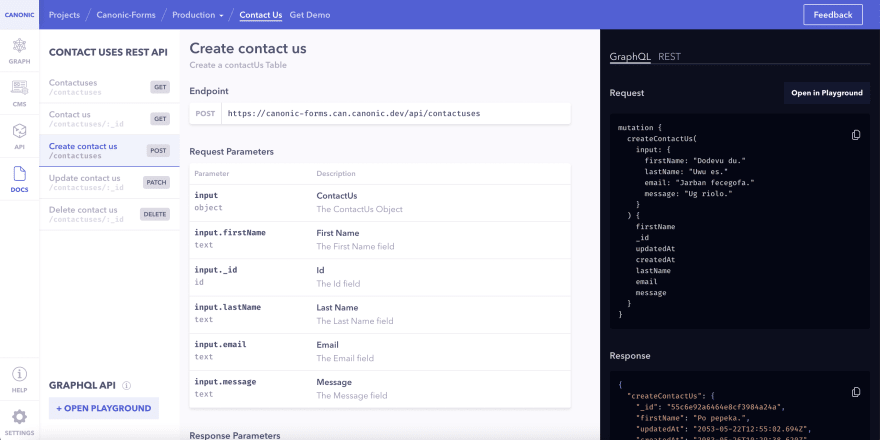
👩🔧Step 6: Let's Integrate
Now, we need to hit the copied API endpoint to our backend and store the submission. We'll create a util function to do that and trigger it when the user hits the submit button. We'll create a new file -
useContactUs.js at src/utils/apis.
Add the following code and replace the
YOUR_URL_HERE with the URL that you just copied.const UseContactUs = async (data) => {
const url = "YOUR_URL_HERE";
const submitRequest = async (reqBody) => {
try {
const res = await fetch(url, {
method: "POST",
headers: { "Content-Type": "application/json" },
body: JSON.stringify({ input: reqBody }),
});
const json = await res.json();
return { response: json, error: undefined };
} catch (error) {
return { response: undefined, error: error };
}
};
return await submitRequest(data);
};
export default UseContactUs;🔽Step 7: Add the submit button!
Let's Head over to your
ContactUs.js file and trigger this submit request function to post the data on our backend.useContactUs.js fileonSubmit which will first validate the form fields and then make a request to our backend to store the filled information.handleSubmission that will reset our fields if the request is successful or show an error if not.onSubmit function to our submit button's onClick.Add the following code to do that:
...
// Import useContactUs.js
import UseContactUs from "../../utils/apis/useContactUs";

// Add onSubmit & handleSubmission functions inside our //ContactForm component
...

const [form] = Form.useForm();
const { Title, Text } = Typography;

const handleSubmission = React.useCallback(
    (result) => {
      if (result.error) {
        // Handle Error here
      } else {
        // Handle Success here
        form.resetFields();
      }
    },
    [form]
  );

const onSubmit = React.useCallback(async () => {
    let values;
    try {
      values = await form.validateFields(); // Validate the form fields
    } catch (errorInfo) {
      return;
    }
    const result = await UseContactUs(values); // Submit the form data to the backend
    handleSubmission(result); // Handle the submission after the API Call
  }, [form, handleSubmission]);


...

// Add the onSubmit to the onClick of our Submit Button

<Form.Item // Form Item (Submit Button)
>
 <Button type="primary" onClick={onSubmit}>
   Submit
 </Button>
</Form.Item>

...
Let's head to our app to see if it's working as expected. If you now try submitting the details with out any data, the validation will show up. Otherwise, the request to our backend will start happening.

🙌Step 8: Let's handle the results now!
We want to show a notification to the user after the submission. Ant Design has a
notification component here that we can use. Let's create a new file showNotification.js at src/utils/views where we can write the code to show these notifications and use it in our ContactUs component.import { notification } from "antd";
const showNotification = (type, details) => {
notification[type]({
message: details.message,
description: details.description,
});
};
export default showNotification;We also create a new
Constants.js file at src/utils/constants that can hold the messages for success and error:const NOTIFICATION_DETAILS = {
success: {
message: "Details Submitted!",
description:
"We've got your information. Our team will get in touch you shortly!",
},
error: {
message: "Something went wrong!",
description: "Please try again later or email us to [email protected]!",
},
};
export default NOTIFICATION_DETAILS;🔔Step 9: Showing of notification!
Let's go back to our
ContactUs.js component. We'll use our handleSubmisson function to show there notifications....
//Import the new Notification and Constants files
import NOTIFICATION_DETAILS from "../../utils/constants/Constants";
import showNotification from "../../utils/views/showNotification";
...
const handleSubmission = (result) => {
if (result.error) {
showNotification("error", NOTIFICATION_DETAILS.error); // Show Success Notification
} else {
showNotification("success", NOTIFICATION_DETAILS.success); // Show Error Notification
form.resetFields();
}
};
...After the submission, you'll see the success notification like this 👇

And with that, you have successfully made the contact forms for your project. 💃🕺
Congratulation! 🎉
If you want, you can also clone this project from Canonic's sample app and easily get started by customizing it as per your experience. Check it out here.
You can also check out our other guides here.
Join us on discord to discuss or share with our community. Write to us for any support requests at [email protected]. Check out our website to know more about Canonic.
34