
22
How to Analyze and Improve your 'Create React App' Production Build
If you are interested in a video version of this tutorial, check out the link below. You can follow along with the code in this blog. (The video is entirely optional, every step and instruction is covered in the blog post.)

In this tutorial we're gonna take a step-by-step look at how to analyze and optimize your Create React App project using a custom webpack configuration that is extremely easy to set up.
We will be using examples that make small adjustments and try different ways of importing modules and splitting your code to see the direct impacts it has on your bundle sizes and performance.
The goal here is to help you get a better understanding of what webpack is actually doing by seeing the exact changes that occur to a production build when you make small changes to your application.
To begin, we'll create a brand new React app called
something-big-and-bloatednpx create-react-app something-big-and-bloated --template typescriptNext we'll install the dependencies we need to analyze the project.
npm install @craco/craco webpack-bundle-analyzer --save-devWe need to create a configuration file for
craco in the root of our project to include our webpack plugin:craco.config.jsconst BundleAnalyzerPlugin =
require("webpack-bundle-analyzer").BundleAnalyzerPlugin;
module.exports = function () {
return {
webpack: {
plugins: [new BundleAnalyzerPlugin({ analyzerMode: "server" })],
},
};
};If we run the usual
npm run build script for a production build, it will use the standard react-scripts method. However if we run
craco build it will still run the same process, but inject in any webpack configuration you have included in your craco.config.js file. Pretty sweet. Let's give it a try. We'll create a new entry called analyze in
package.json scripts:{
...
"scripts": {
"start": "react-scripts start",
"build": "react-scripts build",
"test": "react-scripts test",
"eject": "react-scripts eject",
"analyze": "craco build"
}
}Now run:
npm run analyzeBecause we set the
analyzerMode to "server" in our craco config, we will automatically get our browser open with the results served as a webpage (you can use the "json" option if you want the output without involving the browser)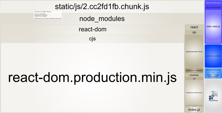
You can hover over each module within the chunks or your can use the little arrow at the upper left which pops out a drawer. You'll get three different values:
So for most deployments you can look at the gzipped value as how much network usage you will need, and the parsed size as how much code the browser is going to handle once unzipping is complete. Be aware that this value can be just as problematic on users with less powerful CPUs as the gzip size can be for those on slow networks. Both are important to consider.
On
create-react-app v4.0.3 for this tutorial the values I get are 205kb / 135kb / 44kb for stat / parsed / gzipped respectively. You can see right out of the box we get a bit of overhead (though for most users that's a small price to pay for convenience). Now let's try adding some libraries and look at how this value changes. We'll consider the way that we do our imports and see how we might be able to better control our bundle size by only importing what we need.
I'm gonna pick a fairly popular UI library called MUI (Material UI). It's a good example of a large package that can significantly weigh down your app if not bundled properly. It will make a good example for our tutorial.
We will need the following packages:
@mui/material.@mui/material.
npm install @mui/material @mui/icons-material @emotion/react @emotion/styled --saveBefore we even do anything let's run our analyzer again. Remember we've added these libraries, but we aren't actually using any of them yet. Do you think our bundle size will increase? Let's find out:
npm run analyze205kb / 135kb / 44kb again. Exact same result. That's great! That means that webpack is not including any libraries we don't actually use. It's doing its job well.
Now we'll import a component from MUI. We'll grab a relatively complex one, something more than a button. Let's use the Speed Dial! Create a new component file in
src:src/CustomSpeedDial.tsximport React from "react";
import Box from "@mui/material/Box";
import SpeedDial from "@mui/material/SpeedDial";
import SpeedDialIcon from "@mui/material/SpeedDialIcon";
import SpeedDialAction from "@mui/material/SpeedDialAction";
import FileCopyIcon from "@mui/icons-material/FileCopyOutlined";
import SaveIcon from "@mui/icons-material/Save";
import PrintIcon from "@mui/icons-material/Print";
import ShareIcon from "@mui/icons-material/Share";
const actions = [
{ icon: <FileCopyIcon />, name: "Copy" },
{ icon: <SaveIcon />, name: "Save" },
{ icon: <PrintIcon />, name: "Print" },
{ icon: <ShareIcon />, name: "Share" },
];
export default function CustomSpeedDial() {
return (
<Box sx={{ height: 320, transform: "translateZ(0px)", flexGrow: 1 }}>
<SpeedDial
ariaLabel="SpeedDial basic example"
sx={{ position: "absolute", bottom: 16, left: 16 }}
icon={<SpeedDialIcon />}
>
{actions.map((action) => (
<SpeedDialAction
key={action.name}
icon={action.icon}
tooltipTitle={action.name}
/>
))}
</Box>
);
}Replace the contents of your
App.tsx file with the following:src/App.tsximport React from "react";
import CustomSpeedDial from "./CustomSpeedDial";
function App() {
return <CustomSpeedDial />;
}
export default App;Run the development server to check it out:
npm run start
Everything looks good. Let's see how much that impacted our build. Run our analyze command again:
npm run analyze
Our bundle size is now up to 660kb / 270kb / 88kb. That's a significant increase for one component! Of course bear in mind that it's fairly complex, and as soon as you use one you need to include all the other dependencies that make MUI function.
I'd bet if you added a second component you wouldn't get such a big jump. In fact we can try now. Add the following to your SpeedDial component:
src/CustomSpeedDial.tsx:import React from "react";
import Box from "@mui/material/Box";
import SpeedDial from "@mui/material/SpeedDial";
import SpeedDialIcon from "@mui/material/SpeedDialIcon";
import SpeedDialAction from "@mui/material/SpeedDialAction";
import FileCopyIcon from "@mui/icons-material/FileCopyOutlined";
import SaveIcon from "@mui/icons-material/Save";
import PrintIcon from "@mui/icons-material/Print";
import ShareIcon from "@mui/icons-material/Share";
// NEW
import Button from "@mui/material/Button";
const actions = [
{ icon: <FileCopyIcon />, name: "Copy" },
{ icon: <SaveIcon />, name: "Save" },
{ icon: <PrintIcon />, name: "Print" },
{ icon: <ShareIcon />, name: "Share" },
];
export default function CustomSpeedDial() {
return (
<Box sx={{ height: 320, transform: "translateZ(0px)", flexGrow: 1 }}>
{/* NEW */}
<Button variant="contained">Hello world!</Button>
<SpeedDial
ariaLabel="SpeedDial basic example"
sx={{ position: "absolute", bottom: 16, left: 16 }}
icon={<SpeedDialIcon />}
>
{actions.map((action) => (
<SpeedDialAction
key={action.name}
icon={action.icon}
tooltipTitle={action.name}
/>
))}
</SpeedDial>
</Box>
);
}We've imported a button above and included it with our speed dial (two new lines marked with "NEW" comments.)
When we run
npm run analyze again we get.... almost the same! 677kb / 278kb / 89kb. We can see that the button extremely little to the bundle size since most of the building blocks for it were already included with the Speed Dial. But now let's compare when using the traditional commonJS import.
Add the following line to the very top of your
CustomSpeedDial component (if ESLint complains about import order, place the line after all your imports statements)src/CustomSpeedDial.tsxconst material = require("@mui/material");Analyze again:
npm run analyze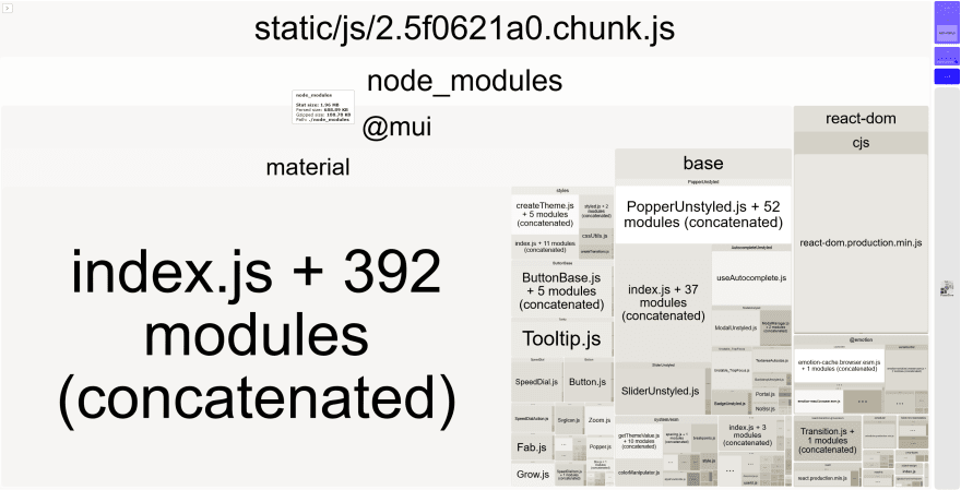
Holy moly! 1.97*MB* / 697kb / 194kb.
What happened? Looks like we're bundling the entire MUI library. Popper? Tooltip.js? We're not using any of those, but they're taking up a ton of space in our chunk.
It turns out that when we are using ES6 modules webpack is very good at figuring out which pieces of code we are actually using based on what we import and export.
This process is called tree shaking and it requires you to use ES6 modules in order to work. You can see that doing so can have a very dramatic effect on our final bundle.
Our current program is exactly the same functionally as our previous one, but thanks to a single commonJS import it's a whopping 3x the size. Yikes!
Here's what we're going to do though. Instead of removing that
require in our CustomSpeedDial we're going to leave it there, and introduce something called code spltting as another option available to you.Code splitting is effective when you have a certain component or page or general part of your application that isn't necessary required for every visitor. It might be a datepicker that only appears when a user makes a booking, or it might be a "help" page that only a small percentage of users will need.
We can use React's lazy and suspense features to break these pieces into separate bundle chunks, and only load them when necessary.
Let's update
App.tsx. There's a lot to unpack here, so we'll just show the code first and break it down:src/App.tsximport CircularProgress from "@mui/material/CircularProgress";
import Button from "@mui/material/Button";
import React, { Suspense, useState } from "react";
// 1
const CustomSpeedDial = React.lazy(() => import("./CustomSpeedDial"));
function App() {
// 2
const [showSpeedDial, setShowSpeedDial] = useState(false);
// 4
if (showSpeedDial) {
return (
// 5
<Suspense fallback={<CircularProgress />}>
<CustomSpeedDial />
</Suspense>
);
}
return (
// 3
<Button variant="contained" onClick={() => setShowSpeedDial(true)}>
Click to load speed dial
</Button>
);
}
export default App;The numbers are a little out of order, but that's intentional. You'll see it follows the actual flow of the component.
CustomSpeedDial module. Remember that's the one that uses require for the entire MUI package and comes in at 1-2MB. By using the lazy import, what happens is that the import only occurs when our primary component here (CustomSpeedDial) actually tries to render it. We'll see that it doesn't by default.
false value means we will not be rendering CustomSpeedDial
Button imported directly from MUI. When this button is pressed it sets the value of showSpeedDial to true.showSpeedDial is true we take this branch at the next render. The reason we get a re-render is because we updated a stateful React value (showSpeedDial).Suspense component is to tells React what to render while waiting for the module to import. Depending on the size it could take a second or more. For our example we are using MUI's CircularProgress to imply a loading state while the module is loading. Once it loads it switches to render the children of the Suspense component.
Now it's time to try it out! We'll begin with an analyze:
npm run analyze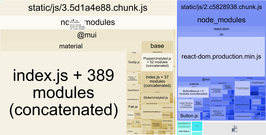
This gets really interesting. Webpack has created new separate chunks. You'll notice there are more
.js chunks when you toggle the drawer on the left.In fact this largest chunk on the left
3.5d1a4e88.chunk.js (1.52mb / 475kb / 122kb) isn't even used on the default load of our app. Based on our learnings earlier, we can see that huge chunk is definitely our CustomSpeedDial.tsx component that imports all of MUI with require commonJS import. On the right we have the much smaller bundle
2.c5828938.chunk.js that includes things like Button and ButtonBase. This is the chunk that will load on every page load. We can look at the size (451kb / 214kb / 69kb) and validate that in a moment. Since our ultimate goal is to make sure our production app is running as efficiently as possible, we want to run our tests on the production version of the app. Use the following command to build a production version of the app:
bpm run buildNext we'll need to serve that
build directory that was created. If you have your own local serve you prefer to use, use it! If not just add the serve package:npm install serve --save-devAnd then use it to serve the
build directory:npx serve buildYou can find the page at http://localhost:3000/ (or whatever port serve specifies on the command line).
Press F12 to open your browser's Developer Tools and click the Network tab. This process should be roughly the same in both Chrome, Edge and Firefox.
I am using Firefox so the screenshots should match your experience. If you are using another browser the options will still be there, just potentially in a different location.
Click the Disable Cache checkbox so that we are loading the JS files on every refresh and not a cached version from the browser. We want to be able to see the load times and sizes.
Now hit the refresh button (F5).
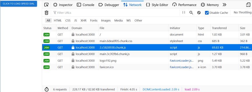
As we predicted, our total transfer is 82KB with 69KB of that being the highlighted smaller
c5828938 chunk we identified (remember this is a served production build, so we are working with GZIP sizes just like your real app would for real users) There is no sign of the 122KB gzipped chunk. Let's click the "load speed dial" button on our app.

There's that 122KB chunk with our
CustomSpeedDial component inside of it. How cool is it that it only loaded the code on demand?
I hope you can start brainstorming ways to reduce the bundle size of your app and potentially introduce code splitting to improve initial load times.
Also worth noting: these tips are not exclusive to Create React App. All we did was introduce a special tool called
craco to allow us to configure webpack. Any application running webpack can potentially benefit from these tips!It would be irresponsible to me not to mention that Create React App does recommend a similar tool that doesn't require
craco (although personally I feel it's not as intuitive to read the data) it still gets the job done well. Read about it here.Please check some of my other learning tutorials. Feel free to leave a comment or question and share with others if you find any of them helpful:
For more tutorials like this, follow me @eagleson_alex on Twitter
22