
31
How to Create Modern Cards using React and Tailwind
One of my favorite components is undoubtedly cards and the reasons are very simple, they can have many uses.
In the same way that it can be used for informative content (such as brief descriptions), it can also be used to focus the user's attention momentarily (such as a post on social media) or so that the user can take an action.
When designing a card we need to pay attention to some aspects:
From these small points we only need to pay attention to a few aspects in terms of the element's anatomy.
Obviously, many of the elements end up being optional and for that same reason today I'm only going to focus on just these:
And one of the aspects that I find interesting is that it's a component that generally has great behaviors in terms of responsiveness.
Anyway, these are just a few aspects that I take into account when working with interface elements, so I recommend reading this Material Design page which explains in detail what kind of behavior this component should have.
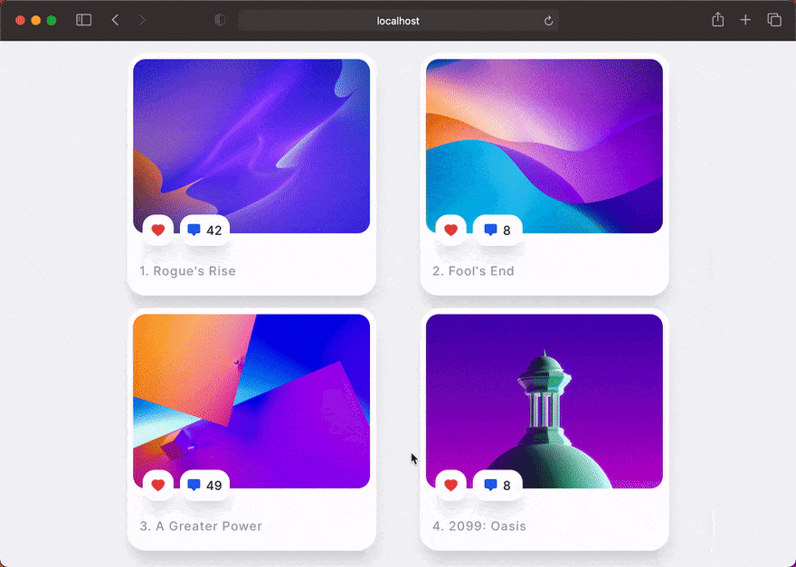
In today's example we will make a simple card, but in my opinion it has a very different design when compared to many libraries and frameworks. A behavior I recommend adopting is to spend a few minutes daily to see designs that you find interesting and I tried to copy them. I hope that at the end of today's article you have a similar result:
The framework we are going to use today is Tailwind CSS and along with this framework we are going to use other tools such as classnames and react-icons.
npm install classnames react-iconsAfter that we will create a file that contains the contents of the cards.
// @src/data/posts.js

export default [
  {
    title: "Rogue's Rise",
    likes: Math.floor(Math.random() * (50 - 0) + 0),
    image: "https://bit.ly/3BQdTqk",
  },
  {
    title: "Fool's End",
    likes: Math.floor(Math.random() * (50 - 0) + 0),
    image: "https://bit.ly/3CQFPvv",
  },
  {
    title: "A Greater Power",
    likes: Math.floor(Math.random() * (50 - 0) + 0),
    image: "https://bit.ly/3ERuyMd",
  },
  {
    title: "2099: Oasis",
    likes: Math.floor(Math.random() * (50 - 0) + 0),
    image: "https://bit.ly/3CQKSwb",
  },
];
Now we can start working on our card but first let's create the styles for our component:
/* @src/components/Card.module.css */

.wrapper {
  @apply bg-white hover:bg-gray-800 shadow-xl hover:shadow-none cursor-pointer w-80 rounded-3xl flex flex-col items-center justify-center;
}

.wrapperAnime {
  @apply transition-all duration-500 ease-in-out;
}

.header {
  @apply relative mt-2 mx-2;
}

.imageWrapper {
  @apply h-56 rounded-2xl overflow-hidden;
}

.image {
  @apply object-cover w-full h-full;
}

.textWrapper {
  @apply pt-10 pb-6 w-full px-4;
}

.text {
  @apply font-medium leading-none text-base tracking-wider text-gray-400;
}

.badgeWrapper {
  @apply absolute bottom-0 left-0 -mb-4 ml-3 flex flex-row;
}

.dangerBadge {
  @apply h-10 w-10 flex items-center justify-center text-xl bg-white hover:bg-red-500 text-red-500 hover:text-white rounded-2xl shadow-xl;
}

.primaryBadge {
  @apply h-10 w-16 ml-2 bg-white hover:bg-blue-600 flex items-center justify-center font-medium text-blue-600 hover:text-white rounded-2xl shadow-xl;
}

.counter {
  @apply text-gray-800 ml-2;
}

.badgeAnime {
  @apply transform-gpu translate-y-0 hover:-translate-y-1 transition-all duration-300 ease-in-out;
}
Now we can start working on our component's jsx. Our component will receive four props, which will be the title, the number of likes, the order of the array element and the image.
After that we can import our icons and we can start applying the styles of our component:
// @src/components/Card.jsx

import React from "react";
import classNames from "classnames";
import { AiFillHeart } from "react-icons/ai";
import { BsChatSquareFill } from "react-icons/bs";

import styles from "./Card.module.css";

const Card = ({ title, likes, order, image }) => {
  return (
    <div className={classNames([styles.wrapper, styles.wrapperAnime])}>
      <div className={styles.header}>
        <div className={styles.imageWrapper}>
          <img src={image} className={styles.image} alt="" />
        </div>
        <div className={styles.badgeWrapper}>
          <div
            className={classNames([styles.dangerBadge, styles.badgeAnime])}
          >
            <AiFillHeart />
          </div>
          <div
            className={classNames([
              styles.primaryBadge,
              styles.badgeAnime,
              "group",
            ])}
          >
            <BsChatSquareFill />
            <span
              className={classNames([styles.counter, "group-hover:text-white"])}
            >
              {likes}
            </span>
          </div>
        </div>
      </div>
      <div className={styles.textWrapper}>
        <h1 className={styles.text}>{`${order}. ${title}`}</h1>
      </div>
    </div>
  );
};

export default Card;
Last but not least we have to go to our entry file (which in this case is App.jsx) and we will have the following styles:
/* @src/App.module.css */

.section {
  @apply bg-gray-100 h-full md:h-screen w-full;
}

.container {
  @apply container mx-auto px-0 md:px-4 py-4;
}

.layout {
  @apply grid grid-cols-1 md:grid-cols-2 lg:grid-cols-3 2xl:grid-cols-4 justify-items-center gap-4;
}
Now in our App.jsx we're going to import our data from the posts and our Card component that we created, then we're going to loop and pass in the necessary props.
// @src/App.jsx

import React from "react";

import styles from "./App.module.css";
import Card from "./components/Card";
import posts from "./data/posts";

const App = () => {
  return (
    <main className={styles.section}>
      <section className={styles.container}>
        <div className={styles.layout}>
          {posts.map((element, index) => (
            <Card
              key={index}
              title={element.title}
              likes={element.likes}
              order={index + 1}
              image={element.image}
            />
          ))}
        </div>
      </section>
    </main>
  );
};

export default App;As always, I hope you found it interesting. If you noticed any errors in this article, please mention them in the comments. 🧑🏻💻
Hope you have a great day! ✌️
31