
30
How to make comical visualizations in Python: Explained using Netflix Movie and TV Show dataset
After you’re done watching a brilliant show or movie on Netflix, does it ever occur to you just how awesome Netflix is for giving you access to this amazing plethora of content? Surely, I’m not alone in this, am I?
One thought leads to another, and before you know it, you’ve made up your mind to do an exploratory data analysis to find out more about who the most popular actors are and which country prefers which genre.
Now, I’ve spent my fair share of time making regular bar plots and pie plots using Python, and while they do a perfect job in conveying the results, I wanted to add a little fun element to this project.
I recently learned that you can create XKCD-like plots in Matplotlib, Python’s most popular data viz library, and decided that I should comify all my plots in this project just to make things a little more interesting.
Let’s take a look at what the data has to say!
I used this dataset, that’s available on Kaggle. It contains 7,787 movie and TV show titles available on Netflix as of 2020.
To start off, I installed the required libraries and read the CSV file.
import pandas as pd
import matplotlib.pyplot as plt
plt.rcParams['figure.dpi'] = 200

df = pd.read_csv("../input/netflix-shows/netflix_titles.csv")
df.head()
I also added new features to the dataset that will be used later on in the project.
df["date_added"] = pd.to_datetime(df['date_added'])
df['year_added'] = df['date_added'].dt.year.astype('Int64')
df['month_added'] = df['date_added'].dt.month

df['season_count'] = df.apply(lambda x : x['duration'].split(" ")[0] if "Season" in x['duration'] else "", axis = 1)
df['duration'] = df.apply(lambda x : x['duration'].split(" ")[0] if "Season" not in x['duration'] else "", axis = 1)
df.head()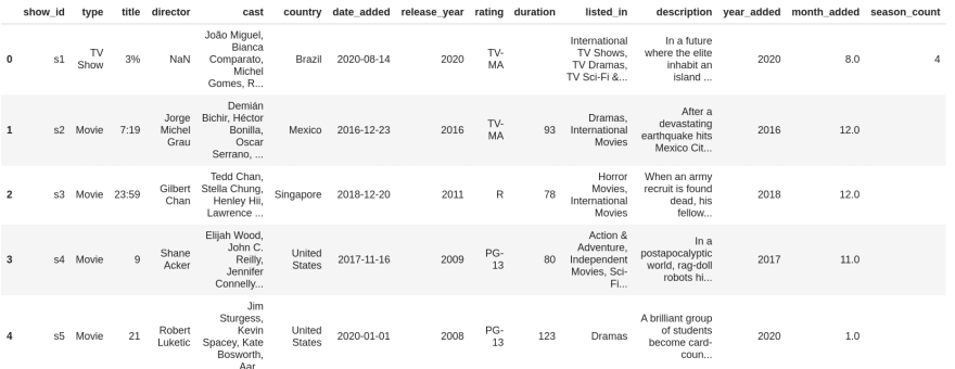
Now we can get to the interesting stuff!
Let me also add that, to XKCDify plots in matplotlib, you just need to engulf all your plotting code within the following block and you’ll be all set:
with plt.xkcd():
    # all your regular visualization code goes in here
First, I thought it would be worth looking at a timeline that depicts the evolution of Netflix over the years.
from datetime import datetime
## these go on the numbers below
tl_dates = [
    "1997\nFounded",
    "1998\nMail Service",
    "2003\nGoes Public",
    "2007\nStreaming service",
    "2016\nGoes Global",
    "2021\nNetflix & Chill"
]
tl_x = [1, 2, 4, 5.3, 8,9]
## the numbers go on these
tl_sub_x = [1.5,3,5,6.5,7]
tl_sub_times = [
    "1998","2000","2006","2010","2012"
]
tl_text = [
    "Netflix.com launched",
    "Starts\nPersonal\nRecommendations","Billionth DVD Delivery","Canadian\nLaunch","UK Launch"]
with plt.xkcd():
# Set figure & Axes
    fig, ax = plt.subplots(figsize=(15, 4), constrained_layout=True)
    ax.set_ylim(-2, 1.75)
    ax.set_xlim(0, 10)
# Timeline : line
    ax.axhline(0, xmin=0.1, xmax=0.9, c='deeppink', zorder=1)
# Timeline : Date Points
    ax.scatter(tl_x, np.zeros(len(tl_x)), s=120, c='palevioletred', zorder=2)
    ax.scatter(tl_x, np.zeros(len(tl_x)), s=30, c='darkmagenta', zorder=3)
    # Timeline : Time Points
    ax.scatter(tl_sub_x, np.zeros(len(tl_sub_x)), s=50, c='darkmagenta',zorder=4)
# Date Text
    for x, date in zip(tl_x, tl_dates):
        ax.text(x, -0.55, date, ha='center',
                fontfamily='serif', fontweight='bold',
                color='royalblue',fontsize=12)
# Stemplot : vertical line
    levels = np.zeros(len(tl_sub_x))
    levels[::2] = 0.3
    levels[1::2] = -0.3
    markerline, stemline, baseline = ax.stem(tl_sub_x, levels, use_line_collection=True)
    plt.setp(baseline, zorder=0)
    plt.setp(markerline, marker=',', color='darkmagenta')
    plt.setp(stemline, color='darkmagenta')
# Text
    for idx, x, time, txt in zip(range(1, len(tl_sub_x)+1), tl_sub_x, tl_sub_times, tl_text):
        ax.text(x, 1.3*(idx%2)-0.5, time, ha='center',
                fontfamily='serif', fontweight='bold',
                color='royalblue', fontsize=11)
ax.text(x, 1.3*(idx%2)-0.6, txt, va='top', ha='center',
            fontfamily='serif',color='royalblue')

# Spine
    for spine in ["left", "top", "right", "bottom"]:
        ax.spines[spine].set_visible(False)
# Ticks
    ax.set_xticks([])
    ax.set_yticks([])
# Title
    ax.set_title("Netflix through the years", fontweight="bold", fontfamily='serif', fontsize=16, color='royalblue')
    ax.text(2.4,1.57,"From DVD rentals to a global audience of over 150m people - is it time for Netflix to Chill?", fontfamily='serif', fontsize=12, color='mediumblue')
plt.show()
This plot paints a pretty decent picture of Netflix’s journey. Also, the plot looks hand-drawn because of the
plt.xkcd() function. Wicked stuff.Next, I decided to take a look at the ratio of Movies vs TV Shows.
col = "type"
grouped = df[col].value_counts().reset_index()
grouped = grouped.rename(columns = {col : "count", "index" : col})
with plt.xkcd():
    explode = (0, 0.1)  # only "explode" the 2nd slice (i.e. 'TV Show')
fig1, ax1 = plt.subplots(figsize=(5, 5), dpi=100)
    ax1.pie(grouped["count"], explode=explode, labels=grouped["type"], autopct='%1.1f%%',
        shadow=True, startangle=90)
    ax1.axis('equal')  # Equal aspect ratio ensures that pie is drawn as a circle.
plt.show()
The number of TV shows on the platform is less than a third of the total content. So probably, both you and I have better chances of finding a relatively good movie than a TV Show on Netflix. *sighs*
For my third visualization, I wanted to make a horizontal bar graph that represented the top 25 countries with the most content. The
country column in the dataframe had a few rows that contained more than 1 country (separated by commas).
To handle this, I split the data in the country column with
", “ as the separator and then put all the countries into a list called categories :from collections import Counter
col = "country"
categories = ", ".join(df[col].fillna("")).split(", ")
counter_list = Counter(categories).most_common(25)
counter_list = [_ for _ in counter_list if _[0] != ""]
labels = [_[0] for _ in counter_list]
values = [_[1] for _ in counter_list]
with plt.xkcd():
fig, ax = plt.subplots(figsize=(10, 10), dpi=100)
y_pos = np.arange(len(labels))
ax.barh(y_pos, values, align='center')
ax.set_yticks(y_pos)
ax.set_yticklabels(labels)
ax.invert_yaxis() # labels read top-to-bottom
ax.set_xlabel('Content')
ax.set_title('Countries with most content')
plt.show()
Some overall thoughts after looking at the plot above:
To take a look at the popular directors and actors, I decided to plot a figure (each) with six subplots from the top six countries with the most content and make horizontal bar charts for each subplot. Take a look at the plots below and read that first line again. 😛
from collections import Counter
from matplotlib.pyplot import figure
import math
colours = ["orangered", "mediumseagreen", "darkturquoise", "mediumpurple", "deeppink", "indianred"]
countries_list = ["United States", "India", "United Kingdom", "Japan", "France", "Canada"]
col = "director"
with plt.xkcd():
    figure(num=None, figsize=(20, 8))
    x=1
    for country in countries_list:
        country_df = df[df["country"]==country]
        categories = ", ".join(country_df[col].fillna("")).split(", ")
        counter_list = Counter(categories).most_common(6)
        counter_list = [_ for _ in counter_list if _[0] != ""]
        labels = [_[0] for _ in counter_list][::-1]
        values = [_[1] for _ in counter_list][::-1]
        if max(values)<10:
            values_int = range(0, math.ceil(max(values))+1)
        else:
            values_int = range(0, math.ceil(max(values))+1, 2)
        plt.subplot(2, 3, x)
        plt.barh(labels,values, color = colours[x-1])
        plt.xticks(values_int)
        plt.title(country)
        x+=1
    plt.suptitle('Popular Directors with the most content')
    plt.tight_layout()
    plt.show()
col = "cast"
with plt.xkcd():
    figure(num=None, figsize=(20, 8))
    x=1
    for country in countries_list:
        df["from_country"] = df['country'].fillna("").apply(lambda x : 1 if country.lower() in x.lower() else 0)
        small = df[df["from_country"] == 1]
        cast = ", ".join(small['cast'].fillna("")).split(", ")
        tags = Counter(cast).most_common(11)
        tags = [_ for _ in tags if "" != _[0]]
        labels, values = [_[0]+"  " for _ in tags][::-1], [_[1] for _ in tags][::-1]
        if max(values)<10:
            values_int = range(0, math.ceil(max(values))+1)
        elif max(values)>=10 and max(values)<=20:
            values_int = range(0, math.ceil(max(values))+1, 2)
        else:
            values_int = range(0, math.ceil(max(values))+1, 5)
        plt.subplot(2, 3, x)
        plt.barh(labels,values, color = colours[x-1])
        plt.xticks(values_int)
        plt.title(country)
        x+=1
    plt.suptitle('Popular Actors with the most content')
    plt.tight_layout()
    plt.show()
I thought it would be quite interesting to look at the oldest movies and TV shows that are available on Netflix and how long back they’re dated.
small = df.sort_values("release_year", ascending = True)
#small.duration stores empty values if the content type is 'TV Show'
small = small[small['duration'] != ""].reset_index()
small[['title', "release_year"]][:15]
small = df.sort_values("release_year", ascending = True)
#small.season_count stores empty values if the content type is 'Movie'
small = small[small['season_count'] != ""].reset_index()
small = small[['title', "release_year"]][:15]
small
Woah, Netflix has some realllyyy old movies and TV shows, some even released more than 80 years ago. Have you watched any of these?
(Fun fact: When he began implementing Python, Guido van Rossum was also reading the published scripts from “Monty Python’s Flying Circus”, a BBC comedy series from the 1970s (that was added on Netflix in 2018). Van Rossum thought he needed a name that was short, unique, and slightly mysterious, so he decided to call the language Python.)
Yes, Netflix is cool and all for having content from a century ago, but does it also have the latest movies and TV shows? To find this out, first I calculated the difference between the date on which the content was added on Netflix and the release year of that content.
df["year_diff"] = df["year_added"]-df["release_year"]Then, I created a scatter plot with x-axis as the year difference and y-axis as the number of movies/TV shows:
col = "year_diff"
only_movies = df[df["duration"]!=""]
only_shows = df[df["season_count"]!=""]
grouped1 = only_movies[col].value_counts().reset_index()
grouped1 = grouped1.rename(columns = {col : "count", "index" : col})
grouped1 = grouped1.dropna()
grouped1 = grouped1.head(20)
grouped2 = only_shows[col].value_counts().reset_index()
grouped2 = grouped2.rename(columns = {col : "count", "index" : col})
grouped2 = grouped2.dropna()
grouped2 = grouped2.head(20)
with plt.xkcd():
    figure(num=None, figsize=(8, 5))
    plt.scatter(grouped1[col], grouped1["count"], color = "hotpink")
    plt.scatter(grouped2[col], grouped2["count"], color = '#88c999')
    values_int = range(0, math.ceil(max(grouped1[col]))+1, 2)
    plt.xticks(values_int)
    plt.xlabel("Difference between the year when the content has been\n added on Netflix and the realease year")
    plt.ylabel("Number of Movies/TV Shows")
    plt.legend(["Movies", "TV Shows"])
    plt.tight_layout()
    plt.show()
As you can see, the majority of the content on Netflix has been added within a year of its release date. So, Netflix does have the latest content most of the time!
If you’re still here, here’s an xkcd comic for you, you’re welcome.

I also wanted to explore the
rating column and compare the amount of content that Netflix has been producing for kids, teens, and adults and if their focus has shifted from one group to the other over the years.To achieve this, first I took a look at the unique ratings in the dataframe:
print(df['rating'].unique())Output:
['TV-MA' 'R' 'PG-13' 'TV-14' 'TV-PG' 'NR' 'TV-G' 'TV-Y' nan 'TV-Y7' 'PG' 'G' 'NC-17' 'TV-Y7-FV' 'UR']Then, I classified the ratings according to the groups (namely — Little Kids, Older Kids, Teens, and Mature) they fall into and changed their values in the
rating column to their group names.ratings_group_list = ['Little Kids', 'Older Kids', 'Teens', 'Mature']
ratings_dict={
'TV-G': 'Little Kids',
'TV-Y': 'Little Kids',
'G': 'Little Kids',
'TV-PG': 'Older Kids',
'TV-Y7': 'Older Kids',
'PG': 'Older Kids',
'TV-Y7-FV': 'Older Kids',
'PG-13': 'Teens',
'TV-14': 'Teens',
'TV-MA': 'Mature',
'R': 'Mature',
'NC-17': 'Mature'
}
for rating_val, rating_group in ratings_dict.items():
df.loc[df.rating == rating_val, "rating"] = rating_groupFinally, I made line plots with year on the x-axis and content count on the y-axis.
df['rating_val']=1
x=0
labels=['kinda\nless', 'not so\nbad', 'holy shit\nthat\'s too\nmany']
with plt.xkcd():
    for r in ratings_group_list:
        grouped = df[df['rating']==r]
        year_df = grouped.groupby(['year_added']).sum()
        year_df.reset_index(level=0, inplace=True)
        plt.plot(year_df['year_added'], year_df['rating_val'], color=colours[x], marker='o')
        values_int = range(2008, math.ceil(max(year_df['year_added']))+1, 2)
        plt.yticks([200, 600, 1000], labels)
        plt.xticks(values_int)
        plt.title('Count of shows and movies that Netflix\n has been producing for different audiences', fontsize=12)
        plt.xlabel('Year', fontsize=14)
        plt.ylabel('Content Count', fontsize=14)
        x+=1
    plt.legend(ratings_group_list)
    plt.tight_layout()
    plt.show()
Okay, so the content count for mature audiences on Netflix is way more than the other groups. Another interesting observation is that there was a surge in the count of content produced for Little Kids from 2019–2020 whereas the content for Older Kids, Teens, and Mature Audiences decreased during that time period.
col = "listed_in"
colours = ["violet", "cornflowerblue", "darkseagreen", "mediumvioletred", "blue", "mediumseagreen", "darkmagenta", "darkslateblue", "seagreen"]
countries_list = ["United States", "India", "United Kingdom", "Japan", "France", "Canada", "Spain", "South Korea", "Germany"]
with plt.xkcd():
    figure(num=None, figsize=(20, 8))
    x=1
    for country in countries_list:
        df["from_country"] = df['country'].fillna("").apply(lambda x : 1 if country.lower() in x.lower() else 0)
        small = df[df["from_country"] == 1]
        genre = ", ".join(small['listed_in'].fillna("")).split(", ")
        tags = Counter(genre).most_common(3)
        tags = [_ for _ in tags if "" != _[0]]
        labels, values = [_[0]+"  " for _ in tags][::-1], [_[1] for _ in tags][::-1]
        if max(values)>200:
            values_int = range(0, math.ceil(max(values)), 100)
        elif max(values)>100 and max(values)<=200:
            values_int = range(0, math.ceil(max(values))+50, 50)
        else:
            values_int = range(0, math.ceil(max(values))+25, 25)
        plt.subplot(3, 3, x)
        plt.barh(labels,values, color = colours[x-1])
        plt.xticks(values_int)
        plt.title(country)
        x+=1
    plt.suptitle('Top Genres')
    plt.tight_layout()
    plt.show()
Key takeaways from this plot:
I finally ended the project with two word clouds — first, a word cloud for the
description column and a second one for the title column.from wordcloud import WordCloud
import random
from PIL import Image
import matplotlib
# Custom colour map based on Netflix palette
cmap = matplotlib.colors.LinearSegmentedColormap.from_list("", ['#221f1f', '#b20710'])
text = str(list(df['description'])).replace(',', '').replace('[', '').replace("'", '').replace(']', '').replace('.', '')
mask = np.array(Image.open('../input/finallogo/New Note.png'))
wordcloud = WordCloud(background_color = 'white', width = 500, height = 200,colormap=cmap, max_words = 150, mask = mask).generate(text)
plt.figure( figsize=(5,5))
plt.imshow(wordcloud, interpolation = 'bilinear')
plt.axis('off')
plt.tight_layout(pad=0)
plt.show()
Live, love, life, friend, family, world, and find are some of the most frequent words to appear in the descriptions of movies and shows. Another interesting thing is that the words — one, two, three, and four — all appear in the word cloud.
cmap = matplotlib.colors.LinearSegmentedColormap.from_list("", ['#221f1f', '#b20710'])
text = str(list(df['title'])).replace(',', '').replace('[', '').replace("'", '').replace(']', '').replace('.', '')
mask = np.array(Image.open('../input/finallogo/New Note.png'))
wordcloud = WordCloud(background_color = 'white', width = 500,  height = 200,colormap=cmap, max_words = 150, mask = mask).generate(text)
plt.figure( figsize=(5,5))
plt.imshow(wordcloud, interpolation = 'bilinear')
plt.axis('off')
plt.tight_layout(pad=0)
plt.show()
Do you see Christmas right at the center of this word cloud? Seems like there is an abundance of Christmas movies on Netflix. Other popular words are — Love, World, Man, Life, Story, Live, Secret, Girl, Boy, American, Game, Night, Last, Time, and Day.
Working on projects like these is what makes Data Science fun!
If you want to add unique projects like this to your resume, join Build To Learn Club.
I’m building it to help aspiring Data professionals build a “dangerously good” resume. It’s for Python enthusiasts who are tired of doing online courses.
30