
26
8 CSS Units to make site Responsive
Today, We live in the world of gadgets. With so many gadgets there are so many screens that too of different sizes from 4" to 13" or larger. You can find a screen of almost any size.
So to provide the contents to the consumer using any type of screen is the responsibility of a developer. This is possible only by using the proper Relative Size Units. And therefore here we will learn about those 8 Units.
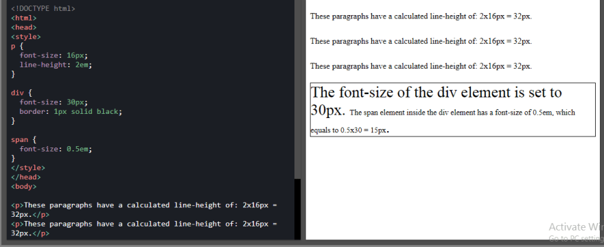
It is relative to the font-size of the parent.2em means 2 times the size of the current font.
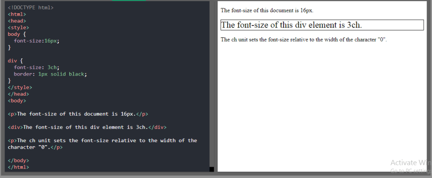
It is relative to the width of the "0" (Zero).
It is relative to the font size of the root element.

It is relative to 1% of the width of the viewport.

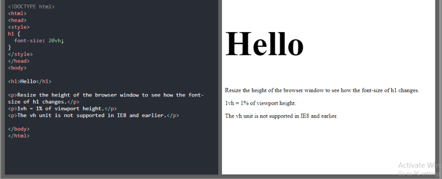
It is relative to 1% of the height of the viewport.
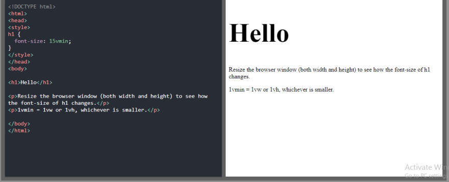
It is relative to 1% of the viewport's smaller dimension.
It is relative to 1% of viewport's larger dimension.

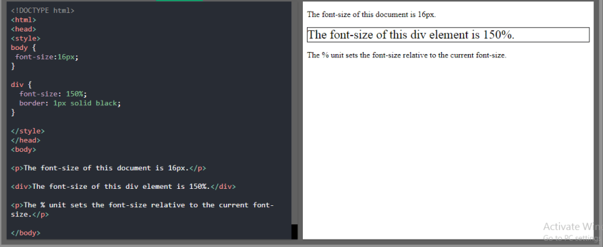
It is relative to the parent element.
That's all for this blog. If you learned from this blog Do Like it and SHARE it with your friends.
We will meet in the Next Blog Until then Keep Learning, Keep Growing.
Reference: W3Schools
Connect with me 👇
| Gmail | DEV | ||
|---|---|---|---|
 |
 |
 |
 |