
37
Styled Components 101 💅 Lecture 1: Introduction + Setup in a React Environment ⚛️
Hello, everybody! 👋
And welcome to the first lecture of the Styled Components 101 series.
And welcome to the first lecture of the Styled Components 101 series.
In this series, we will be thoroughly covering different topics related with Styled Components.
Still don't know what Styled Components are? It seems like you're in luck because we start with the first lesson right now! 👇
Styled Components is a modern tool used to generate components out of the most basic HTML elements, which also allows you to write your custom CSS styles for them in JavaScript by making use of the tagged template literals feature.
Styled Components gets rid of the mapping between components and styles, so, when declaring your CSS, what you're actually doing is creating a regular React component that has its own styles attached.
If you use npm:
npm install styled-componentsIf you use yarn:
yarn add styled-componentsThis is the best part: no extra configuration is needed to start using Styled Components with React. In next lectures, we'll see how to configure Styled Components to get it to work with frameworks like Next.js and how to integrate them with SSR (Server Side Rendering). But, for now, everything's ready on React side. Keep tuned to this series of Styled Components if you want to learn further 😺
There are a couple ways to define a styled component. Personally, my favorite is to keep the component independent, defined in its own file, as we regularly do with React components. But, although conceptually speaking, this is the best way of keeping an app properly modularized and making a good use of abstraction, the approach of declaring a styled component within another component is widely extended as well. Not my favorite, but also valid.
Our first styled component will be a Button. Let's see how we can define it using the Styled Components syntax:
StyledButton.jsimport styled from "styled-components";
export default styled.button`
background-color: #7b4cd8;
color: #fff;
padding: 10px;
border: none;
border-radius: 5px;
font-size: 1.25rem;
`As you can see in the example above, we're using plain CSS syntax inside of backticks to make our styles understandable to JavaScript.
And then, we just have to import our component wherever we want it to be rendered:
import StyledButton from "./components/StyledButton";

const MyApp = () => {
   ...
   return(
      <StyledButton>I am a styled button! 😼</StyledButton>
   )
   ...
}

export default MyApp;
Our first styled button will look like this:

In the previous example, all the styles have been predefined by us and every rendered
StyledButton will have the exact same appearance. But, can we render the same type of component multiple times to create different components and apply different styles to them? The answer is yes and what we're going to do to get this behavior is passing props with custom values to our styled button.
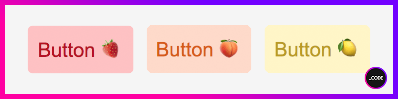
Let's say we want to have three buttons with different background and text colors, but with the same padding, border radius and font size.
Then, we're going to do something like this:
StyledButtonWithProps.jsimport styled from "styled-components";
export default styled.button`
background-color: ${props => props.bg};
color: ${props => props.color};
padding: 10px;
border: none;
border-radius: 5px;
font-size: 1.25rem;
`Let's now call our three buttons:
import StyledButtonWithProps from "./components/StyledButtonWithProps";

const MyApp = () => {
   ...
   return(
      <StyledButtonWithProps bg="#ffc3c3" color="#b6201e">Button 🍓</StyledButtonWithProps>
      <StyledButtonWithProps bg="#ffdaca" color="#d85d16">Button 🍑</StyledButtonWithProps>
      <StyledButtonWithProps bg="#fff4c7" color="#bb9922">Button 🍋</StyledButtonWithProps>
   )
   ...
}

export default MyApp;
And this is the result:
Let's now have a look at how we can style our button component by adding some conditions.
This time, let's say we want to have a different background color for our button depending on its type value, which will be passed in to the component through the prop buttonType.
Then we should do the following:
StyledButton.jsimport styled from "styled-components";
export default styled.button`
${props => props.buttonType && props.buttonType==="primary" ?
`background-color: #7b4cd8; color: #fff; font-size: 1.25rem;` :
`background-color: #ff31ca; color: #ffe6f9; font-size: 0.95rem;`};
padding: 10px;
border: none;
border-radius: 5px;
`If the prop buttonType exists and has a value of primary, then the component will get the first set of style properties. Otherwise, the second.
Note that the style properties defined outside the condition block, remain the same for all components.
Let's now call our buttons:
import StyledButton from "./components/StyledButton";

const MyApp = () => {
   ...
   return(
      <StyledButton buttonType="primary">I am a Primary Button! 👆</StyledButton>
      <StyledButton>I am a different kind of button! 👇</StyledButton>
   )
   ...
}

export default MyApp;
And there we are:

Even though the aforementioned method of passing style properties by using component props works well in every scenario, if our app starts to grow, we can find the process of creating components tedious and repetitive.
And now's when constructors come to rescue: we can have a supercomponent (like a superclass, making reference to inheritance in OOP 🤓), whose styles can be inherited by other components.
This means that every children component that inherits from the supercomponent will have the supercomponent styles in addition to its own custom styles.
Let's see how we can connect them:
SuperButton.jsimport styled from "styled-components";
export default styled.button`
color: #fff;
width: 200px;
height: 50px;
border: none;
border-radius: 5px;
font-size: 1.25rem;
`ChildrenButton.jsimport styled from "styled-components";
import SuperButton from "./SuperButton";
export default styled(SuperButton)`
background-color: ${props => props.bg};
`Let's now call them all:
import ChildrenButton from "./components/ChildrenButton";

const MyApp = () => {
   ...
   return(
      <ChildrenButton bg="deeppink">Hello! 👋 </ChildrenButton>
      <ChildrenButton bg="hotpink">Hello! 👋 </ChildrenButton>
      <ChildrenButton bg="coral">Hello! 👋 </ChildrenButton>
   )
   ...
}

export default MyApp;
And this is the result:

Not really. But you can still make use of their most common features.
Styled Components is based on the paradigm CSS-in-JS, so, technically, we need to use plain CSS to define them. However, we can kinda emulate the behavior of a preprocessor: Styled Components allows us to define variables and nest selectors, for example.
The following snippet would be far correct in Styled Components:
StyledDiv.jsimport styled from "styled-components";
export default styled.div`
p{
font-family: 'Arial', sans-serif;
font-size: 1.5rem;
color: deeppink;
&.primary{
font-weight: bold;
}
}
`And by calling it like this...
import StyledDiv from "./components/StyledDiv";

const MyApp = () => {
   ...
   return(
      <StyledDiv>
         <p className="primary">Hello from a Styled Div!</p>
      </StyledDiv>
   )
   ...
}

export default MyApp;
...this is what we get:

This behavior is doable because Styled Components uses a preprocessor, called stylis, under the hood, so it supports scss-like syntax, which is really cool for nesting and using pseudo-elements and pseudo-classes out of the box.
Absolutely yes.
This time, we're going to define a
<p> element to append some content to it. Let's take a step further and let's add that content based on a condition.StyledP.jsimport styled from "styled-components";
export default styled.p`
{$props => props.before ? `
color: #7b4cd8;
&::before {
content: "${props.before}";
}` :
`color: #ff31ca;`
}
`import StyledP from "./components/StyledP";
const MyApp = () => {
...
return(
<StyledP before="_">CODE</StyledP>
<StyledP>I don't have a ::before 😢</StyledP>
)
...
}
export default MyApp;Et voilà:

If a prop called before is found, its value will be appended in front of the
<p> element and the component will receive the specified text color. Otherwise, since the condition would never be satisfied, the only style property the component would get would be the color.And this is all for this first Styled Components 101 lecture!
In next episodes, we'll keep delving into all the amazing features of Styled Components and how we can integrate them into our projects.
I hope you found this article useful and I see you all in the next 👋
We all know there are million ways to get things done when it comes to programming and development, and we're here to help and learn, so, if you know another possible way to do what others are sharing (not better, not worse, just different), feel free to share it if you feel like it, but, please, always be kind and respectful with the author and the rest of the community. Thank you and happy coding!
37