
36
Creating Patterns with CSS simplified.
Did you know you can create really cool patterns using just the CSS background properties? This blog will get you started on how to approach patterns with CSS and you'll be able to create this 👇 simple bookmark pattern at the end of this article.

Before we begin, let's understand why its worth knowing how to create patterns with CSS:
Before we begin, let's understand why its worth knowing how to create patterns with CSS:
Here are a few places, a CSS background can be preferred over an image:
Let's dive in!
To create our pattern (or any pattern) we need to understand the following 4 background properties:
background-image: This property, although commonly used for assigning images, is where we will use gradient functions to create our patterns.
background-image: linear-gradient(180deg, black, pink);linear-gradient() - this commonly used gradient method will let us specify a direction(in degrees, radians, or simply words) and a bunch of colours which it will arrange in the form of a gradient. For instance,
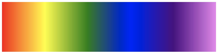
background-image: linear-gradient(90deg, red, orange, yellow, green, blue, indigo, violet);gives us the following gradient,
For patterns we often use multiple gradients in combinations. While using more than one gradient(simply separated by commas) we use the shorthand background property instead of background-image. For instance, the code below -
For patterns we often use multiple gradients in combinations. While using more than one gradient(simply separated by commas) we use the shorthand background property instead of background-image. For instance, the code below -
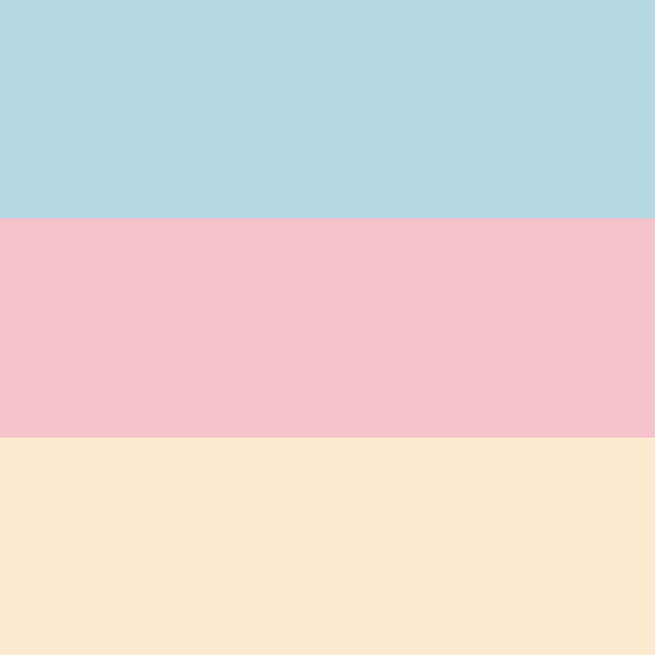
background: linear-gradient(0deg, blanchedalmond 33.3%, transparent 33.3%),
            linear-gradient(0deg, pink 66.6%, transparent 66.6%),
            lightblue
creates the following background:
background-position: This property lets us move around the gradients within the containing element. It takes values in CSS units for the x and y axes as follows
background-position: 10px 20px;background-size: This property lets us define the size within which the pattern is to be created. This is a complex CSS property as it can take multiple types of values. However, with respect to this blog we will need only to understand the following type.
background-size: 60px 60px;Here we have simply defined the width and height of the background i.e. the background is now contained to a 60*60 box in the element.
background-repeat: This property controls how the background gets repeated in the container. Since we are attempting to create a symmetrical pattern we will ensure the value reads:
background-repeat: repeat;To understand them all better look at the following snippet:
background-image: linear-gradient(180deg, black, pink );
background-size: 60px 60px;
background-position: 60px 60px;
background-repeat: no-repeat;
Since we have given a

no-repeat we will see a single box of dimension 60*60px with a gradient at a position of 60px from the top-left of the container as follows.To construct the bookmark pattern let's break it down to simple shapes first

We first set the background to be white. Assign a background-size, for example lets take 40px*40px. To create each triangle we will be using the linear-gradient() function
Triangle 1:
We first set the background to be white. Assign a background-size, for example lets take 40px*40px. To create each triangle we will be using the linear-gradient() function
Triangle 1:
background: linear-gradient(120deg, black 50%, transparent 50%),
            white;
Triangle 2:
background: linear-gradient(60deg, black 50%, transparent 50%),
            white;
Put together we have
background:  linear-gradient(120deg, black 50%, transparent 50%),
             linear-gradient(60deg, transparent 49%, black 50%),
             white
background-size: 40px 40px;
The above code creates 40*40 boxes with 2 triangles placed one above the other but the background looks like this 👇 due to background repeat.

The white stripes can be created with the following code:
background: linear-gradient(0deg, white 15%, transparent 15%) 0 6px,
            linear-gradient(90deg, white 50%, transparent 50%) -10px 0
Note that here, we have specified a background position for each of the gradient right after the function. Now we put it all together as follows,
background: linear-gradient(0deg, white 15%, transparent 15%) 0 6px,
            linear-gradient(90deg, white 50%, transparent 50%) -10px 0,
            linear-gradient(120deg, black 50%, transparent 50%),
            linear-gradient(60deg, transparent 49%, black 50%),
            white;
background-size: 40px 40px;
This gives us the complete pattern. Codepen demo below 👇
I was inspired to learn CSS patterns after visiting Lea Verou's Pattern Gallery. Check it out for some amazing patterns 🤩.
I was further inspired to create my own pattern gallery which is live here and the code can be found on github. Thanks for reading. I'd love to see the patterns that you create. Please feel free to share them with me on twitter or in the comments below!
I was further inspired to create my own pattern gallery which is live here and the code can be found on github. Thanks for reading. I'd love to see the patterns that you create. Please feel free to share them with me on twitter or in the comments below!
36