

32
Build Complex CSS Transitions using Custom Properties and cubic-bezier()
I recently illustrated how we can achieve complex CSS animations using
cubic-bezier() and how to do the same when it comes to CSS transitions. I was able to create complex hover effect without resorting to keyframes. In this article, I will show you how to create even more complex CSS transitions.This time, let's use the
@property feature. It's only supported on Chrome-based browsers for now but we can still play with it and demonstrate how it, too, and can be used to build complex animations.Read the below for more detail about
@propertyI highly recommend reading my previous article because I will be referring to a few concepts I explained in detail there. Also, please note that the demos in this article are best viewed in Chromium-based browsers while
@property support is still limited.Let’s start with a demo:
Click on the button (more than once) and see the "magic" curve we get. It may look trivial at first glance because we can achieve such effect using some complex keyframes. But the trick is that there is no keyframe in there! That animation is done using only a transition.
Awesome right? And this is only the beginning, so let's dig in!
The trick in the previous example relies on this code:
@property --d1 {
  syntax: '<number>';
  inherits: false;
  initial-value: 0;
}
@property --d2 {
  syntax: '<number>';
  inherits: false;
  initial-value: 0;
}

.box {
  top: calc((var(--d1) + var(--d2)) * 1%);
  transition:
    --d1 1s cubic-bezier(0.7, 1200, 0.3, -1200),
    --d2 1s cubic-bezier(0.5, 1200, 0.5, -1200);
}
.box:hover {
  --d1: 0.2;
  --d1: -0.2;
}
We're defining two custom properties,
--d1 and --d2. Then, we declare the top property on a .box element using the sum of both those properties. Nothing overly complex yet—just calc() applied to two variables.The two properties are defined as
<number> and I multiply those values by 1% to convert them into a percentage. We could define these as <percentage> right away to avoid the multiplication. But I've chosen numbers instead in favor of more flexibility for more complex operations later.Notice that we apply a different transition to each variable—more precisely, a different timing-function with the same duration. It's actually a different sinusoidal curve for both variables which is something I get deep into in my previous article.
From there, the property values change when the
.box is hovered, triggering the animation. But why do we get the result we see in the demo?It's all about math. We are adding two functions to create a third one. For
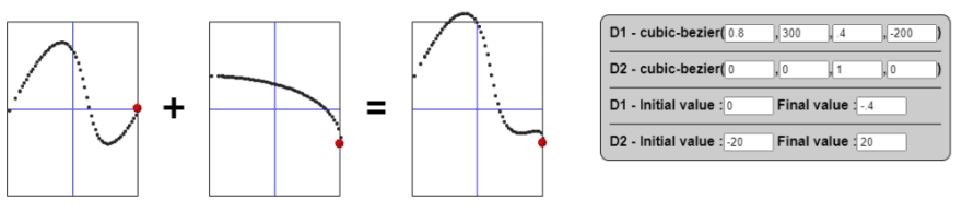
--d1, we have a function (let's call it F1); for --d2 , we have another one (let's call it F2). That means the value of top is F1 + F2.An example to better illustrate:
The first two transitions illustrate each variable individually. The third one is the sum of them. Imagine that at in each step of the animation we take the value of both variables and we add them together to get each point along the final curve.
Let's try another example:
This time, we combine two parabolic curve to get a… well, I don't know its name it but it's another complex curve!
This trick is not only limited to the parabolic and sinusoidal curve. It can work with any kind of timing function even if the result won’t always be a complex curve.
This time:
--d1 goes from 0 to 30 with an ease-in timing function--d2 goes from 0 to -20 with an ease-out timing function
The result? The top value goes from 0 to 10 (30-20) with a custom timing function (the sum of ease-in and ease-out).We are not getting a complex transition in this case — it's more to illustrate the fact that it’s a generic idea not only limited to
cubic-bezier().I think it's time for an interactive demo.
All you have to do is to adjust a few variables to build your own complex transition. I know
cubic-bezier() may be tricky, so consider using this online curve generator and also refer to my previous article.Here are some examples I made:


As you can see, we can combine two different timing functions (created using
cubic-bezier() ) to create a third one, complex enough to achieve a fancy transition. The combinations (and possibilities) are unlimited!In that last example, I wanted to demonstrate how adding two opposite functions lead to the logical result of a constant function (no transition). Hence, the flat line.
You thought we'd stop at only two variables? Certainly not! We can extend the logic to N variables. There is no restriction — we define each one with a timing function and sum them up.
An example with three variables:
In most cases, two variables are plenty to create a fancy curve, but it's neat to know that the trick can be extended to more variables.
Of course! We can also extend the same idea to consider more operations. We can add, subtract, multiply, divide—and even perform a complex formula between variables.
Here, we're multiplying values:


We can also use one variable and multiply it by itself to get a quadratic function!
Let's add more fun in there by introducing
min()/max() to simulate an abs() function:Notice that in the second box we will never get higher than the center point on the y-axis because
top is always a positive value. (I added a margin-top to make the center of box the reference for 0.)

I won't get into all the math, but you can imagine the possibilities we have to create any kind of timing function. All we have to do is to find the right formula either using one variable or combining multiple variables.
Our initial code can be generalized:
@property --d1 { /* we do the same for d2 .. dn */
  syntax: '<number>';
  inherits: false;
  initial-value: i1; /* the initial value can be different for each variable */
}

.box {
  --duration: 1s; /* the same duration for all */
  property: calc(f(var(--d1),var(--d2), .. ,var(--dn))*[1UNIT]);
  transition:
    --d1 var(--duration) cubic-bezier( ... ),
    --d2 var(--duration) cubic-bezier( ... ),
    /* .. */
    --dn var(--duration) cubic-bezier( ... );
}
.box:hover {
  --d1:f1;
  --d2:f2;
  /* .. */
  --dn:f3;
}
This is pseudo-code to illustrate the logic:
@property to define numeric custom properties, each with an initial value.f function that is the formula used between the variables. The function provides a number that we use to multiply the relevant unit. All this runs in calc() applied to the property.Given this, the property transitions from
f(i1,i2,…,in) to f(f1,f2,..,fn) with a custom timing function.We've reached the point where we were able to create a complex timing function by combining basic ones. Let's try another idea that allow us to have more complex timing function: chaining timing functions together.
The trick is to run the transitions sequentially using the
transition-delay property. Let's look back at the interactive demo and apply a delay to one of the variables:We are chaining timing functions instead of adding them together for yet another way to create more complex timing functions! Mathematically, it's still a sum, but since the transitions do not run at the same time, we will be summing a function with a constant, and that simulates the chaining.
Now imagine the case with N variables that we are incrementally delayed. Not only can we create complex transitions this way, but we have enough flexibility to build complex timelines.
If you followed my underline/overlay collections you will remember the below one I built using such technique.
You will find no keyframes there. A small action scene is made entirely using one element and a CSS transition.
Here is a realistic pendulum animation using the same idea:
Or, how about a ball that bounces naturally:
Or maybe a ball rolling along a curve:
See that? We just created complex animations without a single keyframe in the code!
I hope you took three key points away from this article and the previous one:
cubic-bezier() that allow us to create complex transitions without keyframes.calc().transition-delay to build a complex timeline.Thanks to these three features, we have no limits when it comes to creating complex animations without keyframes
32