
36
Jazz up your hamburger menu icon
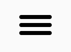
Hamburger icons are pretty ubiquitous these days but I sometimes find them to be a symptom of lazy design. However it's quite easy to make them a little more interesting!
In this blog post I'll explain how to build the below hamburger icon animation using only HTML and CSS.
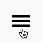
We're not going to be using an SVG or anything so we need to "draw" the icon using HTML and CSS before animating it. We'll be using a checkbox to control the icon's state.
The markup for this component is very simple:
<input type="checkbox" id="hamburger-menu-checkbox">
<label for="hamburger-menu-checkbox">
  <span></span>
</label>
Since we've specified an
id for the checkbox and associated the label with it using the for attribute, clicking the <label> will select and deselect the checkbox. Using CSS we'll hide the actual checkbox and use the contents of <label> as our control.To draw the 3 lines for the hamburger icon, we'll use the
<span> element and its ::before and ::after pseudo elements. The CSS for this is:#hamburger-menu-checkbox ~ label {
/* Show the 'hand' cursor when the user hovers over the icon */
cursor: pointer;
/* Increase the hit area of the icon */
padding: 8px;
display: flex;
align-items: center;
z-index: 99;
}
/* Hide the checkbox control */
#hamburger-menu-checkbox {
display: none;
}
/* Set up the middle line of the hamburger icon */
#hamburger-menu-checkbox ~ label span {
display: inline-block;
width: 32px;
height: 4px;
background-color: black;
border-radius: 3px;
margin-left: var(--space-small);
}
/* Set up the top and bottom lines of the hamburger icon */
#hamburger-menu-checkbox ~ label span::after,
#hamburger-menu-checkbox ~ label span::before {
content: '';
position: absolute;
width: 32px;
height: 4px;
background-color: black;
border-radius: 3px;
}
/* Place the bottom line 8px below the middle */
#hamburger-menu-checkbox ~ label span::after {
margin-top: 8px;
}
/* Place the top line 8px above the middle line */
#hamburger-menu-checkbox ~ label span::before {
margin-top: -8px;
}This will give us a static hamburger icon that we can then animate!
To achieve the animation shown above, we need to make the following transforms on the icon:
Breaking it down to those steps makes it fairly easy to implement some CSS animations to make those transforms. Steps 1 and 3 will be 0.2 seconds long whereas step 2 will be instant as that line will be obscured by the other 2 lines anyway.
Let's take a look at the code:
/* Set the middle line's transition to be instantaneous and to start */
/* 0.2 seconds after the transition is applied */
#hamburger-menu-checkbox ~ label span {
  transition-duration: 0s;
  transition-delay: 0.2s;
}

/* Apply styles to the top and bottom lines */
#hamburger-menu-checkbox ~ label span::after,
#hamburger-menu-checkbox ~ label span::before {
  /* Set the transition time for the top and bottom lines to 0.2s. */
  transition-duration: 0.2s;

  /* Set the transition properties as we need these lines to animate */
  /* upwards or downwards as applicable and then rotate */
  transition-property: margin, transform;

  /* These styles are applied in the unselected state of the */
  /* control, so we need to setup the reverse animation here. */
  /* This property animates the transform (rotation) immediately */
  /* and the margin 0.2s later, as is needed when going from the */
  /* cross to the hamburger icon */
  transition-delay: 0.2s, 0s;
}

/* Hide the middle line when the control is selected */
#hamburger-menu-checkbox:checked ~ label span {
  background-color: transparent;
}

/* Set up the forward animation for the top and bottom lines. */
#hamburger-menu-checkbox:checked ~ label span:before,
#hamburger-menu-checkbox:checked ~ label span:after {
  transition-delay: 0s, 0.2s;
  margin-top: 0;
}

/* Rotate the top line by 45 degrees */
#hamburger-menu-checkbox:checked ~ label span:before {
  transform: rotate(45deg);
}

/* Rotate the bottom line by 45 degrees in the opposite direction */
#hamburger-menu-checkbox:checked ~ label span:after {
  transform: rotate(-45deg);
}
And that's all we need to "draw" and animate a hamburger icon from scratch and make it a little less boring. The best part is we don't even need to use any JavaScript!
36