
26
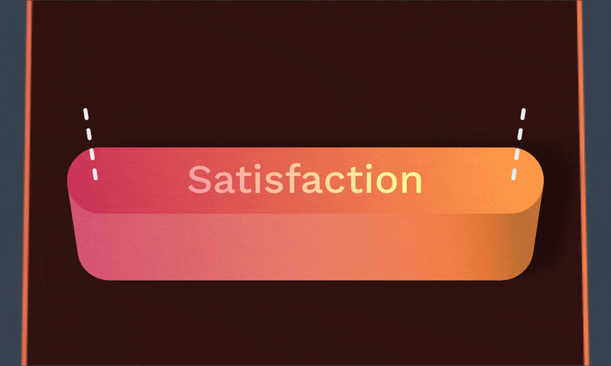
Art of making satisfying buttons
There is only one rule of making a satisfying button. When You press it, You need to feel the same as pressing a physical one.
When You create a website, You need to imagine how it looks in 3D space. Why bother? Because every time You use a shadow, You simulate that the element is either thicker or floating. Understanding 3D will help You fake depth later with CSS. Let's start with shadows.

Firstly there are no shadows without the light. Ask Yourself:
Answers for the above will help You decide what shape of shadows You should use and how to animate them.
Besides the light, there is only one more rule to follow:
Besides the light, there is only one more rule to follow:
The thicker the button, the longer and more diffuse shadows are.
button {
  /* Use realistic shadows */
  box-shadow: 1px -1px 2px 0 hsla(0, 0%, 0%, 0.06),
              3px -3px 4px 0 hsla(0, 0%, 0%, 0.08);
}

/* On button press */
button:active {
  /* Make shadows much smaller */
  box-shadow: 0 0 1px 0 hsla(0, 0%, 0%, 0.06),
              1px -1px 1px 0 hsla(0, 0%, 0%, 0.08);
}
Learn more about realistic shadows in The master guide to smooth, realistic shadows in CSS by Devang Saklani.
Simply put, perspective is an optical illusion that makes things further away appear smaller.
In web design, we need to fake the perspective. To do that, You can make floating elements larger than those below them. In the case of a button, it'll get smaller on press.
That might be enough, but if You want to make perspective more obvious, You may want to show the side of a button. It'll feel like looking at the interface from an angle.
That might be enough, but if You want to make perspective more obvious, You may want to show the side of a button. It'll feel like looking at the interface from an angle.
button {
  /* Make sure that transform-origin match translate() direction.
     It makes translate() and scale() work it the same axis */
  transform-origin: bottom center;
}

/* On button press */
button:active {
  /* Apply perspective transformation */
  transform:
    /* Translate down on Y axis */
    translatey(0.25em)
    /* Make button smaller */
    scale(0.98);
}
For more insight on perspective, check out Fix Your Perspective by Matt Kohr.
Bear in mind, adding
In the case of buttons, we may use a brief
transition is not always necessary for small scale transformations. It's like in classic animation. Our mind will fill the gaps. In the case of buttons, we may use a brief
transition to keep them pressed for a bit longer. It'll help the user to see the impact of clicking it.button {
/* Add short transition with a delay
This transition will control second half of the animation */
transition:
transform 50ms ease-in 10ms,
box-shadow 50ms ease-in 10ms;
}
/* On button press */
button:active {
/* Add short transition
This transition will control first half of the animation */
transition:
transform 50ms ease-in,
box-shadow 50ms ease-in;
}For the best guide on animation — check out 12 Principles of Animation by Frank Thomas & Ollie Johnston.
To optically centre a button's content, try moving it up a bit.
button {
  padding-top: 1rem;
  /* Make bottom padding slightly larger */
  padding-bottom: 1.05rem;
}Go and press some buttons around You. For science!
26