
58
Build a custom field color picker React component for Payload CMS
You can build completely custom field types in Payload by swapping in your own React components for any field in your app. In this tutorial, we'll be showing you how.
Building your own custom fields in Payload is as easy as writing a React component. Any field type can be extended further to make your own custom field, right down to how it works in the admin panel. In this way, you can avoid reinventing everything about a field and only work on adding your custom business logic exactly how you need.
To demonstrate this, we're going to create a simple color picker component for use right in the Payload CMS admin panel. By the end of this guide, we'll have created a modular, reusable custom field that can be dropped into any Payload CMS app with ease.
The component will:
text field typeuseFieldType hookPreferences featureCell component, showing the selected color in the List view of the admin panelAll the code written for this guide can be seen in the Custom Field Guide repository.
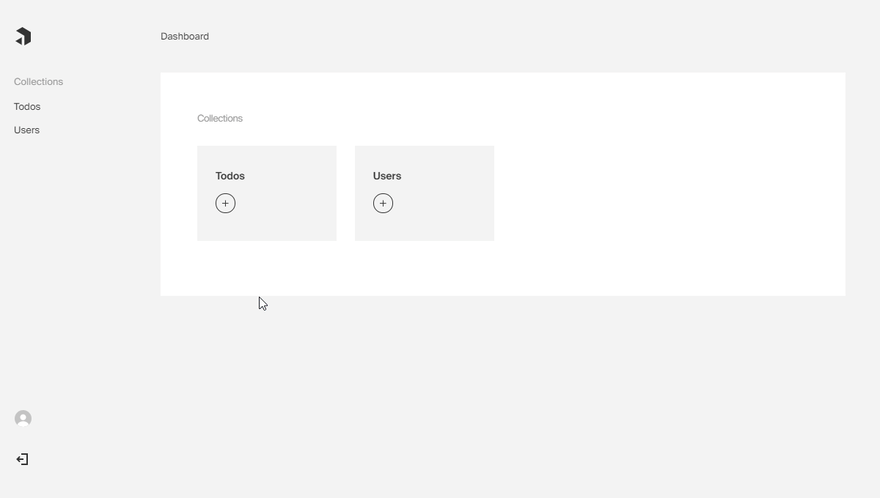
You can use your own Payload app or start a new one for this guide. If you haven't started a project yet, you can get started easily by running
npx create-payload-app in your terminal.For more details on how to start an application, including how to do so from scratch, read the installation documentation.
The first step is to create a new file in your app for our new field's config. That will let us import it to different collections wherever it is needed. Because we want our field to store a string in the database, just like the built-in
text field type does, we'll set our field's type equal to text. That will tell Payload how to handle storing the data. We'll also write a simple validation function to tell the backend and frontend what to allow to be saved.import { Field } from 'payload/types';
export const validateHexColor = (value: string): boolean | string => {
return value.match(/^#(?:[0-9a-fA-F]{3}){1,2}$/).length === 1 || `${value} is not a valid hex color`;
}
const colorField: Field = {
name: 'color',
type: 'text',
validate: validateHexColor,
required: true,
};
export default colorField;Note that though code snippets are TypeScript, it can be done the same way in regular JavaScript by omitting the extra
type declarations.
We'll import the field to an existing collection, so we can see it in use, before building it up a bit more.
/src/collections/ToDoLists.ts:import { CollectionConfig } from 'payload/types';
import colorField from '../color-picker/config';
const Todo: CollectionConfig = {
fields: [
colorField,
]
}This is a good time to mention that because we're just dealing with JavaScript, you could import this field and use it anywhere. You could also change individual properties specific to this collection by destructuring the object and add extra properties you wish to set. To do that, in place of the imported
colorField instead do { ...colorField, required: false }, or any other properties as needed.So far, the default
Text component is still rendering in the admin panel. Let's swap that out with a custom component, and modify the field's config to include it.Custom field components are just basic React components, so let's scaffold that out and then build the extra features one-by-one. Create a new file for the
Field component:/src/color-picker/InputField.tsx:import React from 'react'
// this is how we'll interface with Payload itself
import { useFieldType } from 'payload/components/forms';
// we'll re-use the built in Label component directly from Payload
import { Label } from 'payload/components/forms';
// we can use existing Payload types easily
import { Props } from 'payload/components/fields/Text';
// we'll import and reuse our existing validator function on the frontend, too
import { validateHexColor } from './config';
// Import the SCSS stylesheet
import './styles.scss';
// keep a list of default colors to choose from
const defaultColors = [
'#333333',
'#9A9A9A',
'#F3F3F3',
'#FF6F76',
'#FDFFA4',
'#B2FFD6',
'#F3DDF3',
];
const baseClass = 'custom-color-picker';
const InputField: React.FC<Props> = (props) => {
const {
path,
label,
required
} = props;
const {
value = '',
setValue,
} = useFieldType({
path,
validate: validateHexColor,
});
return (
<div className={baseClass}>
<Label
htmlFor={path}
label={label}
required={required}
/>
<ul className={`${baseClass}__colors`}>
{defaultColors.map((color, i) => (
<li key={i}>
<button
type="button"
key={color}
className={`chip ${color === value ? 'chip--selected' : ''} chip--clickable`}
style={{ backgroundColor: color }}
aria-label={color}
onClick={() => setValue(color)}
/>
</li>
)
)}
</ul>
</div>
)
};
export default InputField;You'll see above that Payload automatically provides our React component with the
props that it needs. The most important prop is the path, which we pass on to the useFieldType hook. This hook allows us to set the field's value and have it work with the rest of the Payload form.The component returns the markup for the component, complete with a Label and a list of clickable colors.
This won't be very functional until we add styling. Let's add a new line to import a new stylesheet:
import './styles.scss';. Create that file and paste in the following SCSS:/src/color-picker/styles.scss:@import '~payload/scss';
.custom-color-picker {
&__colors {
display: flex;
flex-wrap: wrap;
list-style: none;
padding: 0;
margin: 0;
}
}
.chip {
border-radius: 50%;
border: $style-stroke-width-m solid #fff;
height: base(1.25);
width: base(1.25);
margin-right: base(.5);
box-shadow: none;
&--selected {
box-shadow: 0 0 0 $style-stroke-width-m $color-dark-gray;
}
&--clickable {
cursor: pointer;
}
}The simple styles above will give the color "chips" a clickable circle to set the value and show which is currently selected.
Tip:
You'll notice that the SCSS above imports Payload styles directly. By recycling Payload styles as much as possible, the UI elements we are adding will not stand out and look unfamiliar to our admin panel users.
Another part of the custom component that we can add is a nice way to display the color right in a collection
List. There, we can create the following:/src/color-picker/Cell.tsx:import React from 'react';
import { Props } from 'payload/components/views/Cell';
import './styles.scss';
const Cell: React.FC<Props> = (props) => {
const { cellData } = props;
if (!cellData) return null;
return (
<div
className="chip"
style={{ backgroundColor: cellData as string }}
/>
)
}
export default Cell;Note that we can reuse our styles here as we want the color "chip" to appear the same. We get the cellData from the Prop and that will be our saved hex values for the field.
Now that we have a functional component to serve as our input, we can update
color-picker/config.ts with a new admin property:import { Field } from 'payload/types';
import InputField from './InputField';
import Cell from './Cell';
const colorField: Field = {
// ...
admin: {
components: {
Field: InputField,
Cell,
},
},
};Now is a good time to see it working! After you login and navigate to the url to create a new Todo item you will see the component and can use it to create a new Todo list.

Back in the
List view, you should also be able to see the color that was chosen right in the table. If you don't see the color column, expand the column list to include it.
What we have is nice if we want to control available color options closely, but we know our users want to add their own too. Let's add to the UI a way to do that and while we're at it we should store the user's newly added colors in Payload's user preferences to re-use color options without re-entering them every time.
To make the interactions possible, we'll add more state variables and
useEffect hooks. We also need to import and use the validation logic from the config, and set the value in a new Input which we can import styles directly from Payload to make it look right.By adding Payload's
usePreferences() hook, we can get and set user specific data relevant to the color picker all persisted in the database without needing to write new endpoints. You will see we call setPreference() and getPreference() to get and set the array of color options specific to the authenticated user.Note that the preferenceKey should be something completely unique across your app to avoid overwriting other preference data.
Now, for the complete component code:
/src/color-picker/InputField.tsx:import React, { useEffect, useState, useCallback, Fragment } from 'react'
// this is how we'll interface with Payload itself
import { useFieldType } from 'payload/components/forms';
// retrieve and store the last used colors of your users
import { usePreferences } from 'payload/components/preferences';
// re-use Payload's built-in button component
import { Button } from 'payload/components';
// we'll re-use the built in Label component directly from Payload
import { Label } from 'payload/components/forms';
// we can use existing Payload types easily
import { Props } from 'payload/components/fields/Text';
// we'll import and reuse our existing validator function on the frontend, too
import { validateHexColor } from './config';
// Import the SCSS stylesheet
import './styles.scss';
// keep a list of default colors to choose from
const defaultColors = [
'#333333',
'#9A9A9A',
'#F3F3F3',
'#FF6F76',
'#FDFFA4',
'#B2FFD6',
'#F3DDF3',
];
const baseClass = 'custom-color-picker';
const preferenceKey = 'color-picker-colors';
const InputField: React.FC<Props> = (props) => {
const {
path,
label,
required
} = props;
const {
value = '',
setValue,
} = useFieldType({
path,
validate: validateHexColor,
});
const { getPreference, setPreference } = usePreferences();
const [colorOptions, setColorOptions] = useState(defaultColors);
const [isAdding, setIsAdding] = useState(false);
const [colorToAdd, setColorToAdd] = useState('');
useEffect(() => {
const mergeColorsFromPreferences = async () => {
const colorPreferences = await getPreference<string[]>(preferenceKey);
if (colorPreferences) {
setColorOptions(colorPreferences);
}
};
mergeColorsFromPreferences();
}, [getPreference, setColorOptions]);
const handleAddColor = useCallback(() => {
setIsAdding(false);
setValue(colorToAdd);
// prevent adding duplicates
if (colorOptions.indexOf(colorToAdd) > -1) return;
let newOptions = colorOptions;
newOptions.unshift(colorToAdd);
// update state with new colors
setColorOptions(newOptions);
// store the user color preferences for future use
setPreference(preferenceKey, newOptions);
}, [colorOptions, setPreference, colorToAdd, setIsAdding, setValue]);
return (
<div className={baseClass}>
<Label
htmlFor={path}
label={label}
required={required}
/>
{isAdding && (
<div>
<input
className={`${baseClass}__input`}
type="text"
placeholder="#000000"
onChange={(e) => setColorToAdd(e.target.value)}
value={colorToAdd}
/>
<Button
className={`${baseClass}__btn`}
buttonStyle="primary"
iconPosition="left"
iconStyle="with-border"
size="small"
onClick={handleAddColor}
disabled={validateHexColor(colorToAdd) !== true}
>
Add
</Button>
<Button
className={`${baseClass}__btn`}
buttonStyle="secondary"
iconPosition="left"
iconStyle="with-border"
size="small"
onClick={() => setIsAdding(false)}
>
Cancel
</Button>
</div>
)}
{!isAdding && (
<Fragment>
<ul className={`${baseClass}__colors`}>
{colorOptions.map((color, i) => (
<li key={i}>
<button
type="button"
key={color}
className={`chip ${color === value ? 'chip--selected' : ''} chip--clickable`}
style={{ backgroundColor: color }}
aria-label={color}
onClick={() => setValue(color)}
/>
</li>
)
)}
</ul>
<Button
className="add-color"
icon="plus"
buttonStyle="icon-label"
iconPosition="left"
iconStyle="with-border"
onClick={() => {
setIsAdding(true);
setValue('');
}}
/>
</Fragment>
)}
</div>
)
};
export default InputField;We made a lot of changes—hopefully the code speaks for itself. Everything we did adds to the interactivity and usability of the field.
Lastly we want to finish off the styles of our input with a few new pieces.
Update your
styles.scss with the following:/src/color-picker/styles.scss:@import '~payload/scss';
.add-color.btn {
margin: 0;
padding: 0;
border: $style-stroke-width-m solid #fff;
}
.custom-color-picker {
&__btn.btn {
margin: base(.25);
&:first-of-type {
margin-left: unset;
}
}
&__input {
// Payload exports a mixin from the vars file for quickly applying formInput rules to the class for our input
@include formInput
}
&__colors {
display: flex;
flex-wrap: wrap;
list-style: none;
padding: 0;
margin: 0;
}
}
.chip {
border-radius: 50%;
border: $style-stroke-width-m solid #fff;
height: base(1.25);
width: base(1.25);
margin-right: base(.5);
box-shadow: none;
&--selected {
box-shadow: 0 0 0 $style-stroke-width-m $color-dark-gray;
}
&--clickable {
cursor: pointer;
}
}The custom color picker in this guide serves as an example of one way you could extend the UI to create a better authoring experience for users.
I hope you're inspired to create your own fantastic UI components using Payload CMS. Feel free to share what you build in the GitHub discussions.
58