
41
Everything You Need to Know About CSS Transition and Animation
Animation is a great way to bring your websites to life, but animation in CSS can be a bit confusing. This is where this guide comes in! So without further a-do, let's dive in.
Disclaimer: I'm no expert on animation, so take this section with a grain of salt; and if you find any errors in my explanation, feel free to correct me 😃
Wikipedia defines animation as:
a method in which figures are manipulated to appear as moving.
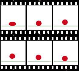
Animation is done by showing images sequentially as such high speeds that they appear to be moving to the human eye.
this can be done in a number of ways, one of the most well-known ways is frame-by-frame animation, where every frame is drawn by hand.
this can be done in a number of ways, one of the most well-known ways is frame-by-frame animation, where every frame is drawn by hand.
In CSS, things are a little bit different. We don't draw the frames, rather we tell the browser how to draw the frames for us; this is done by two properties:
transition and animation.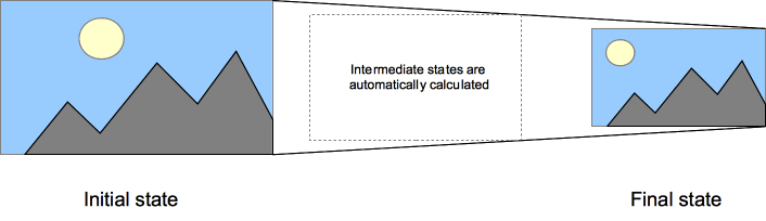
The
transition property allows to define a... well, transition for a CSS property. this transition starts at the initial value (or state) of that property, and ends at the final value. The transition is triggered as soon as the value of that property changes.The
transition property is made of 3 required values and 1 optional value.Required values:
Optional values:
So defining a transition would look like this:
div {
  transition: transition-property duration timing-function (delay?);
}
You can also set each property on its own.
You might be wondering, why are we using
transform instead of height? that's a good question! The reason for that is that there are performance concerns when using properties like height. And the reason for that comes down to layout. Properties like height cause layout shifting, and therefore, layout recalculations; which can be very expensive.transform and opacity are the safest bet you have when it comes to animation performance in CSS. If you would like to learn more about performant animations you can read this article
And if you want to learn more about transforms, you can read this article
Although keep in mind that transforms don't alter the layout of the page (that's why they're performant), which means that the parent element won't change in size, nor will the rest of the document shift. So be wary of that when using transforms.
The transition property is the property you would like to transition. For example:
color, width, or transform. It can also be all to encompass all possible properties, but I would generally advise against this for the sake of predictability, clarity, and performance.The amount of time the transition will last for. Expressed in seconds
Note: 1s = 1000ms
s or milliseconds ms.Note: 1s = 1000ms
Timing is an extremely important part of animation. It defines how things move from one state to another.
In the real world, things don't move at perfectly linear pace; things ease in, ease-out, and move in all sorts of wacky ways.
Timing functions allow us to create lively, realistic, and expressive animations.
Timing functions are expressed as a
cubic-bezier, A thing I know very little about. thankfully there are tools online that allow you to make and visualize these functions. CSS also includes five ones out-of-the-box! they're linear, ease, ease-in, ease-out, and ease-in-out; and they should enough for 90% of your animation needs.Delay is the amount of time before the transition occurs. Expressed in seconds
s or milliseconds ms.If we have navbar that is hidden on small screens. And we want it to expand when the user clicks on a button, We would attach an
active class to our navbar when the user clicks on the button. Like so:.navbar {
transform: scaleY(0);
}
.navbar.active {
transform: scaleY(1);
}this causes our navbar to instantly appear as soon as our user clicks our button. But we may want to animate our navbar expanding; in this case we would define a transition. But how do we do that?
If we want to animate our navbar, we would do something like this:
.navbar-list {
  transform: scaleY(0);
  transform-origin: top;
  transition: transform 250ms ease-out;
}

.navbar.active .navbar-list {
  transform: scaleY(1);
}
This would cause the navbar to gracefully expand when activated. Making it more visually appealing.
animation defines a... you guessed it! animation. And it works largely in the same way as transition. But there a few key differences.Unlike
transition, which triggers when a property updates; animation is active from the moment it's applied.Also, instead of taking a
transition-property, animation takes something called keyframes. and we will discuss those soon.The
animation property is made of 3 required values and 5 optional valusRequired values:
Optional values:
So defining an animation would look like this:
div {
  animation: animation-name duration timing-function (delay?) (iteration-count?) (direction?) (fill-mode?) (play-state?);
}
You can also set each property on its own.
Wikipedia defines keyframes as:
A key frame (or keyframe) in animation and film-making is a drawing or shot that defines the starting and ending points of any smooth transition. These are called frames because their position in time is measured in frames on a strip of film or on a digital video editing timeline. A sequence of key frames defines which movement the viewer will see, whereas the position of the key frames on the film, video, or animation defines the timing of the movement.
In CSS keyframes are defined using the
@keyframes at-rule. and is a collection of CSS properties associated with specific points in the animation timeline, like 25% from, or to.from is the equivalent of 0%to is the equivalent of 100%If a set of keyframes does not have a starting state (
0% or from). whatever state they were in before the animation starts will be their starting state.Therefore, keyframes define a general sequence of states, but does not define their duration, flow, or direction.
So defining keyframes looks like:
@keyframes spin {
  from {
    transform: rotate(0);
  }

  to {
    transform: rotate(360deg);
  }
}
The
spin keyframes dictates that the element will start at 0 degrees of rotation of rotation, and end at a full 360 degrees.How many times the animation repeats. It can be a number or
infinite to make it repeat indefinitely.What direction the animation animation flows in.
normal means that the animation moves normally (from start to end). reverse means that the animation moves backwards (from end to start). alternate means that the animation moves forwards one time, and backwards the other time; keep in mind this needs an iteration count higher than 1. and alternate-reverse is like alternate, but starts as reverse.sets how a CSS animation applies styles to its target before and after its execution. This property is outside the scope of this article.
sets whether an animation is running or paused.
It has two values.
running and paused. pretty self explanatory.This property is can be useful for manipulating animations with JavaScript.
Using the
spin keyframes we made earlier we can make a loading spinner! like so:@keyframes spin {
from {
transform: rotate(0);
}
to {
transform: rotate(360deg);
}
}
.spinner {
animation: spin 1s linear infinite;
}The animation we defined would make the spinner rotate a full 360 degrees in 1 second and repeat an infinite number of times. effectively creating a spinning animation.
Be careful, when adding your animations. You may think that super flashy, 3 second long animation is cool, but your users might disagree.
Make sure your animations are smooth on all of your target devices. Even the lower-end ones. Read this article for more info
Make sure that animations are reduced (or even removed) when a user has (prefers-reduced-motion:reduce)
Animations that change visual aspects of an element but don't alter it's layout can still cause performance issues on a large scale. But small effects should be fine (like a hover effect on a button)
And that concludes this article. Man this was a doosey to write. 😅 Also I'm sure I made a few mistakes somewhere in there so any comments and suggestions are welcome. 😊
41