20
loading...

HTML and CSS. We will also add some cool hover effect on our links.This tutorial needs you to have a basic understanding of HTML and CSS.

You can support my channel by just subscribing. Please get me to 5k subscribers. 🤗

<!DOCTYPE html>
<html>
  <head>
    <title>Nav Bar</title>
  </head>
  <body>
    <nav>
      <div class="logo">
        <h2>NavBar</h2>
      </div>
      <div class="nav-items">
        <ul class="overview">
          <li><a href="#">Home</a></li>
          <li><a href="#">Dashboard</a></li>
          <li><a href="#">Rates</a></li>
          <li><a href="#">Contact</a></li>
        </ul>
        <ul class="account">
          <li><a href="#">Notifications</a></li>
          <li><a href="#">Settings</a></li>
        </ul>
      </div>
    </nav>
    <div class="hero-section"></div>
  </body>
</html>nav tag inside the body. Inside the nav tag we added two div tags. One will hold our logo and the other one will hold our nav items. Inside the nav items, we used two ul elements to divide our links into overview links and account links. We then added a tags for our links inside the li. It is important to note how the code is organized because it will be useful when we layout our nav using css flexbox. nav we are also adding a div with a class of hero-section. We will use it to add the background image. 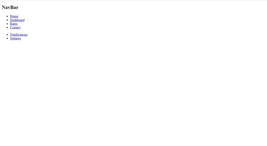
link tag at our head as shown below.<head>
<meta charset="utf-8" />
<title>Nav Bar</title>
<meta name="viewport" content="width=device-width, initial-scale=1" />
<link rel="stylesheet" type="text/css" media="screen" href="main.css" />
</head>meta tags. The first meta tag will tell the browser to use UTF-8 character encoding which is a method of converting your typed character code into machine readable code. The second meta tag helps in controlling layout in mobile browsers. The width property controls the size of the viewport. The initial-scale controls the zoom level when the page first loads. This will come into play when making our navbar to be mobile responsive.@import url("https://fonts.googleapis.com/css2?family=Rubik&display=swap");
* {
margin: 0;
padding: 0;
box-sizing: border-box;
font-family: "Rubik", sans-serif;
}Rubik font from google fonts. Be free to use any font that you want. We are then clearing the defaults by setting the margin and padding for all elements to 0. Setting the box-sizing property as border-box allows us to include the padding and border in an element's total width and height.nav below:/* Hero section */
.hero-section {
height: 100vh;
background: url("hero-bg.jpg") center no-repeat;
background-size: cover;
}
/* Nav */
nav {
height: 70px;
background: rgb(20, 20, 20);
color: rgb(220, 220, 220);
padding: 0 2rem;
display: flex;
justify-content: space-between;
align-items: center;
position: sticky;
top: 0;
}display: flex at our nav. This will make the nav element to be a flex container and by default the flex direction will be row. This will make our logo and nav-items to be side by side. We then push them apart by using justify-content: space-between. Adding position: sticky and top:0 will make our nav to remain at the top even after scroll.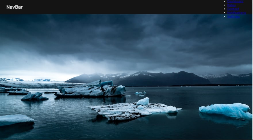
vertically. To arrange them in a horizontal manner, lets add the following stylings..nav-items,
.overview,
.account {
display: flex;
}
.overview {
margin-right: 4rem;
}nav-items will place the overview section and the account section side by side. We then place all the li items to be side by side by adding a display of flex to the overview and account. Adding a margin-right to the overview will simply create some spacing between our overview and account.
hover effect.logo h2 {
text-decoration: overline;
font-style: italic;
color: rgb(0, 206, 206);
cursor: pointer;
margin: 0 0.5rem;
}
nav li {
list-style: none;
margin: 0 0.5rem;
}
nav a {
text-decoration: none;
color: rgb(220, 220, 220);
}
nav a:hover {
color: #a0ebfd;
}
nav a::after {
content: "";
display: block;
height: 3px;
background: #a0ebfd;
width: 0%;
transition: all ease-in-out 300ms;
}
nav a:hover::after {
width: 100%;
}list-style and text-decoration. We are then changing the color for our links and changing it again on hover. We are also creating some spacing between our links using margin: 0 0.5rem at our li.::after. This is called an after pseudo selector. It can enable us to add some content after any html element. What we want to do in this case is to add some underline hover effect. We will create a line under our links by adding a display of block to a::after. This will allow us to give it a height of 3px (you are free to change this value) and a color.0% and transition it to 100% on hover. At this point our desktop nav is complete and it has the nice hover effect.
<!DOCTYPE html>
<html>
<head>
<meta charset="utf-8" />
<meta http-equiv="X-UA-Compatible" content="IE=edge" />
<title>Nav Bar</title>
<meta name="viewport" content="width=device-width, initial-scale=1" />
<link rel="stylesheet" type="text/css" media="screen" href="main.css" />
</head>
<body>
<nav>
<input type="checkbox" id="check" />
<label for="check" class="menu">
<svg
xmlns="http://www.w3.org/2000/svg"
width="30"
height="30"
fill="currentColor"
class="bi bi-list"
viewBox="0 0 16 16"
>
<path
fill-rule="evenodd"
d="M2.5 12a.5.5 0 0 1 .5-.5h10a.5.5 0 0 1 0 1H3a.5.5 0 0 1-.5-.5zm0-4a.5.5 0 0 1 .5-.5h10a.5.5 0 0 1 0 1H3a.5.5 0 0 1-.5-.5zm0-4a.5.5 0 0 1 .5-.5h10a.5.5 0 0 1 0 1H3a.5.5 0 0 1-.5-.5z"
/>
</svg>
</label>
<div class="logo">
<h2>NavBar</h2>
</div>
<div class="nav-items">
<ul class="overview">
<h3>Overview</h3>
<li>
<a href="#"
><svg
xmlns="http://www.w3.org/2000/svg"
width="16"
height="16"
fill="currentColor"
class="bi bi-house-fill"
viewBox="0 0 16 16"
>
<path
fill-rule="evenodd"
d="m8 3.293 6 6V13.5a1.5 1.5 0 0 1-1.5 1.5h-9A1.5 1.5 0 0 1 2 13.5V9.293l6-6zm5-.793V6l-2-2V2.5a.5.5 0 0 1 .5-.5h1a.5.5 0 0 1 .5.5z"
/>
<path
fill-rule="evenodd"
d="M7.293 1.5a1 1 0 0 1 1.414 0l6.647 6.646a.5.5 0 0 1-.708.708L8 2.207 1.354 8.854a.5.5 0 1 1-.708-.708L7.293 1.5z"
/>
</svg>
Home</a
>
</li>
<li>
<a href="#">
<svg
xmlns="http://www.w3.org/2000/svg"
width="16"
height="16"
fill="currentColor"
class="bi bi-speedometer"
viewBox="0 0 16 16"
>
<path
d="M8 2a.5.5 0 0 1 .5.5V4a.5.5 0 0 1-1 0V2.5A.5.5 0 0 1 8 2zM3.732 3.732a.5.5 0 0 1 .707 0l.915.914a.5.5 0 1 1-.708.708l-.914-.915a.5.5 0 0 1 0-.707zM2 8a.5.5 0 0 1 .5-.5h1.586a.5.5 0 0 1 0 1H2.5A.5.5 0 0 1 2 8zm9.5 0a.5.5 0 0 1 .5-.5h1.5a.5.5 0 0 1 0 1H12a.5.5 0 0 1-.5-.5zm.754-4.246a.389.389 0 0 0-.527-.02L7.547 7.31A.91.91 0 1 0 8.85 8.569l3.434-4.297a.389.389 0 0 0-.029-.518z"
/>
<path
fill-rule="evenodd"
d="M6.664 15.889A8 8 0 1 1 9.336.11a8 8 0 0 1-2.672 15.78zm-4.665-4.283A11.945 11.945 0 0 1 8 10c2.186 0 4.236.585 6.001 1.606a7 7 0 1 0-12.002 0z"
/>
</svg>
Dashboard</a
>
</li>
<li>
<a href="#"
><svg
xmlns="http://www.w3.org/2000/svg"
width="16"
height="16"
fill="currentColor"
class="bi bi-bar-chart-fill"
viewBox="0 0 16 16"
>
<path
d="M1 11a1 1 0 0 1 1-1h2a1 1 0 0 1 1 1v3a1 1 0 0 1-1 1H2a1 1 0 0 1-1-1v-3zm5-4a1 1 0 0 1 1-1h2a1 1 0 0 1 1 1v7a1 1 0 0 1-1 1H7a1 1 0 0 1-1-1V7zm5-5a1 1 0 0 1 1-1h2a1 1 0 0 1 1 1v12a1 1 0 0 1-1 1h-2a1 1 0 0 1-1-1V2z"
/>
</svg>
Rates</a
>
</li>
<li>
<a href="#"
><svg
xmlns="http://www.w3.org/2000/svg"
width="16"
height="16"
fill="currentColor"
class="bi bi-envelope-fill"
viewBox="0 0 16 16"
>
<path
d="M.05 3.555A2 2 0 0 1 2 2h12a2 2 0 0 1 1.95 1.555L8 8.414.05 3.555zM0 4.697v7.104l5.803-3.558L0 4.697zM6.761 8.83l-6.57 4.027A2 2 0 0 0 2 14h12a2 2 0 0 0 1.808-1.144l-6.57-4.027L8 9.586l-1.239-.757zm3.436-.586L16 11.801V4.697l-5.803 3.546z"
/>
</svg>
Contact</a
>
</li>
</ul>
<ul class="account">
<h3>Account</h3>
<li>
<a href="#"
><svg
xmlns="http://www.w3.org/2000/svg"
width="16"
height="16"
fill="currentColor"
class="bi bi-bell-fill"
viewBox="0 0 16 16"
>
<path
d="M8 16a2 2 0 0 0 2-2H6a2 2 0 0 0 2 2zm.995-14.901a1 1 0 1 0-1.99 0A5.002 5.002 0 0 0 3 6c0 1.098-.5 6-2 7h14c-1.5-1-2-5.902-2-7 0-2.42-1.72-4.44-4.005-4.901z"
/>
</svg>
Notifications</a
>
</li>
<li>
<a href="#"
><svg
xmlns="http://www.w3.org/2000/svg"
width="16"
height="16"
fill="currentColor"
class="bi bi-gear-fill"
viewBox="0 0 16 16"
>
<path
d="M9.405 1.05c-.413-1.4-2.397-1.4-2.81 0l-.1.34a1.464 1.464 0 0 1-2.105.872l-.31-.17c-1.283-.698-2.686.705-1.987 1.987l.169.311c.446.82.023 1.841-.872 2.105l-.34.1c-1.4.413-1.4 2.397 0 2.81l.34.1a1.464 1.464 0 0 1 .872 2.105l-.17.31c-.698 1.283.705 2.686 1.987 1.987l.311-.169a1.464 1.464 0 0 1 2.105.872l.1.34c.413 1.4 2.397 1.4 2.81 0l.1-.34a1.464 1.464 0 0 1 2.105-.872l.31.17c1.283.698 2.686-.705 1.987-1.987l-.169-.311a1.464 1.464 0 0 1 .872-2.105l.34-.1c1.4-.413 1.4-2.397 0-2.81l-.34-.1a1.464 1.464 0 0 1-.872-2.105l.17-.31c.698-1.283-.705-2.686-1.987-1.987l-.311.169a1.464 1.464 0 0 1-2.105-.872l-.1-.34zM8 10.93a2.929 2.929 0 1 1 0-5.86 2.929 2.929 0 0 1 0 5.858z"
/>
</svg>
Settings</a
>
</li>
</ul>
</div>
</nav>
<div class="hero-section"></div>
</body>
</html>svg icons. But don't worry, I will try to break everything down for you. The first thing we are adding is a checkbox just after the opening nav tag. We then add a label for this checkbox. The label holds the svg menu icon. I got the svg icons from https://icons.getbootstrap.com/
id of the checkbox is similar to the for attribute of the label. This links our label to our checkbox such that when we click on the label, it should check and uncheck the check box. This is what will help us to show and hide the side navbar depending on whether the checkbox is checked or not. I also manually manipulated the width and height of our svg to 30<input type="checkbox" id="check" />
<label for="check" class="menu">
<svg
xmlns="http://www.w3.org/2000/svg"
width="30"
height="30"
fill="currentColor"
class="bi bi-list"
viewBox="0 0 16 16"
>
<path
fill-rule="evenodd"
d="M2.5 12a.5.5 0 0 1 .5-.5h10a.5.5 0 0 1 0 1H3a.5.5 0 0 1-.5-.5zm0-4a.5.5 0 0 1 .5-.5h10a.5.5 0 0 1 0 1H3a.5.5 0 0 1-.5-.5zm0-4a.5.5 0 0 1 .5-.5h10a.5.5 0 0 1 0 1H3a.5.5 0 0 1-.5-.5z"
/>
</svg>
</label>a tags just before the text. Note how there is a spacing between the icons and the text.
nav svg, .nav-items h3, #check, .menu {
display: none;
}/* Responsive */
@media (max-width: 750px) {
.nav-items {
position: fixed;
top: 0;
right: -250px;
height: 100vh;
width: 250px;
flex-direction: column;
justify-content: space-evenly;
background: rgb(20, 20, 20);
padding: 2rem;
transition: all ease-in-out 500ms;
}
.overview,
.account {
flex-direction: column;
width: auto;
}
.overview {
margin: 0;
}
.nav-items h3 {
display: inline-block;
font-weight: 400;
text-transform: uppercase;
font-size: 13px;
margin-bottom: 1rem;
}
}@media (max-width: 750px). This code is what helps us differentiate between the mobile version and the desktop version. It is called CSS Media Queries. When we have a screen with a width of 750px or less, the code inside the @media block will be applied, else the code will be ignored.nav-items and adding stylings to make it our side navbar when we are at a screen size of 750px or less. We are changing the direction of our flex items by using the flex-direction property. Note how the right property is set to -254px. By default we want side navbar to be hidden. When the checkbox is checked we will move the side navbar from -254px to 0px. This preview is when right is set to 0px

nav svg {
display: inline-block;
cursor: pointer;
vertical-align: top;
}
nav li {
margin: 1rem 0;
}
nav a {
display: inline-block;
}
nav a:hover {
margin-left: 2px;
transition: all ease-in-out 300ms;
}
.menu {
display: inline-block;
position: fixed;
right: 2.5rem;
z-index: 99;
}
#check:checked ~ .nav-items {
right: 0;
}~ is called tilde. In CSS it is called the general sibling combinator. It will help us select the .nav-items which is a sibling of our checkbox. We select the nav-items only when the checkbox is checked and set the right property to 0. This will make our side navbar to be visible.Test the complete version here: Responsive Nav
@import url("https://fonts.googleapis.com/css2?family=Rubik&display=swap");

* {
  margin: 0;
  padding: 0;
  box-sizing: border-box;
  font-family: "Rubik", sans-serif;
}
/* Nav */
nav {
height: 70px;
background: rgb(20, 20, 20);
color: rgb(220, 220, 220);
padding: 0 2rem;
display: flex;
justify-content: space-between;
align-items: center;
position: sticky;
top: 0;
}
nav svg {
display: none;
}
.logo h2 {
text-decoration: overline;
font-style: italic;
color: rgb(0, 206, 206);
cursor: pointer;
margin: 0 0.5rem;
}
.nav-items {
display: flex;
justify-content: space-between;
}
.overview,
.account {
display: flex;
}
.overview {
margin-right: 4rem;
}
.nav-items h3 {
display: none;
}
nav li {
list-style: none;
margin: 0 0.5rem;
}
nav a {
text-decoration: none;
color: rgb(220, 220, 220);
}
nav a:hover {
color: #a0ebfd;
}
nav a::after {
content: "";
display: block;
height: 3px;
background: #a0ebfd;
width: 0%;
transition: all ease-in-out 300ms;
}
nav a:hover::after {
width: 100%;
}
#check,
.menu {
display: none;
}
/* Hero section */
.hero-section {
height: 100vh;
background: url("hero-bg.jpg") center no-repeat;
background-size: cover;
}
/* Responsive */
@media (max-width: 750px) {
.nav-items {
position: fixed;
top: 0;
right: 0;
height: 100vh;
width: 250px;
flex-direction: column;
justify-content: space-evenly;
background: rgb(20, 20, 20);
padding: 2rem;
transition: all ease-in-out 500ms;
}
.overview,
.account {
flex-direction: column;
width: auto;
}
.overview {
margin: 0;
}
.nav-items h3 {
display: inline-block;
font-weight: 400;
text-transform: uppercase;
font-size: 13px;
margin-bottom: 1rem;
}
nav svg {
    display: inline-block;
    cursor: pointer;
    vertical-align: top;
  }
  nav li {
    margin: 1rem 0;
  }
  nav a {
    display: inline-block;
  }
  nav a:hover {
    margin-left: 2px;
    transition: all ease-in-out 300ms;
  }
  .menu {
    display: inline-block;
    position: fixed;
    right: 2.5rem;
    z-index: 99;
  }
  #check:checked ~ .nav-items {
    right: 0;
  }
}This is my first time writing such an article. Let me know how I did at the comment section below 😊. Do you want more from me?
I'm on twitter: https://twitter.com/ChaooCharles
and Youtube: https://www.youtube.com/c/chaoocharles
20