
39
Showcasing my new website + Five coding hacks that will change your life.
I just remade my website for probably the third time this year. I used Next.js, React, Express, and lots of CSS to build this.
In this post, I'll show you how to do everything from the robot drawing animation to sending custom emails in NodeJS for free.
Oh and also, if you were previously following me, I changed my name from LeviathanProgramming (The golden dragon) to Ironclad Dev.
Literally, you could watch this animation for hours on end and not get tired of it. Or, at least I could.

The good news? It's not a gif, not a video, and does not require javascript to run!
It's plain SVG and CSS.
It's plain SVG and CSS.
If you're wondering how I drew that, Boxy Svg is the best svg editor I've found so far. It's super easy to use, runs offline if you download the app, and lets you do so much more!
Oh, and if your free trial runs out, just copy-paste the svg elements.

Just to let you know, the svg has to be in raw svg form. It can't be an image url or css rules won't be able to apply.
<svg xmlns="http://www.w3.org/2000/svg" viewbox="..." id="draw-svg">
  ...
</svg>
Now let's write some css to style the svg element.
#draw-svg{
  stroke-dasharray: 100%; /* Starts the svg paths to zero */
  animation: draw 5s ease-in; /* Does the draw animation */
  animation-fill-mode: forwards; /* Only runs the animation once */
  stroke-width: 1; /* Controls the thickness of the svg */
  filter: drop-shadow(0px 0px 3px rgba(255,255,255)); /* Adds a nice little glow effect */
}
Now comes the big moment -- Animating the SVG element!
@keyframes draw {
  0% {
    stroke-dashoffset: 100%;
  }
  100% {
    stroke-dashoffset: 0%;
  }
}
And that's it! If you noticed the animated glow effect and the slow movement bobbing the graphic up and down slowly in my site, I just used
drop-shadow and animated it as well as translating the image up and down slowly.Triangular backgrounds can give an amazing-looking effect (I'm not bragging about mine!) to your website. They are extremely simple to make and will really amp up the look of your site.
Basically, what I did was create a grid container of 1x1 and stack divs on top of each other, each cut with
clip-path.The best editor for clipping element paths is https://bennettfeely.com/clippy/. Be sure to check it out!
Let's create the grid / parent element for all those sharp-looking divs as well as a few slant grid elements.
<div class="overlay-grid">
  <div class="layer" id="slant0"></div>
  <div class="layer" id="slant1"></div>
</div>
Let's style that and also style the elements that go within it.
.overlay-grid {
  display: grid;
  grid-template-columns: 1fr;
  background: #121f33;
}
.layer {
  grid-row-start: 1;
  grid-column-start: 1;
  width: 100vw;
  height: 100vh;
}
I'm going to apply two different triangular slants and create something similar to what I did in my site.
#slant0{
  background: #152c42;
  clip-path: polygon(0 0, 0% 100%, 100% 100%);
}
#slant1{
  background: rgba(0,0,0,0.2);
  clip-path: polygon(100% 0, 0% 100%, 100% 100%);
}
You should be seeing something now! Looking nice already, right?
But wait...how will you add some content on top of that?
It's simpler than ever. Let's make another element within our grid element.
It's simpler than ever. Let's make another element within our grid element.
<div class="overlay-grid">
  <div class="layer" id="slant0"></div>
  <div class="layer" id="slant1"></div>

  <!--The overlay content box-->
  <div class="layer" id="overlay-content">
    <div id="cover-center">
      <h1 id="title">Centered Overlay Content</h1>
    </div>
  </div>
</div>
Your content box might not show up (since you didn't add css!) in front of all the others. I don't know why this happens. It just needs a bit of css styling and it's ready to go.
#overlay-content{
  z-index: 5; /* make it display on the front */
}
#cover-center{
  position: relative;
  top: 50%;
  left: 50%;
  transform: translate(-50%, -50%);
  width: 60vw;
  height: 60vh;
  max-width: 600px;
  max-height: 400px;
  background: rgba(0,0,0,0.4);
  padding: 50px 25px;
}
#title{
  text-align: center;
  color: white;
  font-family: 'Avenir Book', Arial, sans-serif;
}In this example, I'm going to be creating a simple react component with a bit of css styling for the fade-in effect. It's surprisingly simple and will really make your sites look better.
class Fade extends React.Component {
  constructor(props){
    super(props);
  }
  render(){
    return (
      <div>
        {this.props.children}
      </div>
    )
  }
}
No pain in using a class-based component, eh?
Okay, so basically, this just renders a div element.
Let's move on to adding states and all those nice stuff into the constructor.
Okay, so basically, this just renders a div element.
Let's move on to adding states and all those nice stuff into the constructor.
constructor(props){
  super(props);
  this.self = createRef();
  this.state = {
    visible: false
  }
  this.listenToScroll = this.listenToScroll.bind(this);
}
Now let's create an event listener and the
listenToScroll method.listenToScroll(){
try{
if(window.pageYOffset + window.innerHeight >= this.self.current.offsetTop){
this.setState({
visible: false
})
}else{
this.setState({
visible: true
})
}
}catch(e){}
}
componentDidMount(){
window.addEventListener("scroll", this.listenToScroll)
}Okay, you might be wondering "Whoah, hold up there - Why is there a try...catch block?".
The reason is because sometimes this will, for an unknown reason, will complain about refs only being able to be done on class-based components and prevent javascript from working properly.
The reason is because sometimes this will, for an unknown reason, will complain about refs only being able to be done on class-based components and prevent javascript from working properly.
Okay, now that we've got that down, let's remodel the component's rendering.
return (
  <div ref={this.self} className={this.props.classes + " " + (this.state.visible ? "transparent-element" : "visible-element")}>
    {this.props.children}
  </div>
);
Okay, so why would I add a
classes prop? Well, in case you would want to style this element as a div in the future. I'll explain everything after we do the css fading effect styling..transparent-element {
opacity: 0;
transition: 1.5s;
transform: translatey(50px);
}
.visible-element {
opacity: 1;
transition: 1.5s;
transform: translatey(0px);
}I'm just adding the translation in the fade effects to that the elements will appear to move upwards when they fade in, which is optional.
To use the fade element, all you have to do is wrap some existing content with it and it will fade in for you.
<Fade>
  <h1>I faded In!</h1>
</Fade>

<Fade>
  <h1>Me too!</h1>
  <h2>Me Three!</h2>
  <p>Awesome</p>
</Fade>
If you want to style the fade container, you can pass some classes into it as shown:
<Fade classes="box-container translucent solid-border border-white">
  <h1>I'm in a styled container!</h1>
</Fade>For the blog, I just literally used the dev.to API. I almost decided to use hashnode, but decided I'd stick with dev.
All you have to do is fetch JSON data from the easy-to-use dev.to api endpoint, for example
It gives you enough information to make your own blog.
You can also get a specific article, but you shouldn't need that for your blog.
I'm a bit too lazy to be showing you how to fetch JSON apis. Just head over to this article over here I wrote in the past:
https://digest.repl.co/post/61a9497a5ffebb937a6577b4
https://digest.repl.co/post/61a9497a5ffebb937a6577b4
And yes, I did make that digest tutorial site if you were wondering.
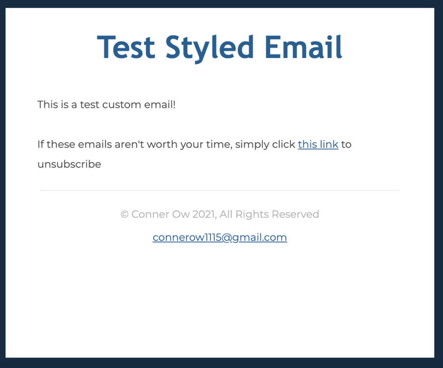
You won't get one of these unless you subscribe to me, but I thought I'd show you how to do it over here.
You can send custom emails from NodeJS for absolutely no cost at all! All it takes is a few npm packages, some authentication, and some css.
Important Notice - Make sure this is run on the server-side (NodeJS) and not the client side of JS (I'm talking to you thirteen-year-old devs out there)!
Let's install two npm packages.
const nodemailer = require('nodemailer');
const inLineCss = require('nodemailer-juice');
Nodemailer does the main emailing stuff and nodemailer-juice converts your css into inline css styling.
Why do you need nodemailer-juice? Well sadly, emails only support inline css and not css files or style tags. It's hard to believe, but it's true and probably won't change for a while.
I've created a simple mailing function. Make sure you put in your correct email credentials!
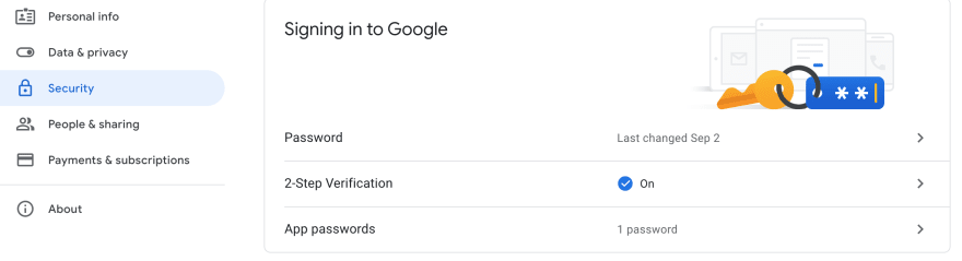
Don't forget to turn on Two-Step verification if you're using gmail and generate an app password for your email password. Otherwise, this won't work.
function sendEmail(to, subject, html) {
  let transporter = nodemailer.createTransport({
    service: 'gmail',
    host: 'smtp.gmail.com',
    port: 465,
    secure: true,
    auth: {
      user: '[email protected]',
      pass: '<input your app password here>'
    }
  });
  transporter.use('compile', inLineCss());

  let mailDetails = {
    from: '[email protected]',
    to: to,
    subject: subject,
    html: html,
  };

  transporter.sendMail(mailDetails, function (err, data) {
    if (err) console.error(err)
  });
}
To send a custom email, all you have to do is pass in an html document as a javascript string into the sendEmail function. It can't be a file.
sendEmail("[email protected]", "This is a test email!", `
<!DOCTYPE html>
<html>
  <head>
    <style>...</style>
  </head>
  <body>
    ...
  </body>
</html>
`)
Here's a little template you can use for emails: https://replit.com/@IroncladDev/Noseletter
What I did to make email sending a bit easier was create a constant function and set it to the html body with a few arguments to edit the content.
const template = (title, body) => `<!DOCTYPE html>
<html lang="en">...`
Well, I guess that's all I have to say. If you have anything to say about my site, feel free to say it! Any criticisms will be appreciated.
Subscribe to my newsletter for new posts, new projects, recaps, and more!
Join my discord to get in touch and hang out!
Also, be sure to support this post with a couple reactions!
39