
33
Simple Introduction to Chakra UI
A lot of things need to be taken into consideration while designing any software application in general. To build a website with the component-based development approach, we would tend to approach a design as individual components.
For example, consider a super simple website like a blog. It would typically have a header, post cover, post content, a footer, and so on.
When we are presented with a design of a website, we would start building up the small individual parts of it, which we refer to as components and then fuse those components together to complete the design for a page.
Suppose, if we want to build a button then it is super simple like
<button onclick="alert('hello world');">Hello</button>This is a simple HTML tag, an element, and also a component. There can be a lot of components we will want to build for a real client application. Some of the examples are modals, drawers, links, tabs, inputs etc.
When building these components we should be careful that we are following same design architecture throughout our application. All the buttons in our application must look and feel the same.
Next thing to be taken for consideration while developing web applications is Web Accessibility. If we are building a dropdown/select component, it must be navigatable via keyboard, should have proper color contrast, accessible by screen readers etc.
There could be many other cases that we may not even aware of while building some complex components like tabs, overlays, modals.
To help us solve these problems and to easily get started with development, there are a lot of UI Component Libraries out there. They have a lot of battle tested components, which would help the developers like us to build our application quickly without sacrificing on accessibility, design architecture, meaningful navigation and so on.
One of such component Library is Chakra UI.
Chakra UI is a simple, modular and accessible component library that gives you the building blocks you need to build your React applications.
Think of these building blocks like set of lego blocks. We can start picking the right ones we need and compose them together to make our dream project!
Before we see about Chakra UI, let's revisit on the ways that we can style our React components with css.
In this approach, we would write our component code in a
.jsx or .tsx files and we would create another file with css and reference them in our component file.components
- mycomponent.jsx
- mycomponent.cssThe challenge with this approach is that the css we are writing is not scoped to the component, rather it would be applied globally.
When we are selecting the elements with classname or IDs and writing specific styles, we should be careful to not repeat the same names. If we are not careful enough then wrong styles would be applied to the element with same selector name on a different page.
This is because our entire css files are bundled together and server over the wire.
Another big headache is when we are removing some components from our application, it is so very easy to forget about the styles that we wrote for that component. Since the styles are not scoped to the component, we have no way to find out the dead css in our application.
As the name suggests, in this approach, we would be writing CSS code in Javascript!
This has a lot of benefits, like
When we scope the css to a particular component, we no longer have to worry about our styles messing up other components. When we remove a component from the application, the css goes away with that! The major benefit of it is sending just the CSS that we need for the page over the wire.
There are a lot of libraries to help us with the css-in-js approach. The famous ones are Styled Components and Emotion.
You can see the difference in the casing of the css properties,
backgroundColor instead of background-color and pseudo selectors as well. We are passing styles as a object to a custom prop css which is inferred by emotion and applies those styles inline to that div.If you want to have a deep dive on this concept, please read thorough the documentation from emotion
We can build our react application with emotion or styled components, but the Chakra UI library takes this approach a one level higher and simpler.
The above example with emotion's css prop can be achieved in Chakra UI with the below piece of code.
import { Box } from "@chakra-ui/react";

return (
    <Box
      backgroundColor="hotpink"
      _hover={{
        color: "lightgreen"
      }}
    >
      This has a hotpink background.
    </Box>
);
Here we are passing in the styles directly to the component
<Box/> as props. The Box component renders a div by default. Chakra UI uses emotion under the hood, so you can also style your components in pure emotion way, but you won't be needing this for the most part.
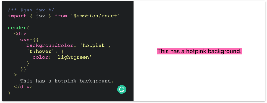
This is chakra component styled with emotion.
return (
    <Box
      css={{
        backgroundColor: "hotpink",
        "&:hover": {
          color: "lightgreen"
        }
      }}
    >
      This has a hotpink background.
    </Box>
);
Both renders the same result.
Let's see another example, where we want to get username and password in a form with a submit button.
In React with plain elements,

Same element styles in Chakra would be
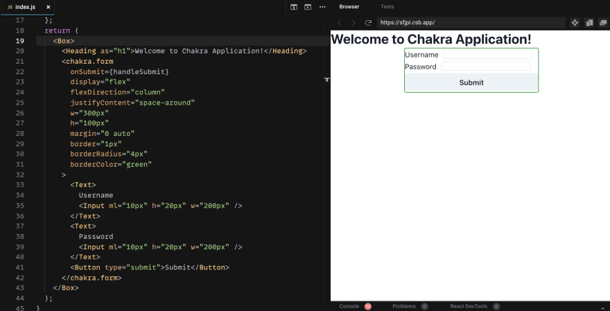
Note: Please ignore the semantics here, as this is just to demonstrate comparison of styles
If the images aren't clear, take a look at the Sandboxes for Plain React and
with Chakra UI components mentioned above.
with Chakra UI components mentioned above.
There are a lot of components we have in chakra and even specific ones like
Grid and Flex to handle layouts exclusively like the one seen above. The awesome part of using Chakra components is the intellisense for the styles are always available for you so that you need not worry about the casing of styles.
The point here is that, Chakra UI is well documented, and you can easily peek into any of the components from the chakra ui repo to learn more about them, and to customize according to your requirements.
In the above form example with chakra, we have seen a component
<chakra.form/> which simply renders HTML <form> but the beauty is, it can accept chakra's style props. We can convert any custom component to receive chakra props with the chakra function. Similar to
styled function from emotion.import styled from '@emotion/styled'
const Button = styled.button`
color: turquoise;
`
render(<Button>This my button component.</Button>)Chakra components are built with accessibility in mind 🚀. For an example, if you are using modal from chakra, these are the keyboard and focus management you get out of the box which complies with accessible standards:
Esc closes the Modal.document.body to
break it out of the source order and make it easy to add aria-hidden to its
siblings.There is special component
challenged users. Though this can be achieved with 10 lines of css, kudos to chakra team for thinking about it and providing it as a component 💯
<VisuallyHidden/> which is not visible to the normal user but would be accessible by screen readers. This is useful for providing additional details to a icon button or image which cannot be perceived by visually challenged users. Though this can be achieved with 10 lines of css, kudos to chakra team for thinking about it and providing it as a component 💯
All the chakra UI components are dark mode compatible, the colors & default styles are easily overridable.
With the excellent community support and documentation, you can build out awesome components with just minimal amount of time.
And to finish off the introduction,
My website is built with Chakra UI components and I feel very happy about it 🥳
Further Information
33